Chapter 1
The short answer: use AI for layout, not final text
To keep typography consistent in AI-generated social images, define type roles, hierarchy, contrast, line length, text density, safe zones, and final text production rules. Use AI to explore composition and mood, but add final text, labels, numbers, and CTA copy in a controlled design layer when accuracy and readability matter.
Typography is not a decorative detail. It controls whether a carousel, infographic, product post, or slideshow can be understood on a phone. If a generated asset contains warped microtext, inconsistent fonts, or low-contrast labels, it should not be published as-is.
The team needs a repeatable typography QA checklist because AI systems can make text look plausible without making it readable or accurate.
Define heading, body, label, source, and CTA roles.
Use consistent scale and spacing across slide sets.
Meet strong contrast standards.
Avoid generated microtext for final factual content.
Review at phone size before scheduling.
Chapter 2
Define type roles before generating assets
A typography system starts with roles. A social image usually needs a hook, section heading, body copy, label, source note, and CTA. Each role should have a size range, weight, color, placement, and maximum length.
Without roles, AI-generated assets often mix type styles randomly. One slide uses giant body text, another uses tiny labels, another invents decorative script, and the final CTA looks like a sticker from a different brand.
The type roles should match the content format. A TikTok slideshow needs fewer words and larger type than a LinkedIn document. A product infographic needs clear labels and source notes. An Instagram carousel needs strong hook hierarchy and a consistent reading path.
- 1
Hook role
The first visible promise or question. It should be short, high contrast, and dominant.
- 2
Body role
The explanation text. It should be concise enough to read during a swipe.
- 3
Label role
Product, diagram, chart, or step labels. They need precision and should usually be added manually.
- 4
Source role
Citation or evidence note. Keep it readable or move full citations to caption or linked article.
- 5
CTA role
The final action. It should not compete with body copy or get hidden by platform UI.
Chapter 3
Use contrast as a hard review gate
Low-contrast typography is one of the fastest ways to make an AI image unusable. It often happens when generated text sits over a busy scene, gradient, photo detail, or decorative texture. The image may look premium while the message is unreadable.
W3C contrast guidance gives teams a concrete floor for text contrast. Social content is not identical to a web interface, but a contrast benchmark is still useful because users read on small screens in imperfect conditions.
If the brand palette includes low-contrast colors, use them for decoration, not primary text. The brand does not become more consistent by making its content harder to read.
Primary text should have strong contrast against the background.
Do not place text over busy product details or faces.
Use solid panels or overlays when a photo background is necessary.
Reserve accent colors for emphasis, not full paragraphs.
Check contrast after export, not only in the prompt.
Build from this playbook
Keep AI-generated social assets readable and on-brand
AttentionClaw helps teams generate social campaigns from approved brand systems, with typography and format rules built into review.
Chapter 4
Control text density by platform
AI can generate beautiful overcrowded slides. Text density should be planned by platform and content job. Instagram carousel slides can carry moderate explanation. TikTok slideshow frames need faster reading. LinkedIn documents can carry more professional detail. Product infographics need labels but not paragraph blocks.
The simplest rule is one idea per slide. If a generated image needs four labels, three arrows, two paragraphs, and a source note, it is probably two or three slides.
Density control also protects brand style. A quiet premium brand looks messy when a generated infographic crams every claim into one card. A practical education brand loses usefulness when type becomes too decorative.
- 1
Instagram carousel
One idea per slide, strong heading, short body, enough spacing.
- 2
TikTok slideshow
Large text, fast hook, minimal labels, strong first frame.
- 3
LinkedIn document
Clear headings, more detail, professional spacing, source-aware notes.
- 4
Product infographic
Labels and comparison points only after product and claim accuracy are verified.
Chapter 5
Add final text in controlled layers
Generated text should not be trusted for final product specs, chart labels, statistics, legal notes, source citations, app UI, or CTA copy. It can be useful as a placeholder that shows where text belongs, but the final wording should be rebuilt.
This is especially important for product pages and infographics. A distorted ingredient name, fake certification, wrong price, or altered app feature can turn a design issue into a trust issue.
Use AI for layout exploration, then finalize text with the brand's type scale and approved copy. That workflow gives speed without sacrificing accuracy.
Rebuild all factual labels.
Rebuild all numbers and chart values.
Rebuild all product names and variant names.
Rebuild all source notes and CTA copy.
Reject outputs where generated text is part of the image and cannot be corrected.
Chapter 6
Run typography QA on the full set
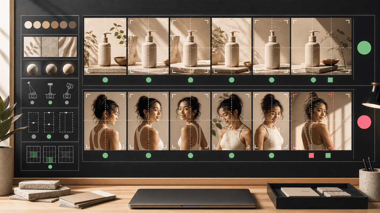
Typography consistency is easiest to see in a grid. Place every carousel slide or campaign image together and check whether the type roles, sizes, weights, spacing, and CTA treatment feel like one system.
Then preview the exported assets on a phone. If the reviewer has to pinch, pause, or guess, the type system is not ready. Social assets are consumed quickly; the typography has to work at actual viewing size.
AttentionClaw can help teams produce content from brand rules, but typography QA remains an essential gate before scheduling.
- 1
Grid check
Compare the full batch for type consistency, hierarchy, spacing, color roles, and CTA treatment.
- 2
Phone check
Preview at the smallest likely viewing size and reject unreadable slides.
- 3
Accuracy check
Verify every label, number, source note, and CTA against the source sheet.
- 4
Platform check
Confirm text-safe areas for Instagram, TikTok, LinkedIn, story, and ad placements.
Callout
Where AttentionClaw fits in the typography workflow
Use AttentionClaw to generate social assets from approved brand systems, then keep typography QA focused on readability, accuracy, and platform fit.
Chapter 7
Building a Type Style Guide That Works Before You Prompt
Typography consistency in AI-generated social images does not start with the prompt — it starts with a written style guide that exists before any generation happens. Without a reference document, each generation session restarts from scratch, and small decisions about font weight, spacing, and text size get made inconsistently by whoever is prompting. A lightweight type style guide eliminates that variability.
The guide does not need to be long. A one-page document that specifies: the name and weight of the headline font, the name and weight of the body font, the maximum character count per text zone by image format, the minimum contrast ratio for text on light and dark backgrounds, and the safe zone dimensions for each platform (where text must stay to avoid being cropped by UI elements) gives any team member or AI workflow a consistent set of constraints to work within.
The style guide serves a second function: it becomes the QA checklist. After generation, a reviewer checks the output against the guide rather than making subjective calls about whether something 'looks right.' Subjective review produces inconsistent results because different reviewers have different thresholds. A guide-based review produces consistent results because the criteria are explicit.
- 1
Define two font roles and stick to them
Name the font used for headlines and the font used for body text. Note the weight (e.g., Bold for headlines, Regular for body). Adding more roles increases complexity without improving recognition.
- 2
Set character limits per zone
Specify the maximum characters for headline text, body text, and labels for each image format you produce. Character limits are more actionable than vague instructions to 'keep it short.'
- 3
Define safe zones by platform
For Instagram carousels, the left and right edges of each slide are partially hidden on mobile. For TikTok, the bottom of the frame is covered by the UI. Map these as pixel or percentage margins and build them into your generation prompts.
Chapter 8
Common AI Typography Errors and How to Catch Them Before Publishing
AI image generation produces a predictable set of typography problems that appear across different tools and prompting styles. Knowing the pattern makes QA faster because reviewers know exactly where to look rather than scanning every pixel of every image.
The most common errors, roughly in order of frequency: text that renders with incorrect letterforms or illegible characters (especially in decorative fonts or small sizes); text that shifts position across slides in a carousel, breaking visual consistency; text that overlaps with the primary image subject because the generator placed it without understanding the focal point; text with insufficient contrast against a background that changed color in generation; and text that breaks mid-word at the end of a line in a way no human typographer would approve. Each of these has a known fix — dedicated text layers applied post-generation, contrast verification tools, grid overlays before approval — and the fix is always applied after generation, not trusted to the generator itself.
A practical QA order: read every word for legibility first, then check contrast, then check position consistency across all slides in the set, then check line breaks and text overflow. This order catches errors from most to least common and stops a flawed set from reaching the approval stage.
Callout
The fastest QA catch
Read every word of AI-generated text aloud before approving. AI generators produce convincing-looking text that is sometimes garbled, misspelled, or broken mid-character. Reading aloud catches what skimming misses.
Next step
Turn this guide into a production-ready carousel.
AttentionClaw helps teams generate social campaigns from approved brand systems, with typography and format rules built into review.
Keep the workflow inside AttentionClaw.
Common Questions
FAQ
More Reading
Keep reading
7-chapter read
How to Debug AI Style Drift in Social Images
AI style drift happens when generated social images slowly stop matching the approved brand, product, character, or scene system. Debug it by isolating the drift type, comparing against baselines, tightening prompt blocks, adding references, and changing the review gate.
8-chapter read
AI Background Consistency for Product Scenes
AI product backgrounds stay consistent when you define scene lanes, surfaces, lighting, camera distance, prop rules, color temperature, and negative constraints before generation. The product identity should stay fixed while context changes only inside approved lanes.
AI-Generated Product Infographic Checklist
AI-generated product infographics should start with product truth and source-backed claims. Use a checklist for SKU accuracy, variant logic, evidence, chart integrity, readability, citations, and destination-page match before publishing.
8-chapter read
Brand Style Prompt Templates for Consistent Social Media Images
Brand style prompts work best as reusable blocks: identity lock, style lane, camera and lighting, composition, allowed variation, negative constraints, and review criteria. The template should protect the brand while leaving enough room for useful campaign variation.

How to Batch Instagram Carousels and Save 10+ Hours Every Week
Most creators spend 2-3 hours per carousel because they restart from scratch every time. A batch production system cuts that to 15 minutes per post.

How to Build a Brand Style System for AI-Generated Social Content
A brand style system for AI-generated social content turns taste into operating rules. It defines visual identity, voice, prompt blocks, reusable scenes, text rules, source rules, and QA gates so every carousel, slideshow, infographic, and product post feels like the same brand.
8-chapter read
How to Build Reusable AI Scenes for Social Posts
Reusable AI scenes turn random generations into a repeatable visual system. Define the scene's job, camera, lighting, prop rules, product placement, variation lanes, and QA checklist so each post feels fresh without breaking brand recognition.
AI Image Consistency Checklist for Instagram Carousels
AI image consistency for Instagram carousels requires checks before, during, and after generation: identity lock, style lane, product accuracy, character continuity, camera rules, crop safety, text safety, disclosure, and final mobile review.
8-chapter read
Social Content Templates for App Onboarding Education
App onboarding education content should teach one useful action at a time. Use social carousels and slideshows for setup, first win, feature discovery, objection answers, and advanced tips. The goal is not to replace in-app onboarding, but to reinforce it with contextual, saveable tutorials users can find before and after install.

Carousel Design Principles: The Visual Rules That Get More Swipes
Great carousel design is not about being a graphic designer. It is about following a set of visual rules that make your content readable, recognizable, and swipeable. This guide breaks down each rule with concrete specifications you can apply immediately.
Sources
- Understanding Success Criterion 1.4.3: Contrast (Minimum) — W3C Web Accessibility Initiative
- Awareness Carousel Ad Specs on Facebook Feed — Meta Ads Guide
- About Carousel Ads in TikTok Ads Manager — TikTok Ads Manager
- Carousel Ads Specifications — LinkedIn Help
Written by
AttentionClaw
Editorial Team
Editorial context
Part of the Carousel Creation topic cluster. Last updated June 22, 2026.