Chapter 1
The direct answer: teach the next useful action
The best social content for app onboarding teaches one next useful action: set up the account, complete the first project, connect an integration, understand a dashboard, generate an output, or recover from a common mistake. It should not try to explain the whole app. A useful onboarding carousel feels like help at the exact moment the user needs it.
This is different from a promotional feature post. A promotional post says, 'Our app has smart scheduling.' An onboarding education post says, 'Here is how to schedule your first week of posts after connecting Instagram.' The second version gives both new users and prospects a clear reason to act.
Nielsen Norman Group's onboarding guidance is a warning against generic tutorials that interrupt users and are quickly forgotten. Social onboarding content works best when it is contextual: one task, one situation, one result, and one next action.
Callout
Template rule
If the post cannot help a user complete something specific, it is not onboarding education. It is product awareness.
Chapter 2
Use five onboarding content templates
A complete onboarding education system needs several content types because users get stuck in different places. Some have not installed yet and need confidence. Some installed but never reached the first win. Some reached the first win but do not know what to do next. Some are evaluating whether the app is serious enough to keep.
The five most useful templates are first-win tutorial, feature discovery, mistake correction, use-case workflow, and advanced-tip series. Together, they cover activation and retention without turning the social feed into a help center.
First-win tutorial: the shortest path from install to visible value.
Feature discovery: one useful capability many users miss.
Mistake correction: a common setup or workflow error and how to avoid it.
Use-case workflow: how a specific persona completes a realistic job.
Advanced-tip series: small upgrades that make active users more successful.
Chapter 3
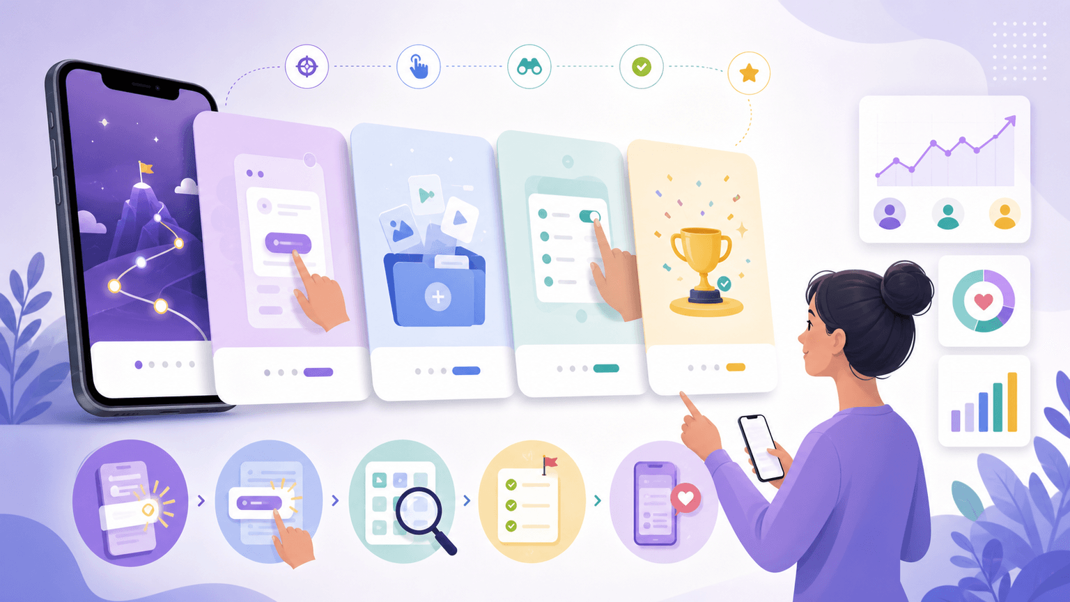
Template 1: the first-win onboarding carousel
The first-win carousel is the highest-priority onboarding asset because it teaches the action most likely to turn a download into a retained user. The first win should be visible and emotionally clear: a completed plan, generated design, connected account, imported data set, or scheduled post.
This template should use numbered steps and product screenshots, but the screenshots must be cropped to the task. The user should not have to inspect a full interface to know where to click. Use the slide headline to interpret the screen, then use an annotation only where it removes ambiguity.
For app-store alignment, this same first-win story can inform product screenshots and preview assets. Apple's guidance says screenshots should communicate the user experience and focus on main benefits or features. Google Play's store listing guidance also treats the listing as the place where users learn the app's value and details.
- 1
Slide 1: First-win promise
Example: 'Create your first launch calendar in 3 minutes.'
- 2
Slide 2: What to have ready
Tell users what they need before starting: account, screenshot, product link, or topic idea.
- 3
Slides 3-6: One action per slide
Use a cropped screen, one verb, and one short instruction per slide.
- 4
Slide 7: Result screen
Show the completed output so the user knows what success looks like.
- 5
Slide 8: Save and start CTA
Ask existing users to save the tutorial and new users to try the app.
Build from this playbook
Turn onboarding moments into reusable social tutorials
AttentionClaw helps app teams turn screenshots, support questions, and setup workflows into consistent onboarding carousels and TikTok slideshows.
Chapter 4
Template 2: feature discovery without feature dumping
Feature discovery content should reveal one useful capability in the context of a task. Avoid 'five features you did not know about' unless each feature is tied to a concrete scenario. Users remember the job, not the menu label.
Progressive disclosure is a useful product principle here. Nielsen Norman Group describes it as showing only the most important options first and revealing specialized options when needed. Social onboarding can follow the same logic: teach the simple path first, then introduce advanced capabilities in later posts.
A good feature discovery carousel might start with 'If your launch calendar is already full, use this to create platform variants.' That framing tells the user when the feature matters. The product feature becomes the answer to a real situation.
Start with the situation where the feature matters.
Show the default path first.
Reveal the advanced option only when the user has context.
Use before-and-after output to prove the feature changed something.
End with a CTA that invites the user to try the feature today.
Chapter 5
Template 3: mistake correction posts that reduce support load
Every support queue contains onboarding content ideas. If users keep asking the same question, create a public carousel or slideshow that answers it. Mistake correction posts are especially useful because they normalize confusion while giving a clear fix.
The structure is simple: name the mistake, explain why it happens, show the wrong path, show the correct path, and show the final result. This content can reduce repeated support work and make the app feel actively maintained.
Mistake correction also works before install. A prospect who sees that the team understands common setup problems may trust the product more because the education is honest. The post says, 'we know where users get stuck, and we built a clear path through it.'
- 1
Slide 1: Name the mistake
Use specific wording: 'Do not connect your account before choosing the campaign type.'
- 2
Slide 2: Explain the consequence
Show what breaks, slows down, or becomes confusing.
- 3
Slides 3-5: Show the fix
Walk through the corrected workflow with screenshots or simple diagrams.
- 4
Slide 6: Result
Show the cleaner output or completed state.
Chapter 6
Template 4: onboarding by persona and use case
Generic onboarding content is easy to ignore because the user has to translate it into their own situation. Persona-specific onboarding removes that translation step. A founder, agency operator, ecommerce marketer, and coach may use the same app differently. Each deserves a different tutorial path.
This does not mean inventing separate product experiences. It means framing the same core workflow with different inputs, examples, and outcomes. For AttentionClaw, the core workflow might be generate, review, schedule. For an app founder, the example is launch education. For an ecommerce brand, it is product benefits. For an agency, it is client approval.
Persona workflows are also strong SEO and AEO content because they answer more specific queries. 'How do agencies onboard clients into a social content workflow' is more valuable than 'how to use our app.'
Use the persona in the hook.
Use inputs that match the persona's real work.
Show a result the persona would value.
Avoid changing the product promise for every persona.
Link each persona tutorial to a related blog post or resource.
Chapter 7
Measure onboarding education by activation behavior
Onboarding education content should be judged by more than likes. Track saves, comments with setup questions, clicks to the app, and in-app completion of the taught workflow. If a tutorial gets fewer views but helps users complete setup, it is doing its job.
Use campaign links or onboarding questions where possible. Ask new users whether a tutorial helped them complete the first action. Compare completion rates for users exposed to a tutorial against users who came from generic promotional posts. The goal is activation, not applause.
The best feedback source is support. If a public onboarding post reduces repeated tickets or changes the questions users ask, keep producing that format. Your social feed becomes part of the product education system.
- 1
Choose one activation metric
Examples: connected account, first project created, first post scheduled, first export completed.
- 2
Map each tutorial to that metric
A tutorial should teach a workflow that can be detected or at least asked about inside the product.
- 3
Review comments and support tickets weekly
Use recurring questions as the next batch of tutorial topics.
Chapter 8
How to build onboarding education assets in AttentionClaw
The most efficient workflow is to create one onboarding brief per task. The brief should include the user type, the trigger, the desired outcome, the screenshots or visual references, and the CTA. AttentionClaw can then help turn the brief into a consistent carousel or TikTok slideshow while preserving the product's visual style.
Batch the assets by lifecycle stage: first-win tutorials, feature discovery, mistake correction, persona workflows, and advanced tips. This keeps the feed balanced and helps new users find the right level of help. It also means launch content can evolve into retention content after the first campaign.
A strong onboarding content library compounds. Each post can support social, email, help-center, app-store screenshot testing, and sales follow-up. The same visual explanation can reduce friction in several parts of the user journey.
Callout
Production shortcut
Turn every onboarding support answer into a reusable social brief: question, short answer, screenshot, result, CTA.
Next step
Turn this guide into a production-ready carousel.
AttentionClaw helps app teams turn screenshots, support questions, and setup workflows into consistent onboarding carousels and TikTok slideshows.
Keep the workflow inside AttentionClaw.
Common Questions
FAQ
More Reading
Keep reading
9-chapter read
Mobile App Permission Onboarding Carousels: Explain Data Requests Before Users Bounce
Mobile app permission onboarding carousels should explain why the app asks for data or device access, what value the user gets, and where privacy details live before the prompt appears.
8-chapter read
Carousel Slide Order That Converts: Hook, Proof, Offer, CTA
A converting carousel usually follows a clear order: hook, context, problem, solution or product, proof, objection handling, offer, and CTA. The exact slide count can change, but the reader should never wonder why the next slide exists.
8-chapter read
Consistent AI Typography for Social Images
Consistent AI typography comes from separating generated layout exploration from final text production. Define type roles, hierarchy, contrast, density, safe zones, and QA rules before approving social images.
App Onboarding Carousels: Turn New Users Into Power Users With Instagram Content
Most apps lose 75% of new users within the first week because users never discover the features that would make them stay. Onboarding carousels published on Instagram solve this by teaching new users how to get value from your app in a format they are already consuming daily.
How to Showcase App Features in Instagram Carousels That Drive Downloads
Listing features does not sell apps. Showing how each feature changes the user's day does. These carousel frameworks turn abstract feature descriptions into visual, benefit-driven content that makes viewers reach for the download button.
7-chapter read
How to Explain a Complex App Feature in Five Carousel Slides
To explain a complex app feature in five carousel slides, show the user's situation, the hidden friction, the simple mental model, the feature workflow, and the result. Do not start with the architecture or settings. Start with the decision the user needs to make and end with the next action.

Instagram Strategy for App Developers: From Zero to 10K Downloads
Most app developers treat Instagram as an afterthought, posting screenshots and hoping for the best. A structured carousel strategy turns Instagram into a predictable app download channel.
8-chapter read
AI App Launch Social Content Plan: From First Demo to First Users
An AI app launch needs social content that proves usefulness, not just novelty. Build the plan around the user problem, the AI-assisted workflow, the visible output, trust and safety expectations, app-store message alignment, and post-launch onboarding. Use carousels and TikTok slideshows to teach, demonstrate, and answer objections before asking for downloads.

SaaS Content Repurposing: Turn Docs, Blogs, and Changelogs Into Carousels
SaaS companies sit on mountains of existing content — docs, blogs, changelogs, support articles — that could become dozens of carousels. The problem is not a lack of ideas. It is the lack of a system to extract and reformat that content efficiently.
Sources
- Onboarding Tutorials vs. Contextual Help — Nielsen Norman Group
- Progressive Disclosure — Nielsen Norman Group
- Creating Your Product Page — Apple Developer
- Create and set up your app — Google Play Console Help
- Creating helpful, reliable, people-first content — Google Search Central
Written by
AttentionClaw
Editorial Team
Editorial context
Part of the Carousel Creation topic cluster. Last updated June 22, 2026.