Chapter 1
Design is not decoration — it is communication
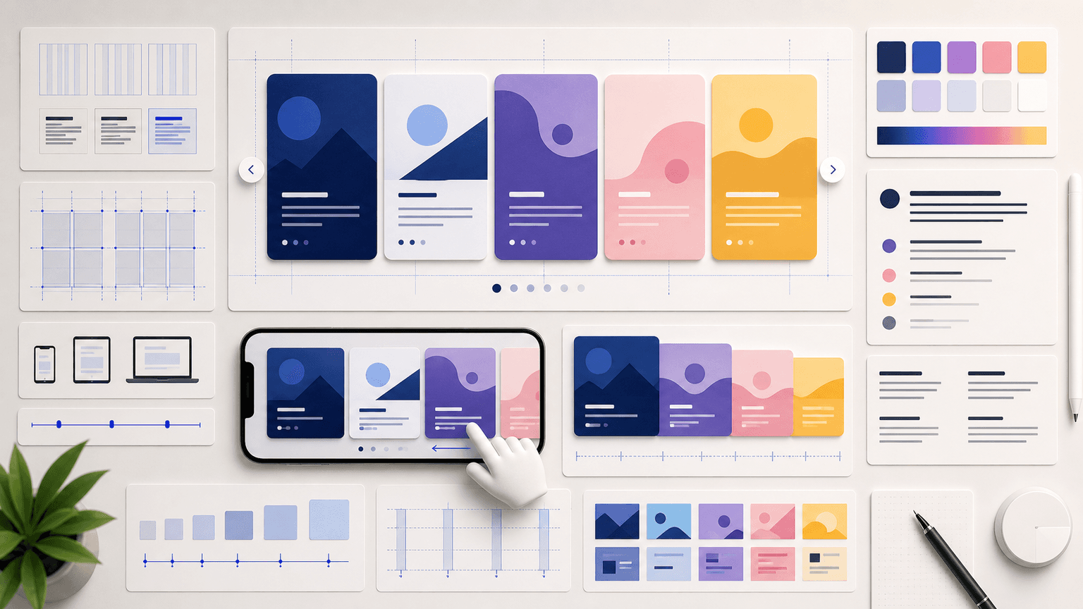
The purpose of carousel design is not to make something beautiful. It is to make something readable, navigable, and compelling. Beauty is a byproduct of good design decisions, not the goal. When design serves communication, the carousel performs. When design serves aesthetics at the expense of readability, engagement drops.
Every visual element on a carousel slide should answer the question: does this help the reader understand the content faster? If a background texture makes text harder to read, it fails. If an icon helps the reader process a concept quickly, it succeeds. If a color accent draws the eye to the key insight on the slide, it works. If a decorative gradient distracts from the headline, it does not.
The best-performing carousel designers on Instagram share a common trait: restraint. They use fewer colors, fewer fonts, fewer visual elements, and more white space than amateurs. This restraint is not laziness — it is discipline. Every element that is removed makes the remaining elements more powerful.
Chapter 2
Typography: the single most important design decision
Typography is the single biggest driver of your carousel's visual impact. Get fonts right and everything else falls into place.
Choose two fonts and never use more. One font for headings and one for body text. The heading font should be bold, high-contrast, and readable at a glance — sans-serif fonts like Inter, Montserrat, or DM Sans work reliably. The body font should be clean and readable at smaller sizes — the same sans-serif family at a lighter weight often works perfectly.
Font size on carousel slides needs to be larger than you think. Viewers are reading on 6-inch screens, often in imperfect lighting, often while moving. Your heading text should be at minimum 32 pixels on a 1080x1080 canvas. Body text should be at minimum 20 pixels. If you cannot read your slide comfortably on a phone at arm's length, the text is too small.
Line spacing (leading) is the invisible factor that separates professional-looking carousels from amateur ones. Set your line spacing to 130-150 percent of your font size. Text that is too tightly packed feels claustrophobic and is harder to read. Text with generous spacing feels clean and authoritative.
Maximum 2 fonts per carousel — one heading, one body (or one font family at two weights)
Heading size: 32-48px on a 1080x1080 canvas, bold or semibold weight
Body size: 20-28px, regular or medium weight
Line spacing: 130-150% of font size for comfortable reading
Letter spacing: slightly tighter for headings (-0.5 to -1%), default for body text
Never use more than 3 text sizes across all slides — heading, subheading, body
Chapter 3
Color: build a system of 4 colors and stop there
Color overwhelm is the second most common carousel design mistake after bad typography. Creators use too many colors, change palettes between carousels, or pick colors based on what looks nice rather than what communicates clearly.
A functional carousel color system needs exactly four roles: a background color, a primary text color, an accent color for emphasis, and a secondary accent for subtle differentiation. These four colors handle every visual need across every slide type. Your background and text colors should have a contrast ratio of at least 4.5:1 for accessibility and readability.
Choose colors that reflect your brand, but prioritize readability over brand expression. A beautiful brand color that reduces text contrast is worse than a simple black-on-white scheme. If your brand palette includes low-contrast combinations, reserve them for accent elements and use high-contrast defaults for text.
- 1
Define your background color
Light backgrounds (white, off-white, light gray) work best for text-heavy educational carousels. Dark backgrounds (charcoal, navy, dark gray) create more visual impact for hook slides. Many top-performing accounts use light backgrounds for middle slides and dark backgrounds for hook and CTA slides.
- 2
Set your primary text color
Near-black (#1A1A1A to #333333) on light backgrounds. Near-white (#F5F5F5 to #FFFFFF) on dark backgrounds. Avoid pure black (#000000) on pure white (#FFFFFF) — the extreme contrast is actually harder on the eyes than slightly softer combinations.
- 3
Choose one accent color
This color highlights key words, underlines important phrases, and marks CTA buttons. It should be your most recognizable brand color. Use it sparingly — if everything is highlighted, nothing is highlighted.
- 4
Add one secondary accent
A muted version of your primary accent or a complementary neutral. Use it for borders, dividers, slide numbers, and secondary information. This prevents you from overusing your primary accent.
Build from this playbook
Beautiful carousels, zero design effort
AttentionClaw generates brand-consistent Instagram carousels and TikTok slideshows that follow professional design principles automatically. Your brand, your content, ready to publish.
Chapter 4
Layout: where to put things on a carousel slide
Layout determines how the reader's eye moves across your slide. A good layout guides the eye from the most important element to the least important in a natural, effortless flow. A bad layout forces the eye to jump around searching for the starting point.
The most reliable carousel layout follows a top-to-bottom reading flow: heading at the top, content in the middle, and secondary elements (slide numbers, branding) at the bottom. This matches how people naturally read on screens. Layouts that center everything vertically also work, but they require careful spacing to avoid the 'floating text' effect.
Margins matter more than most creators realize. Text that touches the edges of your canvas feels cramped and unprofessional. Set minimum margins of 60-80 pixels on all sides of a 1080x1080 canvas. This gives your content room to breathe and prevents Instagram's UI elements from overlapping your text.
Top-to-bottom reading flow: heading, content, secondary elements
Minimum 60-80px margins on all sides of a 1080x1080 canvas
Align all text to the same left edge — avoid mixing left-aligned, center-aligned, and right-aligned text
Group related elements with proximity and separate unrelated elements with space
Keep slide numbers and branding in the same position across all slides for consistency
Leave 30-40% of your slide as white space — this is not wasted space, it is readability
Callout
The grid approach
Divide your 1080x1080 canvas into a simple 3x3 grid. Place your heading in the top row, your main content in the middle row, and your supporting elements in the bottom row. This grid prevents the visual chaos that happens when elements are placed randomly.
Chapter 5
Visual hierarchy: controlling what the reader sees first
Visual hierarchy is the arrangement of elements so that the most important thing is seen first, the second most important thing is seen second, and so on. Without hierarchy, the viewer's eye wanders aimlessly, processing nothing effectively.
You control hierarchy with four tools: size, weight, color, and position. The largest, boldest, most colorful element at the top of the slide gets seen first. Use all four tools to reinforce the same hierarchy — do not make your heading small and your body text large, or put your most important point at the bottom of a slide.
Every carousel slide should have exactly one focal point — the single most important element the reader should see first. On a hook slide, the focal point is the hook text. On a content slide, it is the heading. On a CTA slide, it is the action. If you squint at your slide and cannot immediately identify the focal point, the hierarchy needs work.
- 1
Establish the focal point
Decide what the single most important element is on each slide. Make it the largest, boldest, and most prominently positioned element. Everything else is supporting.
- 2
Create clear levels
Use no more than 3 levels of hierarchy per slide: primary (heading or key point), secondary (supporting text or elaboration), tertiary (slide number, branding, footnotes). Each level should be visually distinct through size, weight, or color differences.
- 3
Use contrast to separate levels
Primary text at 100% opacity. Secondary text at 80% opacity or a lighter color. Tertiary text at 60% opacity. This creates a natural visual step-down that guides the reading order without conscious effort from the viewer.
Chapter 6
Brand consistency: looking recognizable without a logo on every slide
Brand consistency on Instagram carousels means that someone scrolling their feed can identify your content before reading a single word. This recognition comes from consistent use of fonts, colors, spacing, and layout patterns — not from slapping a logo on every slide.
The accounts with the strongest carousel brand consistency use the same design system across every single post. Same fonts, same colors, same margin widths, same heading positions, same text sizes. Individual carousels vary the content and the visual emphasis, but the underlying system remains constant.
Building brand consistency does not require a graphic designer. It requires a documented design system — even if that document is just a list of your font names, hex color codes, standard text sizes, and margin widths. Once you have this list, every carousel you create follows the same specifications. The consistency compounds over months until your content is immediately recognizable.
Callout
Systemize your brand once
AttentionClaw lets you define your brand identity — fonts, colors, tone, style — once and then generates carousels that automatically match it. No design system to maintain manually, no specifications to remember. Your brand stays consistent across every carousel without extra effort.
Chapter 7
Visual continuity: making slides flow into each other
A carousel is not a collection of isolated slides — it is a sequence. The best carousels create visual continuity that makes swiping feel like turning pages of a book rather than jumping between unrelated images.
The simplest continuity technique is maintaining the same background, layout, and text positioning across all slides. When the reader swipes and only the content changes — not the entire visual environment — the transition feels smooth and the content stays the focus.
More advanced techniques include using a visual element that spans slides (a line, a shape, or a gradient that continues across the swipe boundary), numbering your slides so the reader knows their position in the sequence, and using a progress indicator that advances with each swipe. These techniques reduce drop-off because the reader always knows how far they are from the end.
Keep backgrounds consistent across all slides — changing backgrounds feels jarring
Maintain the same text position so the reader's eye does not have to re-orient on each swipe
Number your slides (1/10, 2/10) to set expectations and encourage completion
Use the same layout grid for all content slides — vary the content, not the structure
Reserve visual changes for intentional emphasis: a different background on the hook or CTA slide creates impact
Chapter 8
Eight design mistakes that kill carousel engagement
- 1
Text too small to read on mobile
If body text is below 20px on a 1080x1080 canvas, it is too small. Always preview your carousel on your actual phone before publishing. Desktop previews are misleading.
- 2
Too many fonts
Three or more fonts on a single carousel creates visual chaos. Stick to two: one heading font, one body font. If you need variety, use different weights of the same font family.
- 3
Low contrast text
Light gray text on a white background or dark text on a dark image background is unreadable for many viewers. Check your contrast ratio and aim for 4.5:1 minimum.
- 4
Inconsistent spacing
Margins that change from slide to slide make your carousel look unfinished. Set margin and padding values once and apply them to every slide identically.
- 5
Overusing stock imagery
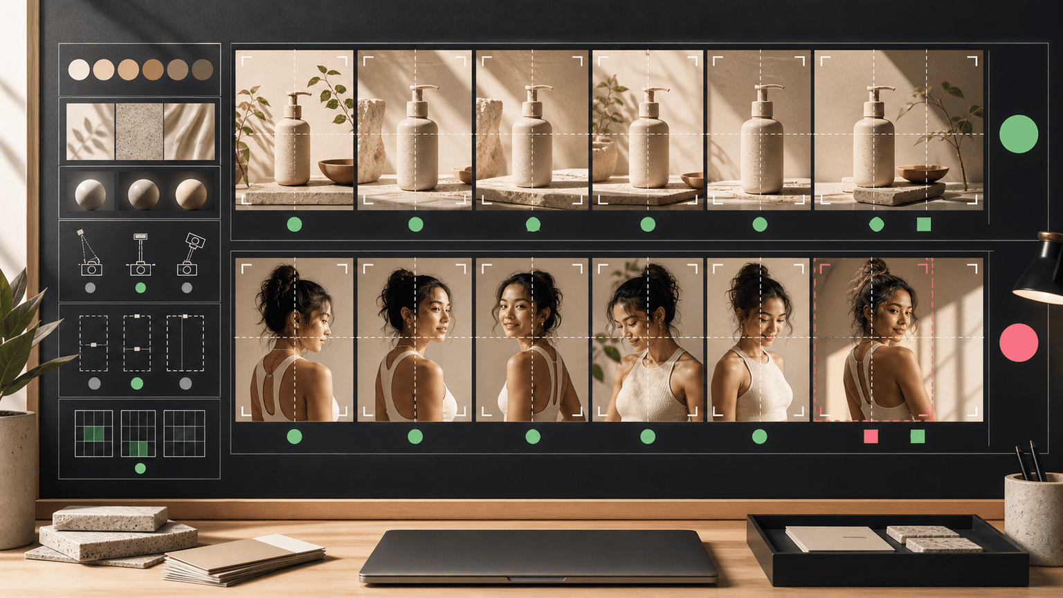
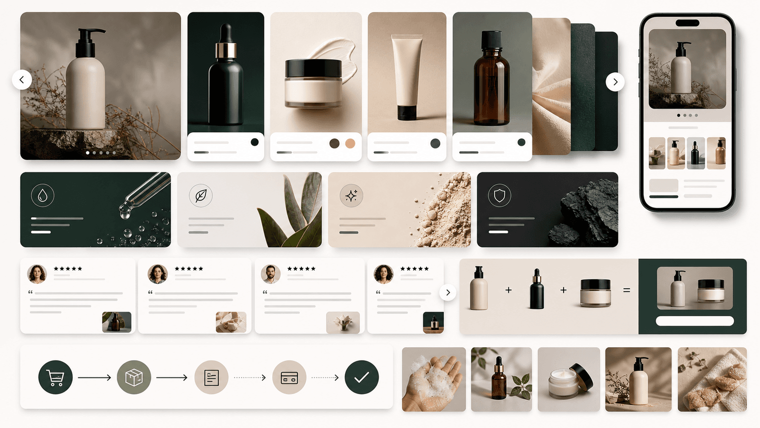
Generic stock photos add visual noise without adding value. If an image does not directly illustrate your point, it is better to use a clean background and let the text do the work.
- 6
Ignoring the safe zone
Instagram overlays UI elements on the top and bottom of carousel slides. Keep critical text and elements away from the outer 100px on top and 150px on bottom to avoid overlap.
- 7
Rainbow color schemes
Using a different accent color on every slide makes the carousel feel chaotic. Your accent color should be the same on every slide. Consistency builds trust.
- 8
Decorating instead of designing
Gradients, shadows, borders, and icons that do not serve the content are decoration, not design. Every visual element should make the content clearer or more compelling. If it does neither, remove it.
Chapter 9
Adapting design for different carousel content types
Not all carousels have the same design needs. A data-heavy carousel needs different visual treatment than a storytelling carousel. Adapting your design system to serve different content types — while maintaining brand consistency — is what separates competent carousel design from exceptional carousel design.
- 1
Educational how-to carousels
Priority: readability and scannability. Use large step numbers, clear headings, and generous spacing. Keep backgrounds simple so the text takes center stage. Numbered lists and checklists perform exceptionally well. This format benefits the most from consistent layouts across all slides.
- 2
Data and statistics carousels
Priority: visual impact of numbers. Make the key statistic the largest element on the slide — 48px or larger. Support it with a brief context line in smaller text. Use your accent color on the number itself to draw the eye. Minimal supporting text lets the data speak.
- 3
Story and case study carousels
Priority: narrative flow and emotional pacing. Allow more visual variety between slides to match the story beats. Use images or screenshots where they add proof. Break from your standard layout for key moments (the turning point, the result) to create visual emphasis.
- 4
Listicle and tip carousels
Priority: scannability and consistency. Every tip slide should follow the same layout so the reader can process each one quickly. Use a consistent numbering system and keep tip titles to one line. The predictable structure lets readers focus entirely on content.
Chapter 10
Build your carousel design system in one hour
You do not need a week to build a design system. One focused hour gives you everything you need to produce consistent carousels indefinitely.
- 1
Minutes 0-15: Choose your fonts
Pick one sans-serif font family. Set your heading weight (bold or semibold) and body weight (regular or medium). Define your three text sizes: heading (36-48px), subheading (24-32px), body (20-28px). Write them down.
- 2
Minutes 15-25: Define your colors
Choose your background color, primary text color, accent color, and secondary accent. Write down the exact hex codes. Test the text-on-background contrast using an online contrast checker. Adjust until you hit 4.5:1.
- 3
Minutes 25-40: Set your layout grid
On a 1080x1080 canvas, set your margins (60-80px all sides). Define where your heading sits, where body text sits, and where secondary elements (slide number, logo) sit. Create one content slide template and duplicate it.
- 4
Minutes 40-55: Create 4 slide templates
Build one hook slide, one content slide with heading and body, one list slide with bullet points, and one CTA slide. These four templates cover 90% of all carousel needs.
- 5
Minutes 55-60: Document everything
Write a simple document listing your fonts, sizes, colors (hex codes), margins, and the four templates. This is your design system. Reference it every time you create a carousel until the specifications become muscle memory.
Callout
Skip the manual work entirely
AttentionClaw builds your carousel design system from your brand definition automatically. Describe your brand identity once — colors, tone, style — and every generated carousel follows those specifications. No templates to create or maintain. No specifications to memorize.
Next step
Turn this guide into a production-ready carousel.
AttentionClaw generates brand-consistent Instagram carousels and TikTok slideshows that follow professional design principles automatically. Your brand, your content, ready to publish.
Keep the workflow inside AttentionClaw.
Common Questions
FAQ
More Reading
Keep reading
8-chapter read
Carousel Slide Order That Converts: Hook, Proof, Offer, CTA
A converting carousel usually follows a clear order: hook, context, problem, solution or product, proof, objection handling, offer, and CTA. The exact slide count can change, but the reader should never wonder why the next slide exists.
7-chapter read
Instagram Carousel Ad Hook Formulas That Qualify Buyers
The best Instagram carousel ad hooks qualify the audience, name the buying problem, and create a reason to swipe. A hook should attract the right buyer, not just the most curious viewer.
8-chapter read
Consistent AI Typography for Social Images
Consistent AI typography comes from separating generated layout exploration from final text production. Define type roles, hierarchy, contrast, density, safe zones, and QA rules before approving social images.

6 Instagram Carousel Hook Formulas That Actually Stop the Scroll
Your carousel is only as good as its first slide. These 6 hook families give you a rotation system that keeps your openings sharp without ever running out of ideas.

How to Batch Instagram Carousels and Save 10+ Hours Every Week
Most creators spend 2-3 hours per carousel because they restart from scratch every time. A batch production system cuts that to 15 minutes per post.
AI Image Consistency Checklist for Instagram Carousels
AI image consistency for Instagram carousels requires checks before, during, and after generation: identity lock, style lane, product accuracy, character continuity, camera rules, crop safety, text safety, disclosure, and final mobile review.
E-Commerce Carousel Templates That Actually Drive Sales (Not Just Likes)
Most e-commerce carousel templates are designed for engagement, not revenue. The formats that actually drive sales look fundamentally different from the ones that rack up likes, and understanding that distinction is worth thousands in monthly revenue.

Local Business Instagram Carousels: Drive Foot Traffic Without Paid Ads
Local businesses do not need viral content. They need carousels that reach the right 5,000 people within a ten-mile radius. A local carousel strategy turns your expertise, your team, and your community presence into foot traffic without spending a dollar on ads.

Carousel Copywriting Masterclass: Write Slides That People Actually Read
The difference between a carousel people swipe through and one they screenshot is the writing. Not the design, not the topic — the copy on each slide. This masterclass covers the word-level techniques that separate forgettable slides from shareable ones.

Carousel A/B Testing: How to Systematically Improve Every Post
Most creators improve their carousels through intuition and guesswork. A systematic A/B testing framework removes the guessing and tells you exactly what works for your specific audience — one variable at a time.
Written by
AttentionClaw
Editorial Team
Editorial context
Part of the Carousel Creation topic cluster. Last updated June 22, 2026.