
Chapter 1
The short answer: teach one buying decision per carousel
A product education carousel should help a shopper make one decision: whether the product fits their problem, which variant to choose, how to use it, why the quality is worth the price, or why a bundle is better than a single item. If a carousel tries to cover all of those at once, it becomes a mini catalog and the buyer leaves with less clarity.
Shopify product pages already contain the raw material: product media, variants, descriptions, ingredients, dimensions, reviews, bundles, and shipping or guarantee information. The carousel's job is to turn those facts into a guided buying explanation that makes sense in the Instagram feed.
Meta's carousel ad guidance allows multiple cards in one ad, which is useful because each frame can carry a distinct part of the decision. Organic Instagram carousels follow the same reader behavior: the first slide earns the swipe, the middle frames explain, and the last frame sends the reader to the product, collection, or offer.
Use one carousel for one buyer decision, not one carousel for the entire product page.
Lead with the buyer's question before showing the product details.
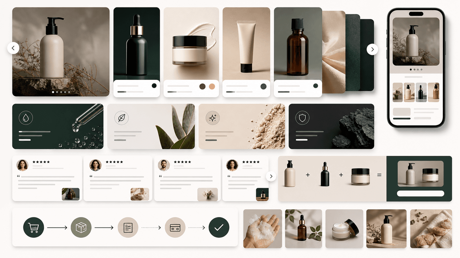
Make product imagery consistent enough to look like one brand, but varied enough to prove fit, scale, use, and quality.
Map every carousel to a product, variant, collection, bundle, or educational landing path.
Measure saves and swipes, but judge the framework by product clicks, add-to-cart behavior, and questions from qualified buyers.
Chapter 2
Turn the product page into a carousel brief
Before writing the carousel, audit the product page like a buyer. What information do they need before clicking buy? What is missing from the hero image? What objections appear in reviews, returns, comments, or support tickets? What variant confusion slows people down?
Shopify's product media documentation emphasizes that media can help customers understand product function, size, and quality. That is the same standard your social product education should meet. A carousel that repeats the same hero image nine times does not educate; it only reminds.
Build a brief with five columns: buyer question, product fact, proof asset, slide idea, and CTA. For example, 'Will it fit my small apartment?' becomes a dimensions slide with the product next to a sofa, tape measure overlay, and CTA to view the compact collection.
- 1
Collect buyer questions
Pull from reviews, product page FAQs, comments, returns, abandoned-cart surveys, sales calls, and customer support. Prioritize questions that appear before purchase, not after.
- 2
Match each question to proof
A fit question needs a comparison image. A quality question needs material or construction detail. A routine question needs a sequence. A safety or ingredient question needs factual explanation and appropriate disclaimers.
- 3
Choose one decision for the carousel
Pick the buyer question that will anchor the entire post. Save the others for additional carousels so the feed becomes a library, not one overloaded guide.
- 4
Define the next action
Decide whether the carousel should drive to one product, a variant selector, a bundle, a collection, a quiz, or a how-to article. The CTA should match the question you answered.
Chapter 3
Five product education carousel frameworks
These five frameworks cover most ecommerce content needs without forcing every product into the same template. Rotate them across the month so your feed teaches, compares, proves, and sells in different ways.
The difference between these frameworks is not visual style. It is the buyer decision each one serves. A variant chooser helps someone select the right size, shade, bundle, or use case. A quality proof carousel helps them justify price. A routine carousel helps them imagine using the product correctly.
Use your product category to choose the first framework. Beauty and wellness brands often start with routine or ingredient education. Apparel brands often start with fit and styling. Home brands often start with dimensions and before-after. Food brands often start with serving ideas and ingredient trust.
- 1
Framework 1: Problem to product
Slide 1 names the problem, slides 2 to 4 explain why it happens, slides 5 to 7 show how the product solves it, and the final slide links to the product. Best for new products, unfamiliar categories, and problem-aware buyers.
- 2
Framework 2: Variant chooser
Slide 1 asks 'Which one should you choose?', slides 2 to 6 compare variants by buyer situation, and the final slide sends people to the product page or variant collection. Best for shades, sizes, scents, formulas, colors, and bundles.
- 3
Framework 3: Use-it-right tutorial
Slide 1 promises a better result, slides 2 to 6 teach the process, and slides 7 to 8 show product-specific tips. Best for products where wrong use causes disappointment, returns, or weak reviews.
- 4
Framework 4: Quality proof
Slide 1 challenges a cheap alternative, slides 2 to 5 show material, construction, sourcing, testing, or design details, and slide 6 explains what that quality changes for the buyer. Best for premium pricing.
- 5
Framework 5: Bundle builder
Slide 1 names a complete outcome, slides 2 to 6 introduce each item and role, and the final slides compare individual total versus bundle value. Best for average-order-value growth and launch offers.
Callout
Do not force every SKU into every framework
A simple consumable may need routine and bundle carousels. A technical product may need comparison and quality proof. The right framework is the one that removes the buyer's real hesitation.
Build from this playbook
Turn product pages into brand-consistent carousel campaigns
AttentionClaw helps Shopify and DTC teams transform product facts, variants, bundles, and proof into scheduled Instagram carousels and TikTok slideshows.
Chapter 4
Write slide copy that explains, not decorates
Product education copy should be concrete. 'Designed for busy mornings' is weaker than 'Apply after cleanser, before SPF, and wait 60 seconds before makeup.' The second line teaches a use behavior, reduces uncertainty, and makes the product feel more real.
Use one job per slide. A common weak carousel combines a headline, paragraph, discount, testimonial, and product detail in the same frame. On mobile, that becomes visual noise. Put the question in the heading and the proof in one or two short lines.
Good ecommerce carousel copy often uses ordinary buyer language, not internal merchandising language. Shoppers search for 'which size rug for small bedroom' before they search for a branded collection name. Use product terms, but anchor them to the buyer's situation.
Replace feature-only copy with feature plus outcome.
Use numbers when they help: dimensions, minutes, pieces, routine order, shipping deadline, quantity, or bundle savings.
Name the product category early so the post can rank and be understood out of context.
Keep legal, medical, and performance-sensitive claims conservative and supported.
Make the final slide a decision aid, not only a logo and 'shop now.'
Chapter 5
Build visual consistency without making every product look the same
A Shopify store needs product imagery that looks coherent across the feed, but product education also requires variety. The solution is to standardize brand elements while changing proof types. Keep typography, spacing, color roles, and product cutout treatment consistent. Rotate product proof: lifestyle, closeup, scale, comparison, process, review, and offer.
Meta's carousel specifications make the technical constraints clear for ad placements, including card count and aspect ratios. Even for organic content, use those constraints as a discipline: design mobile-first, keep product details readable, and avoid layouts that only work on a desktop preview.
A practical visual system has five slide types: hook, product-in-context, detail proof, comparison or list, and CTA. Most product education carousels can be assembled from these. When every SKU uses the same slide grammar, the store looks organized without feeling repetitive.
- 1
Set fixed type roles
Use one headline style, one supporting text style, and one small-label style. Product education should feel clear, not editorially chaotic.
- 2
Define image roles
Use a hero image for desire, a closeup for proof, a comparison image for decision-making, and a real-use image for context. Do not ask one image to do every job.
- 3
Keep color functional
Use colors to signal product family, step order, alert, or CTA. Avoid random accent colors that make a carousel look disconnected from the store.
- 4
Review on a phone
Open the carousel at phone size before scheduling. If variant names, dimensions, ingredient notes, or price cues are unreadable, the design is not finished.
Chapter 6
Connect carousels to the right onsite path
A product education carousel should continue into an onsite experience that answers the same question. If the carousel teaches variant choice, the linked page should make variants easy to compare. If the carousel explains a routine, the product page should show routine order and complementary items. A mismatch between social promise and product page creates friction.
This is also where content marketing and ecommerce merchandising meet. A product education carousel can link to a product page, but it can also link to a buyer guide, collection, bundle, blog article, or quiz. The best destination is the one that lets the buyer finish the decision you started in the feed.
Use UTM tags or campaign naming so you can learn which frameworks drive qualified traffic. A variant chooser might have fewer likes than a trend post but more product-page engagement. Do not retire useful educational frameworks just because they are less viral.
Problem to product carousels should link to the exact product or collection solving that problem.
Variant chooser carousels should link to the product page with clear variant imagery.
Use-it-right tutorials can link to product pages, how-to guides, or bundles.
Quality proof carousels should link to detail-rich product pages, ingredient pages, materials pages, or reviews.
Bundle builder carousels should link directly to the bundle, not a collection where the shopper must recreate the bundle manually.
Chapter 7
A weekly Shopify carousel plan using the five frameworks
A store does not need to publish product education every day, but it should have a reliable cadence. A strong weekly mix might include two product education carousels, one social proof carousel, one TikTok slideshow adaptation, and one product or bundle offer. This keeps the feed useful without turning it into a nonstop catalog.
Use the same product fact base across formats. A Monday variant chooser can become a Wednesday TikTok slideshow. A Friday bundle carousel can become a story sequence, email block, and product page section. The more structured your frameworks are, the easier it becomes to repurpose without copy-paste repetition.
AttentionClaw is useful here because it can keep the brand style and slide grammar consistent while you generate multiple product education assets from the same brief. You still choose the buyer question and proof; the tool accelerates layout, formatting, and cross-platform variations.
- 1
Monday: Problem to product
Educate around a common buying problem and introduce one product as the solution.
- 2
Tuesday: Variant chooser
Help shoppers choose the right size, shade, scent, color, kit, or bundle.
- 3
Wednesday: TikTok slideshow adaptation
Turn the strongest hook and proof slides into a vertical TikTok slideshow with a product-tag or offer CTA.
- 4
Thursday: Quality proof
Show material, ingredient, manufacturing, durability, sizing, or review proof that supports price.
- 5
Friday: Bundle builder
Package complementary products into a complete outcome and send buyers directly to the bundle.
Chapter 8
Common mistakes in ecommerce product education carousels
The first mistake is confusing education with overexplaining. More facts do not automatically create more confidence. A buyer usually needs the right fact at the right moment. If the carousel has long paragraphs, nested labels, and multiple CTAs per slide, it will feel like homework.
The second mistake is using unsupported claims. Words like 'best,' 'cleanest,' 'clinically proven,' 'guaranteed,' or 'sustainable' need careful support. When in doubt, describe what is visibly true, what the product page can prove, or what the customer can verify.
The third mistake is making the carousel beautiful but disconnected from the store. If the social creative uses colors, claims, images, or offers that the product page does not repeat, the buyer has to rebuild trust after clicking. Keep the feed and store experience aligned.
Do not teach multiple unrelated buying decisions in one carousel.
Do not make product details too small to read on mobile.
Do not use a carousel framework without mapping it to a CTA destination.
Do not repeat direct product-page copy without adapting it for swipe behavior.
Do not judge product education only by likes; judge the buyer actions it creates.
Next step
Turn this guide into a production-ready carousel.
AttentionClaw helps Shopify and DTC teams transform product facts, variants, bundles, and proof into scheduled Instagram carousels and TikTok slideshows.
Keep the workflow inside AttentionClaw.
Common Questions
FAQ
More Reading
Keep reading
8-chapter read
Toy Store Gift Guide Instagram Carousels
Toy store gift guide carousels should group products by age, interest, budget, and safety notes while keeping reviews, inventory, and product claims accurate.
9-chapter read
Ecommerce Subscription Retention Instagram Carousels: Reduce Churn With Better Education
Ecommerce subscription retention carousels should help subscribers use the product, understand billing and cancellation choices, skip or swap correctly, and see why the next shipment matters.
8-chapter read
Carousel Slide Order That Converts: Hook, Proof, Offer, CTA
A converting carousel usually follows a clear order: hook, context, problem, solution or product, proof, objection handling, offer, and CTA. The exact slide count can change, but the reader should never wonder why the next slide exists.
8-chapter read
AI Product Image Variant Control for Ecommerce Campaigns
AI product variant control means locking which details can change and which cannot: color, size, label, material, scent, flavor, bundle contents, and product-page destination. Without variant rules, AI-generated social content can accidentally sell a product that does not exist.
7-chapter read
How to Turn a Product Detail Page Into Social Content
A product detail page can become a full social campaign when you extract buyer questions, benefits, proof, variants, objections, reviews, and offers. The goal is not to copy the page into posts; it is to turn each product-page section into one useful social asset.
E-Commerce Carousel Templates That Actually Drive Sales (Not Just Likes)
Most e-commerce carousel templates are designed for engagement, not revenue. The formats that actually drive sales look fundamentally different from the ones that rack up likes, and understanding that distinction is worth thousands in monthly revenue.

Turn Product Benefits Into a Week of Social Posts
A product benefit list can become a full week of social posts when each post answers a different buyer question: what it does, who it is for, how it works, what proof supports it, what objection it answers, how to choose a variant, and what to do next.
30-Day Social Content System for Shopify and DTC Brands
A 30-day Shopify social content system should turn products, objections, proof, education, and offers into a repeatable calendar. Plan four weekly arcs, batch creative by content job, repurpose each product angle across Instagram carousels and TikTok slideshows, then measure buyer actions instead of only engagement.

UGC Carousels for E-Commerce: Turn Customer Photos Into Your Best Sales Tool
User-generated content converts at 4-5 times the rate of brand-produced content, but most e-commerce brands either ignore UGC or use it poorly. Repurposing customer photos into structured carousel formats turns scattered social proof into your highest-performing sales asset.

Carousel Copywriting Masterclass: Write Slides That People Actually Read
The difference between a carousel people swipe through and one they screenshot is the writing. Not the design, not the topic — the copy on each slide. This masterclass covers the word-level techniques that separate forgettable slides from shareable ones.
Sources
- Design Specifications for Carousel Ads — Meta Business Help Center
- Product media — Shopify Help Center
- Adding variants — Shopify Help Center
- Creating helpful, reliable, people-first content — Google Search Central
Written by
AttentionClaw
Editorial Team
Editorial context
Part of the Carousel Creation topic cluster. Last updated June 22, 2026.