Chapter 1
The short answer: every slide should answer the next buyer question
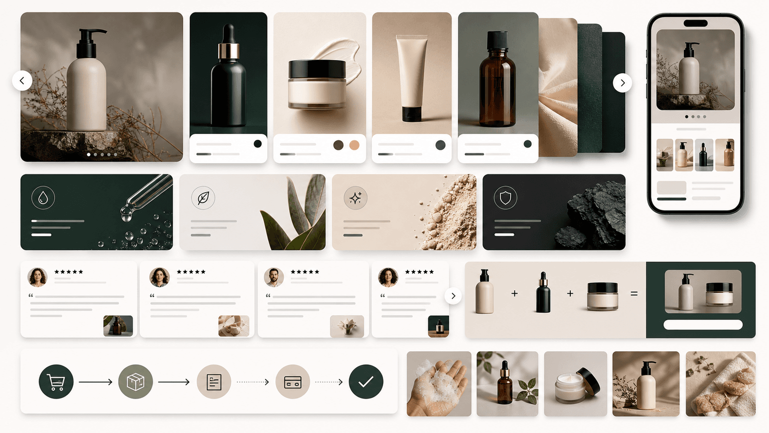
A converting carousel slide order starts with a hook, adds context, names the problem, introduces the product or framework, proves the claim, handles one objection, explains the offer, and closes with a CTA. The exact number of slides can vary, but the logic should not feel random.
Meta carousel ads can contain multiple cards with links and CTAs, while TikTok carousel ads use ordered images that people swipe through. Both formats reward sequences where each swipe reveals the next useful answer.
For paid social, the final slide should not be isolated from the landing page. The page must continue the same promise and offer or the conversion path breaks.
Slide 1: hook.
Slide 2: context.
Slide 3: problem or opportunity.
Slide 4: product, framework, or solution.
Slide 5: proof.
Slide 6: objection.
Slide 7: offer.
Slide 8: CTA and destination.
Callout
Conversion rule
A carousel converts when the next slide feels like the answer the reader already wanted.
Chapter 2
The default 8-slide conversion structure
Use this structure when the buyer needs more than one image to understand the product, offer, or next step. It works for ecommerce products, apps, SaaS, agencies, lead magnets, and launch campaigns.
Do not force every carousel to eight slides. Simple offers may need five. Complex proof may need nine or ten. The structure is a decision order, not a fixed template.
Start with the strongest buyer relevance. Do not save the main promise until the middle.
- 1
Hook
Qualify the buyer and create a reason to swipe.
- 2
Context
Show the situation, use case, or current workflow.
- 3
Problem
Name the friction, cost, or missed opportunity.
- 4
Solution
Introduce the product, framework, workflow, or offer.
- 5
Proof
Show review, screenshot, product detail, comparison, or demonstration.
- 6
Objection
Answer price, setup, fit, trust, compatibility, shipping, or risk.
- 7
Offer
Explain bundle, trial, demo, discount, lead magnet, or launch reason.
- 8
CTA
Send the reader to the matched destination.
Chapter 3
How to adapt the order by campaign type
Different campaigns need different emphasis. A cold prospecting carousel needs more context. A retargeting carousel can start with proof or objection. A launch carousel needs newness and timing. A lead magnet carousel needs preview value before the form.
The key is to preserve logic. If the audience already knows the problem, you can move proof earlier. If the product is unfamiliar, you need more context. If the offer is time-sensitive, urgency can appear earlier but still needs product value.
Use audience stage as the reason to change order, not internal preference.
Cold ecommerce: hook, problem, product, proof, offer, CTA.
Retargeting: reminder, proof, objection, offer, CTA.
SaaS lead gen: role, pain, framework, product context, proof, CTA.
App install: user job, old way, screen, result, proof, install CTA.
Lead magnet: problem, framework preview, deliverable, proof, form CTA.
Build from this playbook
Build carousels where every slide has a job
AttentionClaw helps teams turn hooks, proof, offers, and CTAs into carousel sequences that are easier to test and hand off to landing pages.
Chapter 4
How to test slide order
Slide-order testing should isolate order from content quality. Use the same product, proof, offer, and destination while comparing problem-first versus result-first or proof-early versus proof-late.
Meta A/B testing and TikTok split testing both support the principle of changing variables deliberately. For organic or manual tests, use the same principle even if you are not using a formal split-test tool.
Name the order in `utm_content` or the creative ID so reports remain readable.
- 1
Pick one order question
Example: should proof appear before or after the product explanation?
- 2
Keep assets stable
Use the same images, offer, CTA, and destination.
- 3
Name variants
Use `proof_early_v1` and `proof_late_v1`, or similar.
- 4
Measure downstream action
Review conversion quality, not only swipe or click rate.
Chapter 5
Match the final slide to the landing page
The final slide creates the expectation for the page. If the CTA says `shop the bundle`, the page should open on the bundle. If the CTA says `download the checklist`, the form page should preview the checklist. If the CTA says `start trial`, the page should show trial setup and first value.
Google's landing-page guidance emphasizes relevance and navigation. For carousel traffic, relevance means the destination continues the same slide sequence rather than starting over.
Use the final slide as the page brief. If the page cannot satisfy the final slide's promise, change the page or change the CTA.
Final slide promise matches page headline.
Final slide product matches page product or variant.
Final slide offer matches page terms.
Final slide proof appears or expands on page.
Final slide CTA matches page primary action.
Chapter 6
Slide-order mistakes to avoid
The first mistake is starting with the product before the buyer cares. A product reveal needs context unless the product is already famous or the audience is warm.
The second mistake is leaving proof too late. If skepticism is high, proof should appear earlier. If attention is weak, the hook should be sharper.
The third mistake is using the last slide as a generic logo card. The last slide should carry the next action.
Do not make every slide a feature list.
Do not use unrelated proof.
Do not add slides that do not answer a buyer question.
Do not ask for multiple CTAs at the end.
Do not ignore mobile readability.
Callout
Build sequences where every slide has a job
AttentionClaw helps teams build carousel slide sequences from a campaign brief so every slide has a job and every CTA has a matching destination.
Chapter 7
Adjusting slide order based on how warm the audience is
The standard 8-slide conversion structure assumes a moderately warm audience — someone who has encountered the brand before but has not yet decided. For cold audiences (no prior awareness) and hot audiences (retargeting or existing customers), the optimal slide order shifts.
For cold audiences, add a context slide after the hook before moving into the problem. Cold prospects need to understand the situation before they can feel the problem. Skipping context and leading with 'the problem' can feel presumptuous when the viewer does not yet know what space they are in. Add one slide that establishes the stakes or situation before naming the pain.
For hot audiences — retargeting people who viewed the product page or added to cart — you can cut the context and problem slides entirely. These viewers already know what you sell. Start with proof or the objection and move directly to offer and CTA. A 4-slide retargeting carousel (proof, key objection answered, offer, CTA) often outperforms a full 8-slide version because it respects that the viewer already did the early research.
Cold audience: add context after hook, expand proof section, shorten CTA urgency.
Warm audience (general awareness): use the standard 8-slide structure.
Hot audience (retargeting, cart abandon): skip to slide 5 equivalent — proof, objection, offer, CTA.
Existing customers (upsell, cross-sell): open with shared context, skip problem setup entirely.
Chapter 8
A practical method for testing slide order without a large budget
Formal A/B tests on slide order require ad spend and audience segmentation. Most creators and small teams do not have the budget for controlled tests. A practical alternative is sequential posting: post version A one week, post version B the following week to the same audience, and compare swipe-through rate and CTA click rate. This is not a controlled experiment, but it produces signal.
When testing, change one structural element at a time. Move the proof slide from position 5 to position 3 while keeping everything else constant. Move the problem slide before the hook's payoff. Change the CTA from slide 8 to a mid-carousel appearance on slide 5 plus a repeat on slide 8. Each of these is a single-variable test that produces directional insight even without statistical significance.
The metric that best reveals slide-order effectiveness is swipe depth: what percentage of viewers made it to each slide. If the drop-off between slides 2 and 3 is steep, something in that transition is losing people — either the context slide is too long, the problem does not resonate, or the visual change is too abrupt. Swipe depth data tells you where the carousel is leaking attention before the CTA.
Next step
Turn this guide into a production-ready carousel.
AttentionClaw helps teams turn hooks, proof, offers, and CTAs into carousel sequences that are easier to test and hand off to landing pages.
Keep the workflow inside AttentionClaw.
Common Questions
FAQ
More Reading
Keep reading
8-chapter read
Nonprofit Donor Thank-You Instagram Carousels
Nonprofit donor thank-you carousels should show what happened after a campaign, thank supporters, clarify impact, protect beneficiary dignity, and keep receipt or tax language accurate.
7-chapter read
Instagram Carousel Ad Hook Formulas That Qualify Buyers
The best Instagram carousel ad hooks qualify the audience, name the buying problem, and create a reason to swipe. A hook should attract the right buyer, not just the most curious viewer.
9-chapter read
Carousel Ad Slide Order Examples for Ecommerce Offers
Ecommerce carousel slide order should follow the buyer's decision: hook, product context, proof, objection, offer, and CTA. Different offers need different ordering, but every slide should make the next swipe feel useful.

6 Instagram Carousel Hook Formulas That Actually Stop the Scroll
Your carousel is only as good as its first slide. These 6 hook families give you a rotation system that keeps your openings sharp without ever running out of ideas.

How to Batch Instagram Carousels and Save 10+ Hours Every Week
Most creators spend 2-3 hours per carousel because they restart from scratch every time. A batch production system cuts that to 15 minutes per post.
E-Commerce Carousel Templates That Actually Drive Sales (Not Just Likes)
Most e-commerce carousel templates are designed for engagement, not revenue. The formats that actually drive sales look fundamentally different from the ones that rack up likes, and understanding that distinction is worth thousands in monthly revenue.

Coaching Business Carousel Strategy: Get Clients From Instagram Without Feeling Salesy
Most coaches post carousels that get likes but never convert to discovery calls. This strategy fixes that by aligning every carousel to a specific stage in your client's decision journey.

High-Ticket Offer Funnels Using Instagram Carousels: From Free Value to $5K Clients
High-ticket clients do not buy from a single post. They buy after experiencing a sequence of content that builds belief, addresses objections, and makes the investment feel inevitable. This guide shows you how to engineer that sequence using Instagram carousels.

Carousel Copywriting Masterclass: Write Slides That People Actually Read
The difference between a carousel people swipe through and one they screenshot is the writing. Not the design, not the topic — the copy on each slide. This masterclass covers the word-level techniques that separate forgettable slides from shareable ones.

Carousel Design Principles: The Visual Rules That Get More Swipes
Great carousel design is not about being a graphic designer. It is about following a set of visual rules that make your content readable, recognizable, and swipeable. This guide breaks down each rule with concrete specifications you can apply immediately.
Sources
- About Carousel Ads — Meta Business Help Center
- About Carousel Ads in TikTok Ads Manager — TikTok Ads Manager
- About A/B Testing — Meta Business Help Center
- Search ads and the importance of landing page navigation — Google Ads & Commerce Blog
Written by
AttentionClaw
Editorial Team
Editorial context
Part of the Carousel Creation topic cluster. Last updated June 22, 2026.