Chapter 1
The engagement trap: why popular carousels do not sell products
There is a fundamental tension in e-commerce Instagram content. The carousel formats that generate the most likes and saves, such as inspirational quotes, generic tips, and aesthetic moodboards, have almost zero correlation with purchase behavior. They attract people who want to consume content, not people who want to buy products.
Conversion-focused carousels look different. They are specific about what the product is, who it is for, and why someone should buy it now. They replace vague inspiration with concrete outcomes. They show the product in context, address real objections, and make the next step obvious.
This does not mean every carousel should be a hard sell. It means that your carousel templates should be intentionally designed with a purchase pathway in mind, even when the primary goal is education or entertainment. The best e-commerce carousels make selling feel like helping.
High-save carousels often attract content consumers, not product buyers
Conversion-focused carousels are specific about product, audience, and next step
The best templates combine genuine value with a natural path to purchase
Engagement metrics matter only when they correlate with downstream revenue
Every carousel should have a strategic role in moving followers closer to buying
Chapter 2
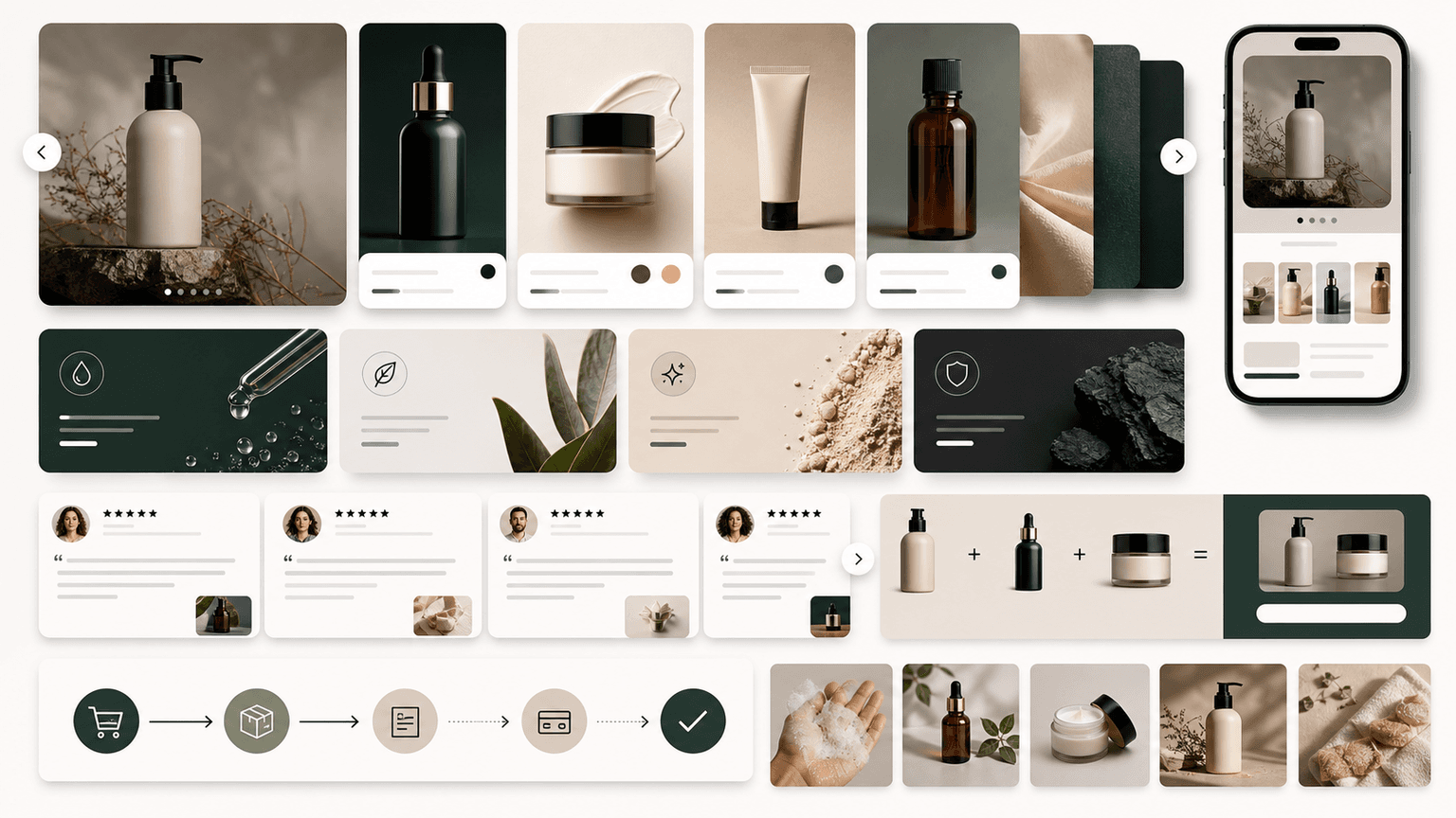
Template 1: The product showcase carousel
This is the workhorse template for any e-commerce brand. It puts your product front and center with a structure that educates and converts.
- 1
Slide 1: Hook with outcome, not product name
Lead with what the product does for the buyer, not what it is called. Instead of 'Introducing the Alpine Backpack,' try 'The only daypack that fits a full workday and a gym session without looking like a hiking bag.' Make the reader see themselves benefiting.
- 2
Slides 2-3: Product hero shots in context
Show the product being used in real life, not on a white background. A skincare product should be on a bathroom shelf. A jacket should be on a person in the weather it is designed for. Context helps the buyer mentally place the product in their own life.
- 3
Slides 4-6: Feature-to-benefit breakdown
Each slide covers one feature paired with the benefit it creates. Not 'waterproof zippers' but 'waterproof zippers so your laptop survives a surprise downpour.' Every feature should answer the reader's unspoken question: why should I care?
- 4
Slide 7: Social proof
One compelling customer quote or a stat like '2,400 five-star reviews.' This slide exists to neutralize the doubt that creeps in after multiple feature slides.
- 5
Slides 8-9: Objection handler and CTA
Address the most common reason people hesitate (price, sizing, durability) and then deliver a clear CTA: shop now via link in bio, use code X for a discount, or DM for a personalized recommendation.
Callout
When to use this template
Use the product showcase for hero products, new arrivals, and any product you want to push volume on. Aim for one showcase carousel per key product per month, rotating in fresh angles and updated social proof.
Chapter 3
Template 2: The shoppable lookbook carousel
Lookbook carousels work for any brand where visual styling matters: fashion, home decor, beauty, food, accessories. The format presents multiple products together in a curated, aspirational context that makes the viewer want the entire aesthetic rather than a single item.
The key difference between a lookbook that drives sales and one that just looks pretty is specificity. Every slide should make it easy for the viewer to identify and purchase what they see. That means naming products, noting prices where appropriate, and making the shopping path frictionless.
Structure a lookbook carousel around a theme: a seasonal collection, a color palette, a lifestyle moment like a weekend trip or a dinner party setup. The theme gives the carousel narrative cohesion and helps the viewer imagine themselves in the scene.
- 1
Slide 1: Theme hook
Set the scene with a lifestyle image and a short line that establishes the theme. 'Everything you need for a long weekend that fits in a carry-on' or 'The capsule wardrobe edit for actually hot weather.'
- 2
Slides 2-7: Styled product scenes
Each slide features one or two products styled in context. Include small text overlays with product names and prices. The imagery should feel editorial, not catalog. Shoot in natural light with real environments whenever possible.
- 3
Slides 8-9: Full look summary and shop CTA
The second-to-last slide shows all featured products in a flat-lay or grid format with names and prices. The final slide has a clear CTA to shop the collection via a specific link or landing page.
Build from this playbook
Generate e-commerce carousels that convert, not just engage
AttentionClaw creates brand-consistent Instagram carousels and TikTok slideshows from your product details. Define your style once, generate unlimited sales-driving content.
Chapter 4
Template 3: The bundle builder carousel
Bundle carousels increase average order value by showing customers how your products work together. Instead of selling one item, you are selling a system, a routine, or a complete solution. This works across nearly every e-commerce vertical.
The psychology behind bundles is powerful. When a customer sees four products that solve a problem together, buying just one feels incomplete. The carousel format is perfect for this because each swipe reveals another piece of the puzzle, building the case for the complete set.
Structure the carousel around the problem the bundle solves, not around the products themselves. A skincare brand does not sell a cleanser, toner, serum, and moisturizer. It sells a complete morning routine that takes five minutes and gives you visibly clearer skin in two weeks.
- 1
Slide 1: Problem or goal hook
Start with the outcome the bundle delivers: 'The complete home office setup for under $200' or 'Your entire morning skincare routine in 4 products.' Frame it as a solution, not a shopping list.
- 2
Slides 2-5: Individual product reveals
Each slide introduces one product in the bundle with its role in the system. Explain why this specific product and how it connects to the others. Each slide should make the bundle feel more complete and more essential.
- 3
Slide 6: The bundle together
Show all products together in one styled shot. Include the individual price total versus the bundle price to highlight savings. The visual of everything together triggers the completionist instinct.
- 4
Slides 7-8: Social proof and CTA
Feature a customer review specifically about the bundle experience, then close with bundle pricing, savings amount, and a direct purchase CTA.
Callout
Boosting average order value
Brands that run bundle carousels weekly consistently report meaningfully higher average order values compared to single-product posts. The carousel format naturally builds the case for buying more.
Chapter 5
Template 4: The before-and-after transformation carousel
Nothing sells a product like visible proof that it works. Before-and-after carousels are the highest-converting format for any product with a tangible result: skincare, fitness equipment, cleaning products, organization tools, home improvement, and supplements.
The carousel format is superior to a single before-after image because you can control the narrative between the two states. Instead of a jarring jump from problem to solution, you walk the viewer through the process, building credibility at each step.
Authenticity is critical here. Overly polished before-after content triggers skepticism. Use real lighting, real customers, and real timeframes. A genuine transformation with imperfect photography outperforms a staged one every time.
- 1
Slide 1: Result hook
Lead with the after state and the timeframe: '14 days with this serum. Same lighting, same camera, no filter.' The specificity builds immediate trust.
- 2
Slide 2: The before state
Show the starting point with honest, unflattering detail. The worse the before looks, the more compelling the transformation. Include context about what was tried previously and why it did not work.
- 3
Slides 3-5: The process
Walk through how the product was used: frequency, application method, complementary steps. This is where you educate and address the implicit question of whether the buyer could achieve the same result.
- 4
Slides 6-7: The after reveal
Show the result with the same conditions as the before shot. Include a side-by-side comparison on one slide. Let the visual evidence speak for itself with minimal text.
- 5
Slide 8: CTA with incentive
Close with a purchase CTA and a reason to act now: a discount code, a bundle offer, or a guarantee that reduces risk.
Chapter 6
Template 5: The educational selling carousel
Educational carousels that sell are not thinly disguised ads. They are genuinely useful content where your product naturally appears as part of the solution. This format works because it gives the reader real value before asking for anything, which builds trust and positions your brand as an authority.
The structure follows a teach-then-recommend pattern. You spend 70 percent of the carousel delivering actionable advice on a topic your audience cares about. In the final 30 percent, your product appears as a tool that makes the advice easier to implement. The recommendation feels earned because the education was real.
Pick topics where your product has a genuine advantage. If you sell meal prep containers, teach a carousel on weekly meal prep for busy parents. If you sell workout bands, teach a full-body routine that uses them. The product integration should feel obvious and helpful, not forced.
- 1
Slide 1: Educational hook
Lead with the lesson, not the product: '5 meal prep mistakes that are costing you an extra hour every Sunday' or 'The stretching routine physical therapists actually recommend.' Make it clear this carousel will teach something useful.
- 2
Slides 2-7: Genuine education
Deliver real, actionable advice. Each slide should be valuable on its own. If someone followed your tips without buying your product, they should still get a good result. This is what makes the format trustworthy.
- 3
Slides 8-9: Natural product integration
Introduce your product as the tool that makes the process easier, faster, or more effective. Show it in use within the context of the advice you just gave. Include a specific benefit and a CTA.
Callout
The trust equation
Educational carousels have lower direct conversion rates per post but dramatically higher long-term customer value. People who buy after learning from you have higher trust, lower return rates, and stronger brand loyalty.
Chapter 7
How to choose the right template for each product and goal
Not every product works with every template. The right format depends on your product type, your current marketing goal, and where your audience is in the buying journey. Using the wrong template is the main reason e-commerce carousels underperform.
Map your products to templates based on what makes them compelling. Products with strong visual results belong in before-after carousels. Products that work as part of a system belong in bundle carousels. Products in competitive categories belong in comparison carousels. Products that require education belong in the educational selling format.
Your weekly content mix should include at least two different carousel templates. Running the same format every day causes pattern fatigue and your audience starts scrolling past without swiping. Variety in format keeps each carousel feeling fresh even when the subject matter is your product catalog.
New arrivals and hero products: product showcase template
Fashion, decor, and lifestyle brands: shoppable lookbook template
Products with complementary items: bundle builder template
Products with visible results: before-and-after template
Products requiring education: educational selling template
Competitive market positioning: comparison carousel template
Mix at least two different templates per week to avoid pattern fatigue
Chapter 8
Design principles that separate selling carousels from generic ones
E-commerce carousels have specific design requirements that differ from creator or personal brand carousels. The product needs to be the visual hero, not the typography or the background design. Every layout decision should make the product more appealing and the buying decision easier.
Use consistent product photography across all carousel slides. This means the same lighting setup, the same color temperature, and the same shooting angles. Inconsistent imagery makes products look cheap, even when they are premium. If you are using lifestyle shots, maintain the same aesthetic tone throughout the carousel.
Text overlays should enhance, not compete with, product imagery. Use a clean, readable font at a size that works on mobile without squinting. Position text so it does not obscure product details. Price and CTA text should be visually distinct from educational or descriptive text.
Product should be the visual hero of every slide, not the design or typography
Maintain consistent photography style: same lighting, angles, and color grading
Use text overlays that enhance rather than compete with product imagery
Price and CTA elements should be visually distinct and easy to spot
Design for mobile viewing: test every slide at phone screen size before publishing
Keep slide transitions visually smooth so swiping feels natural, not jarring
Chapter 9
Building a repeatable carousel production workflow for your store
Consistency is what separates e-commerce brands that grow on Instagram from those that stall. Publishing one great carousel is easy. Publishing three to five high-quality, sales-driving carousels every week for months requires a production system.
Start by creating a template library with 5-6 carousel formats you will rotate through. Each template should have predefined slide layouts, copy frameworks, and image requirements. When you sit down to produce a carousel, you are filling in a structure, not inventing one from scratch.
Batch your production by grouping similar tasks. Shoot all product photography in one session. Write all carousel copy in another. Assemble all carousels in a third. This assembly-line approach is substantially faster than creating each carousel individually from start to finish.
- 1
Build your template library
Create 5-6 carousel templates covering your most common use cases. Document the slide structure, copy framework, and image requirements for each. Store these in a shared doc or tool so anyone on your team can use them.
- 2
Schedule photography sessions
Shoot product and lifestyle imagery in batches. One three-hour session can produce enough images for two to four weeks of carousels. Plan shots around upcoming carousel themes and seasonal campaigns.
- 3
Batch copy and assembly
Write all carousel copy for the week in one focused session. Then assemble the carousels using your templates and pre-shot imagery. With tools like AttentionClaw, you can generate carousel designs from your copy and brand style, cutting assembly time from hours to minutes.
- 4
Review and schedule
Review each carousel from the buyer's perspective: does the hook stop a scroll, does the middle deliver value, and does the CTA make the next step obvious? Schedule the entire week's carousels in one sitting.
Chapter 10
Measuring which carousel templates actually drive revenue
Engagement metrics like likes and saves are useful signals, but for e-commerce brands, the only metric that ultimately matters is whether a carousel contributes to revenue. Setting up proper tracking is essential for knowing which templates to invest in and which to retire.
Use UTM parameters on every link associated with a carousel post. Tag each link with the carousel template type, the product featured, and the date. This lets you track in Google Analytics or your e-commerce platform exactly how much revenue each carousel template generates over time.
Run each template type for at least four weeks with consistent posting frequency before drawing conclusions. A single carousel is not a reliable data point. You need volume to account for variations in timing, audience mood, and algorithmic distribution. After four weeks, compare revenue per carousel across template types and double down on the top performers.
Tag every carousel-related link with UTM parameters for template type and product
Track revenue per carousel template type over 30-day rolling windows
Compare conversion rates across templates to identify your highest-performing formats
Monitor which templates drive the highest average order value, not just total sales
Retire templates that consistently underperform and test new variations quarterly
Next step
Turn this guide into a production-ready carousel.
AttentionClaw creates brand-consistent Instagram carousels and TikTok slideshows from your product details. Define your style once, generate unlimited sales-driving content.
Keep the workflow inside AttentionClaw.
Common Questions
FAQ
More Reading
Keep reading
8-chapter read
Toy Store Gift Guide Instagram Carousels
Toy store gift guide carousels should group products by age, interest, budget, and safety notes while keeping reviews, inventory, and product claims accurate.
8-chapter read
Carousel Slide Order That Converts: Hook, Proof, Offer, CTA
A converting carousel usually follows a clear order: hook, context, problem, solution or product, proof, objection handling, offer, and CTA. The exact slide count can change, but the reader should never wonder why the next slide exists.
7-chapter read
Ecommerce Carousel Ad Creative Testing Framework
Ecommerce carousel ad testing should isolate one variable at a time: hook, proof order, product angle, offer, or CTA. Start with three hook variants using the same middle slides, then test proof and offer only after a clear signal appears.

AI-Generated Product Infographic Checklist
AI-generated product infographics should start with product truth and source-backed claims. Use a checklist for SKU accuracy, variant logic, evidence, chart integrity, readability, citations, and destination-page match before publishing.

Product Launch Carousel Strategy: Build Hype and Drive Sales on Instagram
Most product launches fail on Instagram because brands treat them as a single post instead of a multi-phase campaign. A structured carousel strategy across pre-launch, launch day, and post-launch phases turns a one-day event into weeks of sustained sales momentum.
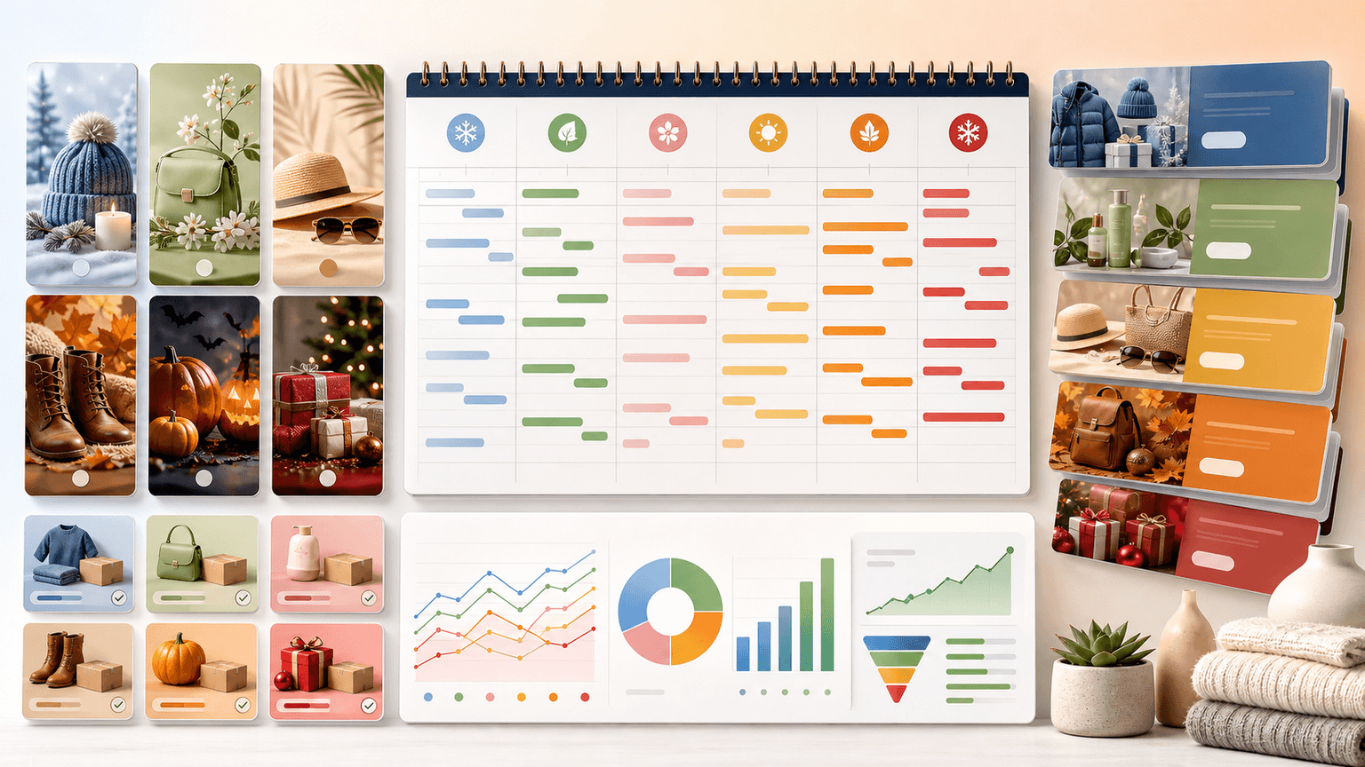
Seasonal Carousel Campaigns for E-Commerce: A Year-Round Playbook
E-commerce brands that plan seasonal carousel campaigns in advance outsell reactive competitors by a wide margin. This playbook covers every major selling season with specific carousel formats, timelines, and content strategies that drive revenue year-round.

Product Comparison Carousels: Help Shoppers Choose (And Choose You)
Comparison carousels are some of the highest-converting content in e-commerce because they meet shoppers at the exact moment they are deciding between options. Done right, they make your product the obvious choice without feeling like a biased sales pitch.

E-Commerce Instagram Content Pillars: The 5-Pillar Framework That Sells
Most e-commerce Instagram accounts either post too much product content and bore their audience, or too much lifestyle content and fail to sell. The five-pillar framework creates a balanced content mix that consistently educates, entertains, builds trust, and drives purchases.

Product Education Carousel Frameworks for Shopify Stores
Product education carousels work when they translate product-page facts into buyer decisions. Use a framework for each job: explain the problem, compare variants, teach use, prove quality, or build a bundle. The goal is not more slides; it is fewer unanswered buying questions.

Carousel Design Principles: The Visual Rules That Get More Swipes
Great carousel design is not about being a graphic designer. It is about following a set of visual rules that make your content readable, recognizable, and swipeable. This guide breaks down each rule with concrete specifications you can apply immediately.
Written by
AttentionClaw
Editorial Team
Editorial context
Part of the Carousel Creation topic cluster. Last updated June 22, 2026.