Chapter 1
The short answer: turn each benefit into a buyer decision
To turn product benefits into social posts, do not simply list the same benefits in different designs. Map each benefit to a buyer decision: why it matters, when it applies, how to use it, how it compares, what proof supports it, what objection it answers, and what action the viewer should take.
This approach works for ecommerce products, apps, SaaS features, courses, and service offers because benefits become content only when they answer real questions. A product page might say 'lightweight,' but the social post should show what lightweight changes for travel, storage, comfort, shipping, setup, or daily use.
Use official product and campaign sources as anchors. Shopify product media guidance reinforces that buyers need accurate product representation. Google campaign tagging guidance helps teams measure which benefit angles drive clicks or conversions instead of treating all posts as equal.
Start with one product or feature.
List 5 to 10 real benefits.
Attach one buyer question to each benefit.
Attach one proof point or visual example.
Choose one CTA based on funnel stage.
Schedule the week so the story builds instead of repeats.
Chapter 2
Translate features into buyer-visible benefits
Most product teams start with feature language because that is how the product is built. Buyers usually respond to use-case language because that is how the product enters their life. The first step is to translate features into practical benefits without exaggerating.
For example, 'double-walled stainless steel' becomes 'keeps a drink cold during a commute.' 'Bulk export' becomes 'turns a batch of finished assets into scheduled posts faster.' 'Custom product pages' becomes 'send launch traffic to a more relevant App Store page.'
The translation should be specific enough to create visuals. If the benefit cannot be shown, compared, demonstrated, or explained, it may be too vague.
- 1
Write the feature
Name the product detail plainly: material, ingredient, workflow, size, screen, integration, service step, or bundle component.
- 2
Write the buyer job
Explain what the detail helps the buyer do, avoid, choose, save, understand, or feel more confident about.
- 3
Write the proof
Attach a product spec, visual demonstration, review, tutorial, comparison, or approved internal fact.
- 4
Write the visual
Decide how the post will show the benefit: product photo, screenshot, side-by-side, checklist, routine, process, or result boundary.
Chapter 3
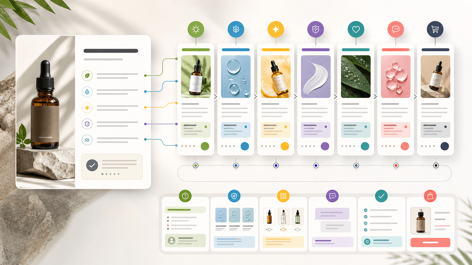
The seven-post benefit calendar
A week of benefit-led content should move from awareness to action. Start with the clearest problem, then teach, demonstrate, prove, compare, answer objections, and end with a direct CTA. This keeps the product visible without making every post sound like the same ad.
The sequence below works as a carousel calendar, TikTok slideshow plan, LinkedIn document post plan, or mixed-format content week.
- 1
Day 1: problem and promise
Introduce the buyer problem and the primary benefit. Hook example: 'If [problem] keeps happening, check this product detail first.'
- 2
Day 2: how it works
Explain the mechanism behind the benefit. Use diagrams, screenshots, ingredient context, or a simple process breakdown.
- 3
Day 3: use-case demo
Show the benefit in a real situation: routine, setup, packing, onboarding, styling, preparation, or workflow.
- 4
Day 4: proof and trust
Use reviews, specifications, testing notes, customer examples, or documented product facts. Keep claims within evidence.
- 5
Day 5: comparison
Compare variants, old workflow versus new workflow, product A versus product B, or buyer type A versus buyer type B.
- 6
Day 6: objection handling
Answer a hesitation: price, fit, setup, maintenance, compatibility, shipping, learning curve, or whether the product is overkill.
- 7
Day 7: decision CTA
Summarize who should choose the product and send the viewer to the product page, app page, waitlist, template, or demo.
Build from this playbook
Turn product benefits into a full week of social assets
AttentionClaw helps you convert product facts, buyer questions, and proof points into carousels, slideshows, captions, and CTA variations.
Chapter 4
Example: one ecommerce product benefit list
Imagine a skincare brand has a moisturizer with three benefits: lightweight texture, barrier-supporting ingredients, and works under makeup. A weak week of posts repeats those three benefits in different designs. A strong week turns them into different buyer decisions.
Day 1 introduces the problem of moisturizers that feel heavy. Day 2 explains texture and layering. Day 3 shows the morning routine. Day 4 uses product facts or customer language. Day 5 compares dry skin and oily skin use cases. Day 6 handles the objection that lightweight means not hydrating enough. Day 7 points to the product page or routine bundle.
The product stays the center of the week, but each post has a distinct reason to exist.
Hook: 'If moisturizer feels heavy by noon, check the texture before the ingredients list.'
Demo: 'The pea-sized amount that covers the face without pilling.'
Proof: 'What barrier-supporting means on this product page.'
Comparison: 'Choose this routine if you wear makeup; choose this one if you do not.'
Objection: 'Lightweight does not have to mean not moisturizing.'
Chapter 5
Example: one app feature benefit list
For an app, a feature benefit list often starts with internal language: AI export, saved templates, custom campaign links, team review, or scheduled publishing. The social week should translate those features into the first successful action the user wants.
For example, a social content app might turn 'saved templates' into a week about avoiding blank-page production. Day 1 names the pain. Day 2 shows the template library. Day 3 demos turning a product page into a carousel. Day 4 shows a finished output. Day 5 compares manual creation with template-assisted creation. Day 6 answers whether templates create repetitive content. Day 7 invites the viewer to try a specific workflow.
This is stronger than posting seven feature screenshots because the viewer understands the benefit in their own workflow.
- 1
Start from user success
Do not start with the settings screen. Start with the action the user wants to finish.
- 2
Show screens in sequence
Use screenshots only when they explain the workflow. Avoid tiny UI details that cannot be read.
- 3
Connect to activation
End the week with a CTA tied to the first useful action, not a vague 'download now.'
Chapter 6
Map CTAs to the week's buyer stage
The CTA should change as the week progresses. Early posts can ask viewers to save, compare, or learn. Later posts can ask for a click, checkout, trial, demo, or waitlist action.
If every post uses a hard conversion CTA, the week feels repetitive. If no post asks for action, the week may build attention without business value. A balanced benefit week uses soft, medium, and direct CTAs.
Day 1 CTA: save this before you compare options.
Day 2 CTA: comment with the product detail you want explained.
Day 3 CTA: view the routine or setup guide.
Day 4 CTA: read the product details or proof page.
Day 5 CTA: choose the right variant.
Day 6 CTA: ask a question or view FAQ.
Day 7 CTA: shop, download, join, book, or try.
Chapter 7
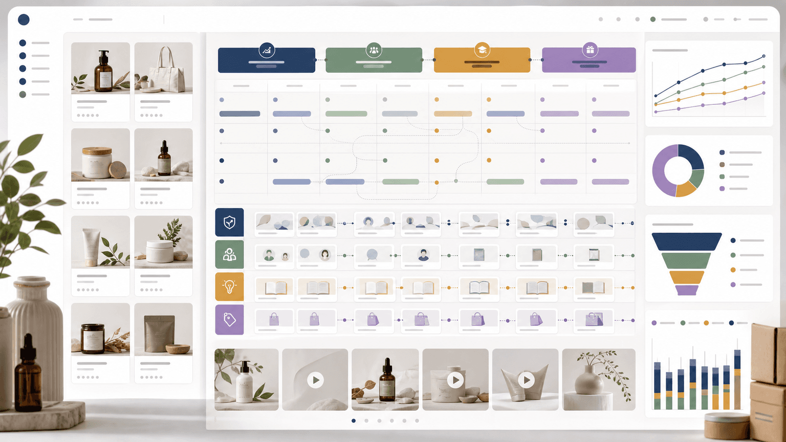
Measure benefit angles separately
Benefit-led content becomes more valuable when the team learns which benefits move behavior. Track each post by benefit, hook family, format, CTA, and destination page. Google campaign URL parameters can help distinguish traffic from different benefit angles when posts link out.
The retrospective should ask: which benefits drove saves, comments, clicks, purchases, trials, or replies? Which benefits were interesting but did not move action? Which objections created the best comments? Use those answers to plan the next week.
- 1
Name the benefit
Use a stable label such as lightweight-texture, faster-export, routine-bundle, or team-review.
- 2
Name the hook family
Track problem, tutorial, comparison, proof, objection, or decision CTA.
- 3
Review by buyer question
Compare performance based on the question answered, not only the platform or post design.
Chapter 8
Use AttentionClaw to turn benefits into assets faster
AttentionClaw fits once the benefit map is clear. Feed the product, benefit, buyer question, proof point, visual angle, and CTA into the workflow, then generate carousel and slideshow variations for the week.
The key is to keep the product facts visible. AI-assisted production should make the week faster to execute, not replace the work of deciding what the buyer actually needs to understand.
Callout
One benefit can create several posts only when each post answers a different question
If the post does not add a new decision point, proof point, objection answer, or use case, it is probably a duplicate.
Next step
Turn this guide into a production-ready carousel.
AttentionClaw helps you convert product facts, buyer questions, and proof points into carousels, slideshows, captions, and CTA variations.
Keep the workflow inside AttentionClaw.
Common Questions
FAQ
More Reading
Keep reading
7-chapter read
How to Turn a Product Detail Page Into Social Content
A product detail page can become a full social campaign when you extract buyer questions, benefits, proof, variants, objections, reviews, and offers. The goal is not to copy the page into posts; it is to turn each product-page section into one useful social asset.

TikTok Slideshow Ideas for Shopify Products
Shopify product slideshows work best when each post answers one buying question: what the product solves, which variant to choose, how it is used, why the bundle exists, what proof supports it, or what offer is available now.

How to Turn One Good Idea Into 7 Different Instagram Carousels
You do not need 30 unique ideas to post every day. You need one strong idea and a system that turns it into 7 carousels with different angles, formats, and depths.
30-Day Social Content System for Shopify and DTC Brands
A 30-day Shopify social content system should turn products, objections, proof, education, and offers into a repeatable calendar. Plan four weekly arcs, batch creative by content job, repurpose each product angle across Instagram carousels and TikTok slideshows, then measure buyer actions instead of only engagement.

Product Comparison Carousels: Help Shoppers Choose (And Choose You)
Comparison carousels are some of the highest-converting content in e-commerce because they meet shoppers at the exact moment they are deciding between options. Done right, they make your product the obvious choice without feeling like a biased sales pitch.

E-Commerce Instagram Content Pillars: The 5-Pillar Framework That Sells
Most e-commerce Instagram accounts either post too much product content and bore their audience, or too much lifestyle content and fail to sell. The five-pillar framework creates a balanced content mix that consistently educates, entertains, builds trust, and drives purchases.

Product Education Carousel Frameworks for Shopify Stores
Product education carousels work when they translate product-page facts into buyer decisions. Use a framework for each job: explain the problem, compare variants, teach use, prove quality, or build a bundle. The goal is not more slides; it is fewer unanswered buying questions.

Carousel Copywriting Masterclass: Write Slides That People Actually Read
The difference between a carousel people swipe through and one they screenshot is the writing. Not the design, not the topic — the copy on each slide. This masterclass covers the word-level techniques that separate forgettable slides from shareable ones.
Sources
- Product media — Shopify Help Center
- Campaign URL Builder — Google Analytics Help
- Creating helpful, reliable, people-first content — Google Search Central
Written by
AttentionClaw
Editorial Team
Editorial context
Part of the Content Planning topic cluster. Last updated June 22, 2026.