
Chapter 1
Why comparison carousels have the highest purchase intent of any format
When someone searches for or engages with comparison content, they have already decided to buy. They are not browsing. They are not saving ideas for later. They are actively choosing between options, and they are looking for information that helps them decide. This is the most valuable audience state in all of e-commerce marketing.
Comparison carousels meet this audience at the perfect moment. They transform a scattered research process where shoppers bounce between product pages, reviews, and competitor sites into a single, swipeable experience where you control the framing. You decide which features to compare, how to present the data, and what conclusion feels natural.
The data supports this. E-commerce brands that publish comparison carousels regularly report that these posts tend to generate significantly more link clicks than standard product showcases. The save rate is also significantly higher because shoppers bookmark comparison content to reference before purchasing.
Comparison content targets shoppers who have already decided to buy something in the category
You control which features are compared and how the data is framed
Comparison carousels tend to generate more link clicks than standard product posts because they reach shoppers already in buying mode
High save rates indicate shoppers bookmarking the content for purchase decisions
The format builds trust by appearing helpful and transparent rather than purely promotional
Chapter 2
Five comparison carousel formats and when to use each one
Not all comparisons serve the same purpose. Choose the format that matches your competitive position and the decision your customer is making.
- 1
Your product vs. a specific competitor
Direct head-to-head comparison on features, price, quality, and customer satisfaction. Use this when you have a clear advantage on dimensions your audience cares about. Be honest about areas where the competitor is comparable to maintain credibility.
- 2
Your product vs. the category average
Compare your product against industry benchmarks or typical alternatives without naming specific brands. This is safer legally and works well when your advantage is broad quality, better ingredients, or superior design rather than beating one competitor on specs.
- 3
Your tiers vs. each other
Compare your own product tiers, sizes, or variations. This helps customers choose within your product line and increases average order value by showing the premium option as the best value. Common for subscription plans, product bundles, and size variations.
- 4
Old way vs. new way
Compare the traditional solution to a problem with your product as the modern alternative. A meal kit brand might compare grocery store meal planning versus their service. This format is effective when your product represents a category shift rather than a incremental improvement.
- 5
Curated category roundup
Compare multiple options in a category and include your product as one of the picks. This feels the most objective and editorial. It works when your product excels in a specific niche within a broader category: the best option for beginners, the best value, or the best for a specific use case.
Chapter 3
How to structure comparisons that feel fair, not biased
The biggest risk with comparison carousels is coming across as a biased sales pitch. If every slide makes your product look perfect and the alternatives look terrible, readers will question your credibility and dismiss the comparison. The counterintuitive truth is that acknowledging areas where your product is not the best actually increases conversion rates.
Start by choosing comparison criteria that your audience genuinely cares about, not just the metrics where you win. If shoppers in your category prioritize price, durability, and ease of use, compare on all three even if you lose on price. Being honest about your price point while winning on durability and ease of use is more persuasive than cherry-picking only the categories you dominate.
Use objective data wherever possible: measurements, ratings, test results, and customer satisfaction scores. Subjective claims like 'better quality' without evidence feel hollow. Specific claims like 'lasted 3x longer in independent wear testing' feel authoritative and trustworthy.
Compare on criteria your audience cares about, not just metrics where you win
Acknowledge one or two areas where alternatives are comparable or stronger
Use objective data, measurements, and third-party test results over subjective claims
Let the reader draw the conclusion rather than explicitly stating your product is best
Include real customer quotes that reinforce your advantages organically
Avoid disparaging competitors by name in a way that feels petty or aggressive
Callout
The honesty advantage
A comparison that says 'Product X is cheaper, but here is why our customers pay more and do not regret it' is infinitely more persuasive than one that pretends you win on every dimension. Readers respect honesty and reward it with purchases.
Build from this playbook
Create comparison carousels that win the sale
AttentionClaw generates brand-consistent Instagram carousels and TikTok slideshows from your product data. Turn competitive advantages into polished, publish-ready comparison content.
Chapter 4
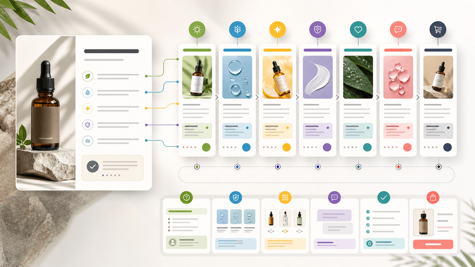
Slide-by-slide structure for a high-converting comparison carousel
The slide sequence of a comparison carousel matters as much as the content itself. The order in which you present information shapes how the reader processes the comparison and what conclusion they reach by the final slide.
- 1
Slide 1: The comparison hook
Frame the comparison as a question your reader is already asking: 'Which standing desk is actually worth your money?' or 'We compared our serum to the three most popular alternatives. Here is what we found.' The hook should feel like the answer to a question they Googled last night.
- 2
Slide 2: The comparison framework
Introduce the criteria you will compare on and why these criteria matter. This slide establishes your authority and ensures the reader evaluates the comparison through the lens you have chosen. Example: 'We tested on three things that actually matter: how long the battery lasts in real use, not lab conditions.'
- 3
Slides 3-7: Feature-by-feature comparison
Dedicate one slide to each comparison criterion. Use a consistent visual format: the criterion at the top, each option side by side, and a brief note on why this criterion matters. Alternate between criteria you win on and criteria where results are close to maintain credibility.
- 4
Slide 8: The summary view
Present all criteria in a single comparison table or checklist. This is the slide that gets screenshotted and shared. Keep it clean, factual, and easy to scan at a glance.
- 5
Slides 9-10: Social proof and CTA
Include a customer quote that reinforces the comparison results, then close with a CTA that makes it easy to choose: 'See why 10,000+ customers switched' or 'Try it risk-free for 30 days.' Include a direct link or instructions to purchase.
Chapter 5
Using tier comparison carousels to increase average order value
Tier comparisons, where you compare your own product variations against each other, are one of the most underused carousel formats in e-commerce. Most brands present their product tiers on a website pricing page and nowhere else. Bringing this information into a carousel format makes it shareable, saveable, and visible to people who might never visit your pricing page.
The psychology of tier comparisons works in your favor. When people see three options, most gravitate toward the middle option. This is the compromise effect, and smart pricing has exploited it for decades. In a carousel, you can present your tiers so that the middle option, typically your highest-margin tier, looks like the obvious best value.
Structure the carousel to make the comparison easy and the best-value tier visually prominent. Use slightly larger text, a highlighted border, or a 'most popular' badge on the tier you want to push. The other tiers exist to make this one look good.
- 1
Slide 1: Frame the decision
Hook with the choice the reader faces: 'Which plan is right for you?' or 'Small, Medium, or Large: here is how to pick the right size.' Make the carousel feel like a personalized recommendation.
- 2
Slides 2-4: Individual tier deep dives
Dedicate one slide to each tier. Describe who it is best for, what is included, and the price. Frame each tier around a customer persona: the casual user, the serious user, and the power user.
- 3
Slide 5: Side-by-side comparison
Show all tiers in a single comparison view with the features that differ between them highlighted. Use visual indicators like checkmarks and dashes to make scanning easy.
- 4
Slides 6-7: Best value highlight and CTA
Explicitly call out the best value tier with a 'most popular' or 'best value' label. Include a brief testimonial from a customer who upgraded from the lower tier. Close with a purchase CTA for each tier.
Callout
The decoy tier
If your margins allow it, create a premium tier that is deliberately expensive to make your mid-tier look like an incredible deal by comparison. The premium tier does not need to sell many units. Its job is to make the middle option irresistible.
Chapter 6
The ethics and legality of competitor comparison carousels
Comparison carousels that mention competitors by name operate in a space where marketing, ethics, and law intersect. Getting this wrong can damage your brand reputation, trigger legal action, or simply make you look petty. Here are the guardrails to stay within.
First, every claim must be true and verifiable. If you say your product lasts longer, you need test data. If you say customers prefer yours, you need a survey or review comparison. Unverifiable claims are not just unethical; they expose you to legal risk in many jurisdictions. Comparative advertising laws vary by country, but truth is universally the strongest defense.
Second, the tone matters as much as the facts. Comparisons that feel informative and helpful build your brand. Comparisons that feel snarky or dismissive toward competitors make you look insecure. The best comparison carousels barely feel like competition. They feel like a helpful friend walking you through a purchasing decision.
Every comparative claim must be truthful, accurate, and backed by verifiable data
Avoid disparaging competitors, focus on factual differences rather than subjective judgments
Use objective metrics like test results, ratings, and specifications over opinion-based claims
Consider using 'Brand A' and 'Brand B' naming if direct naming feels aggressive
Consult your platform's advertising guidelines for rules on comparative content
When in doubt, compare against the category average rather than specific brands
Chapter 7
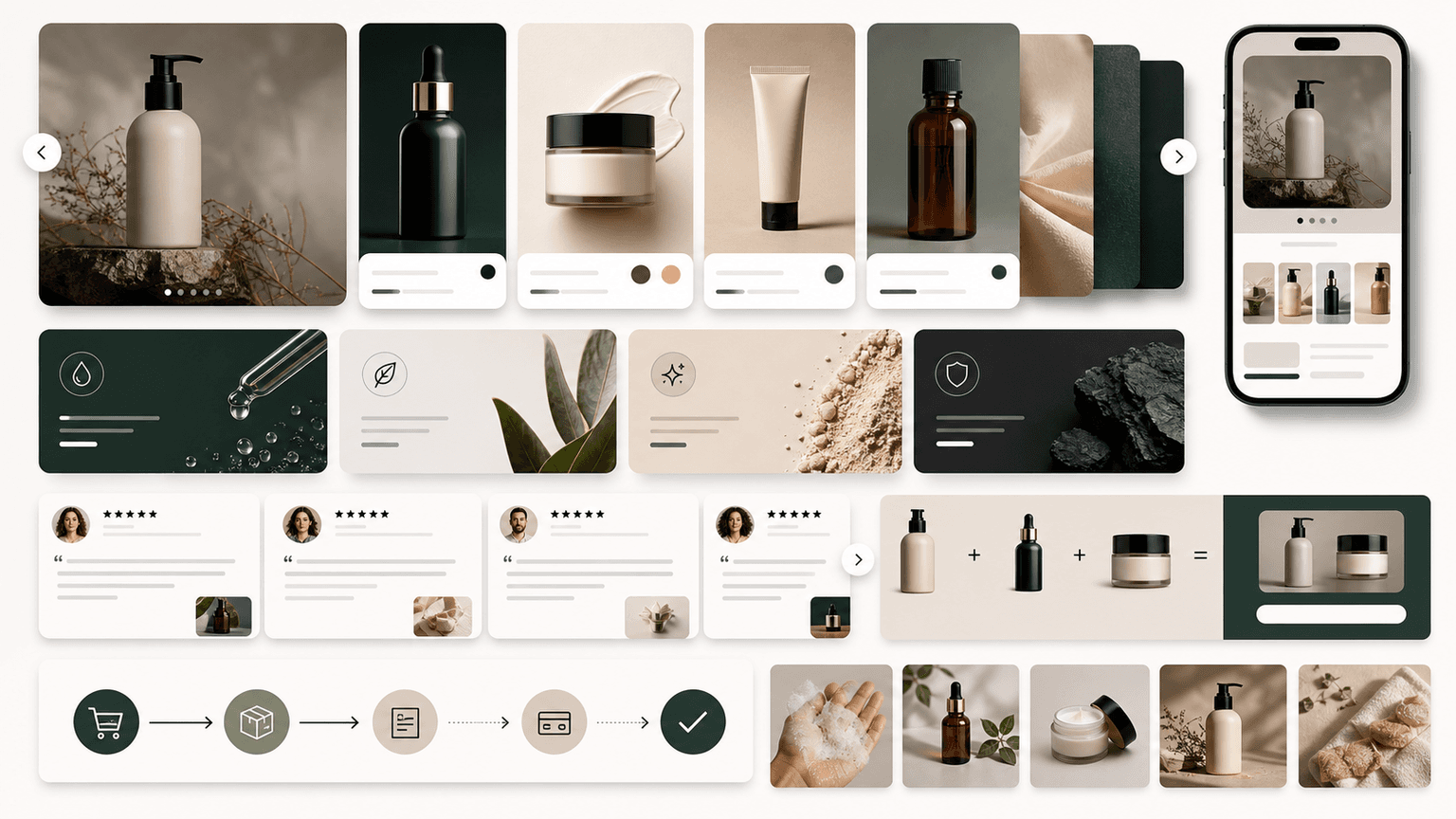
Designing comparison carousels for maximum clarity and impact
Comparison carousels live or die on visual clarity. If a reader cannot instantly understand which product wins on each criterion, the carousel fails regardless of how strong your data is. The design should make the comparison effortless to process, even when swiping quickly on a phone.
Use a consistent two-column or three-column layout across all comparison slides. Your product should always appear in the same position, ideally on the left or at the top, so the reader's eye knows exactly where to look. Color-code the columns so each product is instantly identifiable across slides.
For the summary slide, a table or checklist format works best. Use green checkmarks for advantages, red X marks or dashes for gaps, and a neutral icon for ties. Keep the font large enough to read on a small screen. This summary slide is the most shared and saved slide in any comparison carousel, so invest extra design effort here.
Use a consistent column layout with your product in the same position on every slide
Color-code each product or option for instant visual identification across slides
Use clear visual indicators: checkmarks for wins, dashes for gaps, equals signs for ties
Design the summary slide for maximum screenshot-ability with large, readable text
Test every slide on a phone screen to ensure readability at mobile size
Keep visual hierarchy clear: the winning product should draw the eye without being overbearing
Chapter 8
Where to find reliable comparison data for your carousels
The credibility of a comparison carousel depends entirely on the quality of the data behind it. Vague claims weaken the comparison. Specific, verifiable data strengthens it. Building a reliable data sourcing habit will make every comparison carousel you create more persuasive.
Start with your own product data. Run internal tests on durability, performance, and quality metrics that matter to your customers. Document the methodology so you can reference it if challenged. First-party testing data is the strongest source because you control the conditions and can speak to the methodology.
Supplement with third-party sources: industry reports, customer review aggregation, independent testing organizations, and published benchmarks. Attribute your sources on the comparison slides, even briefly. A line that says 'Based on Consumer Reports testing' or 'Average of 1,200+ verified reviews' adds significant credibility.
- 1
Internal product testing
Test your product and competing products on the criteria your customers care about. Document everything: methodology, sample sizes, conditions, and results. This is the most credible data because you can explain exactly how the test was conducted.
- 2
Customer review analysis
Aggregate star ratings and common themes from review platforms like Amazon, Trustpilot, and Google. Compare your average rating, review volume, and most-mentioned positives against competitors. This is publicly verifiable data that viewers can check themselves.
- 3
Third-party reports and benchmarks
Reference industry reports, independent testing organizations, and published benchmarks. Cite the source on the slide. Even if the data is not specifically about your product, industry benchmarks provide context that strengthens your positioning.
- 4
Customer survey data
Survey your own customers about their experience with your product compared to alternatives they have used. Questions like 'Which product did you use before ours?' and 'How does ours compare?' generate powerful first-party comparison data.
Chapter 9
Getting your comparison carousels in front of the right audience
Comparison carousels have a unique distribution advantage: people actively search for comparison content. Optimizing your comparison carousels for discovery means they can attract new audiences who are deep in the buying process and ready to convert.
Write your carousel caption with search-intent keywords. Include the exact phrases shoppers type when researching: 'Product X vs Product Y,' 'best product for specific use case,' and 'product category comparison 2026.' Instagram search is becoming increasingly capable, and keyword-rich captions improve discoverability.
Pin your best comparison carousel to the top of your grid. This is prime real estate for high-intent visitors. When someone lands on your profile from an ad, a tagged post, or a search result, the pinned comparison carousel immediately addresses their decision-making process and guides them toward a purchase.
Optimize carousel captions with search-intent keywords shoppers actually use
Pin your strongest comparison carousel to the top of your Instagram grid
Share comparison carousels to Stories with polls asking which option viewers prefer
Promote comparison carousels with paid ads targeting competitor brand interests
Repurpose comparison data into Reels for additional distribution
Cross-post comparison content to other platforms where shoppers research purchases
Chapter 10
A repeatable production workflow for comparison carousels
Comparison carousels require more research and data gathering than other carousel formats, which is why many brands create them infrequently. Building a repeatable workflow reduces the effort so you can publish comparison content consistently.
Maintain a running competitive intelligence document that tracks competitor products, their pricing, features, and any published test results or reviews. Update this monthly. When it is time to create a comparison carousel, the research is already done. You are assembling information, not hunting for it.
Templatize the carousel structure so design and layout decisions are pre-made. With a consistent comparison template, producing a new comparison carousel becomes a matter of dropping in data and product images. Tools like AttentionClaw can generate the visual design from your data and brand style, cutting production time even further.
- 1
Maintain a competitive intelligence tracker
Create a spreadsheet tracking competitor products, pricing, features, ratings, and notable customer complaints. Update it monthly with new products and pricing changes. This document becomes the raw material for all comparison carousels.
- 2
Build a comparison carousel template
Design a reusable slide template with consistent column layouts, color coding, and visual indicators. Save it in your design tool or use an AI carousel generator that applies your brand style automatically.
- 3
Schedule comparison carousels regularly
Publish at least one comparison carousel per month. Rotate between competitor comparisons, tier comparisons, and category roundups. Mark these in your content calendar so they become a predictable part of your publishing rhythm.
- 4
Update and republish as data changes
When competitors change pricing, launch new products, or when you collect new test data, update your existing comparison carousels and republish. Fresh data keeps the content credible and gives you an excuse to re-promote high-performing comparisons.
Next step
Turn this guide into a production-ready carousel.
AttentionClaw generates brand-consistent Instagram carousels and TikTok slideshows from your product data. Turn competitive advantages into polished, publish-ready comparison content.
Keep the workflow inside AttentionClaw.
Common Questions
FAQ
More Reading
Keep reading
8-chapter read
Toy Store Gift Guide Instagram Carousels
Toy store gift guide carousels should group products by age, interest, budget, and safety notes while keeping reviews, inventory, and product claims accurate.
9-chapter read
SaaS Migration Objection Instagram Carousels: Answer Switching Fear Before the Demo
SaaS migration-objection carousels should answer switching anxiety around data import, integrations, permissions, security review, timeline, and stakeholder buy-in before the prospect reaches the demo.
8-chapter read
Carousel Slide Order That Converts: Hook, Proof, Offer, CTA
A converting carousel usually follows a clear order: hook, context, problem, solution or product, proof, objection handling, offer, and CTA. The exact slide count can change, but the reader should never wonder why the next slide exists.
7-chapter read
Ecommerce Carousel Ad Creative Testing Framework
Ecommerce carousel ad testing should isolate one variable at a time: hook, proof order, product angle, offer, or CTA. Start with three hook variants using the same middle slides, then test proof and offer only after a clear signal appears.
9-chapter read
Carousel Ad Slide Order Examples for Ecommerce Offers
Ecommerce carousel slide order should follow the buyer's decision: hook, product context, proof, objection, offer, and CTA. Different offers need different ordering, but every slide should make the next swipe feel useful.

How to Write App Comparison Carousels That Win Users From Competitors
Comparison carousels are the most direct way to win users from competitors. This guide covers hooks, slide structures, and ethical framing techniques that position your app as the obvious choice without sounding desperate or dishonest.
E-Commerce Carousel Templates That Actually Drive Sales (Not Just Likes)
Most e-commerce carousel templates are designed for engagement, not revenue. The formats that actually drive sales look fundamentally different from the ones that rack up likes, and understanding that distinction is worth thousands in monthly revenue.
Turn Product Benefits Into a Week of Social Posts
A product benefit list can become a full week of social posts when each post answers a different buyer question: what it does, who it is for, how it works, what proof supports it, what objection it answers, how to choose a variant, and what to do next.

Product Education Carousel Frameworks for Shopify Stores
Product education carousels work when they translate product-page facts into buyer decisions. Use a framework for each job: explain the problem, compare variants, teach use, prove quality, or build a bundle. The goal is not more slides; it is fewer unanswered buying questions.

How to Make TikTok Slideshow Ads for an Ecommerce Product Launch
A TikTok slideshow product launch works when the slides act like a fast sales page: one product promise, visual proof, objections, offer, and next step. Plan 6 to 9 vertical slides, make each frame answer one buying question, and test several hooks before increasing spend.
Written by
AttentionClaw
Editorial Team
Editorial context
Part of the Carousel Creation topic cluster. Last updated June 22, 2026.