Chapter 1
The direct answer: demo the user win, not the build story
A vibe-coded app demo carousel should start with the user's problem, then show the app workflow, result, trust check, and CTA. The build method can appear later as founder context, but the first job is to help a potential user understand what the app does.
This matters because 'I built this with AI' attracts curiosity from builders, while 'here is how to generate a launch calendar in five minutes' attracts users who need the outcome. The demo should make the product useful before it makes the founder interesting.
Google's AI content guidance is a useful reminder: AI assistance is not the point by itself. The output and usefulness matter. App demo content should follow the same rule.
Callout
Demo rule
Put the user outcome on slide 1. Put the build story only where it helps trust.
Chapter 2
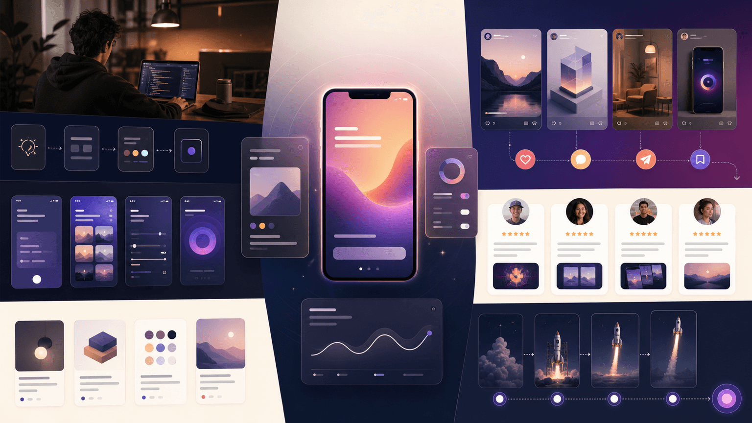
The 8-slide vibe-coded app demo template
Use this structure for Instagram, LinkedIn, or TikTok slideshow variants. It keeps the demo focused on the product path and avoids turning the post into a scattered launch announcement.
- 1
Slide 1: Outcome hook
Name what the user can do. Example: 'Plan 30 launch posts from one app idea.'
- 2
Slide 2: Before state
Show the messy workflow the app replaces.
- 3
Slide 3: Input
Show what the user gives the app: prompt, screenshot, brief, link, or selection.
- 4
Slide 4: App action
Show the main product workflow with a cropped screenshot.
- 5
Slide 5: Output
Show the generated plan, asset, recommendation, or result.
- 6
Slide 6: Review or control
Show how the user edits, approves, or checks the output.
- 7
Slide 7: Founder trust note
Briefly explain what you optimized for or changed after feedback.
- 8
Slide 8: CTA
Send users to the homepage, waitlist, launch page, or app-store listing.
Chapter 3
Choose screenshots that prove the workflow
Do not show every screen. Choose screenshots that prove the main path: input, action, output, and review. Crop tightly. Annotate sparingly. A full dashboard screenshot may look impressive but explain little.
Apple's product page guidance says screenshots should communicate app experience and main benefits. A demo carousel should do the same in social form.
Show the first input screen.
Show one main product action.
Show the output clearly.
Show review or control if AI is involved.
Avoid showing settings unless setup is the point.
Build from this playbook
Create demo carousels that make your app feel real
AttentionClaw helps vibe-coded app founders turn screenshots, workflow notes, and launch CTAs into polished carousels and TikTok slideshows.
Chapter 4
Use founder context to build trust
Vibe-coded apps may face trust questions around stability, support, privacy, or whether the product is more than an experiment. A demo carousel can answer those without becoming defensive. Add one founder-trust slide about feedback, review, roadmap focus, or why the workflow matters.
Keep it brief. The founder context should support the product promise, not interrupt the demo. If the founder story needs more room, create a separate post.
What user feedback changed.
What the app deliberately does not automate.
How users review AI output.
What support or onboarding path exists.
What workflow the founder is focusing on next.
Chapter 5
How AttentionClaw helps create vibe-coded app demos
AttentionClaw helps founders turn screenshots, app ideas, founder notes, and launch CTAs into polished demo carousels and TikTok slideshows. The founder brings the product truth. The tool packages the workflow in a consistent visual style.
This lets a small app feel more deliberate at launch. The demo assets explain what the app does, why it matters, and what a user should try first.
Callout
Workflow shortcut
Create one demo brief per app workflow, then generate carousel and slideshow variants from the same proof assets.
Chapter 6
Write slide copy that works for non-technical audiences
Vibe-coded app demos often fail not because the product is weak but because the slide copy assumes too much technical familiarity. Language like 'no-code backend with API integrations' or 'prompt-chained automations' signals the build method to other developers but says nothing to the user who just wants to know whether the app will save them time. Every slide should pass a one-sentence test: if someone with no interest in how the app was built reads this slide, do they understand what it does for them?
Replace process descriptions with outcome statements. 'Connect your spreadsheet and the app formats your data automatically' is more useful than 'spreadsheet integration with auto-formatting logic.' The outcome statement tells the user what changes for them. The process description tells them how the developer built it. On a demo carousel, only the outcome statement earns a scroll to the next slide.
Reserve technical detail for a dedicated slide near the end, positioned as transparency rather than explanation. 'This was built with AI tools — here is how it works and what that means for reliability' is honest and addresses the trust question directly without front-loading the build story. That slide does its job without slowing down the user who simply wants to see the product path.
Chapter 7
Handle the stability and support trust question directly
The most common silent objection to a vibe-coded app is: 'What happens when it breaks, and who fixes it?' That question rarely appears in comments but it shapes whether someone clicks through to the product page or keeps scrolling. A single trust slide that acknowledges this concern and gives a plain-language answer is more effective than ignoring it and hoping the product demo speaks for itself.
Be specific about what support looks like. If the founder monitors the app and responds to issues personally, say that. If there is a feedback form or a direct contact method, name it. If the app uses a third-party service that has its own status page, mention that. Vague claims like 'fully supported' or 'always improving' do not answer the question. Concrete answers — 'I monitor this app daily and respond to bug reports within 24 hours' — do.
If the app is still in an early or beta phase, own that directly. 'This is an early version — it does X reliably, Y is still being improved' is more trustworthy than presenting a beta product as if it were a fully polished commercial tool. Users who self-select based on honest framing become better early adopters and generate more useful feedback.
Callout
The trust slide formula
Name one limitation honestly. Explain what the founder does when issues arise. Give a specific way to reach support. This slide earns more conversions than a slide that overclaims polish.
Chapter 8
Match the CTA to the app's current stage
A CTA that asks users to sign up for a free trial before the app has even launched creates a credibility gap. The CTA on a demo carousel should be honest about where the product actually is. A waitlist CTA works for pre-launch. A free trial or free plan CTA works for a live product. A feedback request CTA works for an early version being refined with user input. Mismatching the CTA to the stage makes the whole demo feel less trustworthy.
For pre-launch apps, the waitlist CTA can be strengthened by offering something in return: early access, a discounted first month, or direct input into the feature roadmap. The exchange makes the waitlist feel like a relationship rather than a holding queue. A slide that reads 'Join the waitlist — early members get [specific benefit]' will outperform a plain 'Join the waitlist' slide.
For live apps with a free tier, the CTA should specify what the free tier actually includes. 'Try it free' is weaker than 'Use the core features free — no credit card needed.' The specificity removes the implicit question 'What does free actually mean here?' and lowers the cognitive friction standing between the user and the next click.
Next step
Turn this guide into a production-ready carousel.
AttentionClaw helps vibe-coded app founders turn screenshots, workflow notes, and launch CTAs into polished carousels and TikTok slideshows.
Keep the workflow inside AttentionClaw.
Common Questions
FAQ
More Reading
Keep reading
9-chapter read
Mobile App Permission Onboarding Carousels: Explain Data Requests Before Users Bounce
Mobile app permission onboarding carousels should explain why the app asks for data or device access, what value the user gets, and where privacy details live before the prompt appears.
8-chapter read
App Launch FAQ Carousel Template
An app launch FAQ carousel should answer the questions that block trial or download: who the app is for, what it does, what happens first, pricing or access, privacy or AI control, and where to try it. Use one question per slide and keep answers specific enough to reduce uncertainty.
8-chapter read
Carousel Slide Order That Converts: Hook, Proof, Offer, CTA
A converting carousel usually follows a clear order: hook, context, problem, solution or product, proof, objection handling, offer, and CTA. The exact slide count can change, but the reader should never wonder why the next slide exists.

App Onboarding Carousels: Turn New Users Into Power Users With Instagram Content
Most apps lose 75% of new users within the first week because users never discover the features that would make them stay. Onboarding carousels published on Instagram solve this by teaching new users how to get value from your app in a format they are already consuming daily.

How to Showcase App Features in Instagram Carousels That Drive Downloads
Listing features does not sell apps. Showing how each feature changes the user's day does. These carousel frameworks turn abstract feature descriptions into visual, benefit-driven content that makes viewers reach for the download button.
7-chapter read
How to Explain a Complex App Feature in Five Carousel Slides
To explain a complex app feature in five carousel slides, show the user's situation, the hidden friction, the simple mental model, the feature workflow, and the result. Do not start with the architecture or settings. Start with the decision the user needs to make and end with the next action.

Storytelling Hooks for App Creators: Turn Your Build Story Into Downloads
People do not download apps — they buy into stories. This guide shows app creators how to turn their build journey, founder struggles, and behind-the-scenes moments into carousel hooks that build an audience and drive downloads simultaneously.

SaaS Demo Carousels: Turn Product Workflows Into Social Content
A SaaS demo carousel should show one buyer problem, one workflow, one visible result, and one next action. It is not a feature tour. The best SaaS demo carousels translate product screens into a short buyer story: before state, decision point, guided workflow, proof of outcome, and CTA.
How to Market a Vibe-Coded App With Social Content
To market a vibe-coded app, do not lead with the fact that it was built with AI. Lead with the user problem, show the product solving it in short visual workflows, teach the audience how to reach the first useful outcome, and publish proof in a steady launch sequence. The best content mix is demo, education, contrast, founder context, and user evidence.
Sources
- Google Search's guidance about AI-generated content — Google Search Central Blog
- Creating Your Product Page — Apple Developer
- Creating helpful, reliable, people-first content — Google Search Central
Written by
AttentionClaw
Editorial Team
Editorial context
Part of the Carousel Creation topic cluster. Last updated June 22, 2026.