Chapter 1
The direct answer: teach the mental model before the UI
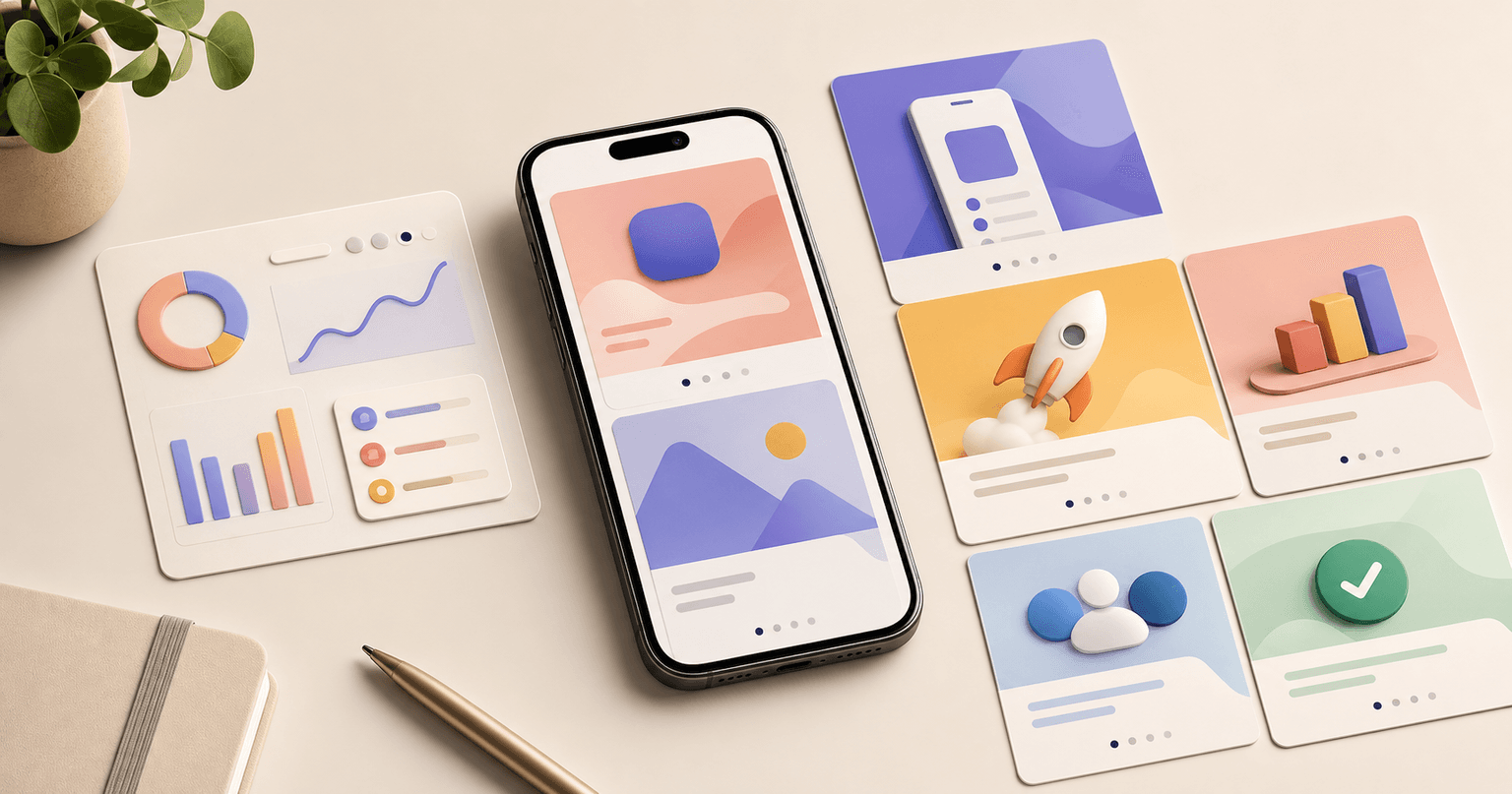
The fastest way to explain a complex app feature is to teach the user's mental model before showing the interface. Start with the situation where the feature matters, name the friction it solves, give a simple model for how it works, show the shortest workflow, and end with the result. This fits into five carousel slides because each slide answers one question.
Do not open with settings, architecture, or a full dashboard screenshot. A viewer who does not yet understand why the feature matters will not study the UI. The first slide should make them feel the problem. The middle slides should simplify the feature. The final slide should show what changes after using it.
This is consistent with progressive disclosure: show what matters first, then reveal complexity only when needed. Social feature education should follow that same principle because the feed is an even harsher learning environment than an app screen.
Callout
Five-slide rule
If the feature cannot be explained in five slides, the first post should explain the use case. Save settings, edge cases, and advanced options for follow-up content.
Chapter 2
The five-slide framework
This framework works for AI features, SaaS workflows, mobile app onboarding, automation builders, analytics dashboards, and collaboration tools. The point is not to hide complexity. The point is to introduce it in the order a user actually needs.
Each slide should be understandable without reading the caption. Use the caption for nuance, examples, or links, not for the core explanation. The carousel itself should carry the learning path.
- 1
Slide 1: Situation
Name the user moment. Example: 'You need 30 launch posts, but every platform needs a different format.'
- 2
Slide 2: Friction
Show why the old workflow breaks: repeated copying, inconsistent style, manual resizing, approval confusion, or unclear analytics.
- 3
Slide 3: Mental model
Explain the feature in one simple concept. Example: 'One campaign brief becomes platform-specific variants.'
- 4
Slide 4: Workflow
Show the shortest path through the product with one screenshot or diagram.
- 5
Slide 5: Result and CTA
Show the output, saved time, cleaner decision, or completed state, then tell users where to try it.
Chapter 3
What to cut from the first explainer
The first carousel should not include everything the feature can do. Cut edge cases, admin settings, permissions, configuration details, secondary personas, and internal terminology unless they are essential to the first action. Those details can become a second post for advanced users.
This is especially important for AI features. If you explain models, prompt chains, constraints, output review, generation settings, and scheduling in one post, the user may understand none of it. Start with what the user gives the app, what the app helps create, and how the user reviews the result.
Google's helpful content guidance is relevant here because useful content leaves the reader with a satisfying answer. A five-slide explainer should make one feature feel usable, not make the company look technically sophisticated.
Cut internal feature names unless users already know them.
Cut secondary settings from the first explainer.
Cut unsupported performance claims.
Cut full-screen screenshots that are too dense for mobile.
Cut any slide that does not answer a user question.
Build from this playbook
Explain complex features with clearer social assets
AttentionClaw helps app and SaaS teams turn feature briefs, screenshots, and workflows into simple carousels and TikTok slideshows.
Chapter 4
Use one screenshot only when it clarifies the workflow
A five-slide feature carousel rarely needs five screenshots. Too many screenshots force the viewer to learn the interface before they understand the concept. Use diagrams, simplified mock states, or annotated crops to explain the idea, then use one focused screenshot to prove the workflow.
Apple's product page guidance recommends screenshots that communicate the user experience and main benefits. That same standard applies in social. A screenshot should make the feature easier to understand. If it makes the slide denser, replace it with a simplified visual.
For SaaS products, consider using a screenshot sandwich: model slide before the screenshot, screenshot in the middle, result slide after. That gives the viewer enough context to interpret what they are seeing.
- 1
Crop to the action
Show only the panel, button, or output that matters.
- 2
Annotate once
Use one highlight or arrow. Multiple annotations compete for attention.
- 3
Show result next
After the screenshot, show what the action produces so the UI detail turns into value.
Chapter 5
Adapt the same feature explainer by platform
Instagram, TikTok, and LinkedIn can use the same logic but need different emphasis. Instagram can handle a more instructional carousel. TikTok slideshows need faster hooks and fewer words. LinkedIn carousels can lean into the business problem and decision framework.
LinkedIn's carousel guidance recommends narrative structure and a clear final CTA. That is exactly what complex features need. Each card should move the explanation forward. The final card should not just say 'learn more'; it should invite the next useful action.
A good workflow is to write the five-slide core once, then adapt the first slide and CTA by channel. Keep the mental model stable so the feature message does not fragment across platforms.
Instagram: teach the workflow with step labels and save-worthy framing.
TikTok: make slide 1 a sharper pain or outcome hook.
LinkedIn: connect the feature to business impact and team workflow.
App onboarding: use the same five slides as an in-app education email or help article.
Paid ads: use the clearest result slide as the creative anchor.
Chapter 6
Example feature angles for app and SaaS teams
The five-slide model becomes easier when you translate features into concrete scenarios. A feature is not 'smart templates.' The scenario is 'turn one launch note into five platform-ready posts.' A feature is not 'approval workflow.' The scenario is 'get client sign-off before anything gets scheduled.'
Build a library of feature angles by collecting support questions, onboarding drop-offs, sales objections, and repeated user tasks. The feature may stay the same, but each scenario deserves its own explainer when it reaches a different audience.
AI image consistency: reference image, style rules, generation, review, scheduled campaign.
SaaS approval workflow: draft, reviewer note, approval status, scheduled output.
App onboarding shortcut: setup, recommended template, first output, next action.
Analytics feature: metric confusion, simplified dashboard, decision, action.
Custom store campaign: social hook, custom page, deep link, first in-app workflow.
Chapter 7
How AttentionClaw helps produce feature explainers
AttentionClaw can turn complex app features into repeatable social explainers by starting from a brief rather than a blank slide. The brief should name the user situation, friction, mental model, workflow screenshot, result, and CTA.
Once the brief exists, a team can generate Instagram carousel frames, TikTok slideshow variants, and onboarding education assets with the same message sequence. That keeps the feature explanation consistent across launch, support, and retention content.
The advantage is not only speed. It is clarity. A small app team can explain advanced features without burying users in technical detail or creating one-off graphics for every platform.
Callout
Use AttentionClaw for feature explainer assets
Use AttentionClaw to turn one complex feature brief into channel-ready carousel and slideshow assets with the same five-slide logic.
Next step
Turn this guide into a production-ready carousel.
AttentionClaw helps app and SaaS teams turn feature briefs, screenshots, and workflows into simple carousels and TikTok slideshows.
Keep the workflow inside AttentionClaw.
Common Questions
FAQ
More Reading
Keep reading
9-chapter read
Turn SaaS Onboarding Emails Into Carousel Content
SaaS onboarding emails can become strong carousel content when each email is translated into one public lesson: first setup, first win, feature discovery, mistake correction, or advanced tip. Do not paste email copy into slides. Rewrite it as a visual workflow with one action per frame.
8-chapter read
Carousel Slide Order That Converts: Hook, Proof, Offer, CTA
A converting carousel usually follows a clear order: hook, context, problem, solution or product, proof, objection handling, offer, and CTA. The exact slide count can change, but the reader should never wonder why the next slide exists.

App Onboarding Carousels: Turn New Users Into Power Users With Instagram Content
Most apps lose 75% of new users within the first week because users never discover the features that would make them stay. Onboarding carousels published on Instagram solve this by teaching new users how to get value from your app in a format they are already consuming daily.

How to Showcase App Features in Instagram Carousels That Drive Downloads
Listing features does not sell apps. Showing how each feature changes the user's day does. These carousel frameworks turn abstract feature descriptions into visual, benefit-driven content that makes viewers reach for the download button.
Instagram Carousels for App Marketing: The Complete Playbook
Instagram carousels consistently outperform single-image posts for app marketing because they let you demonstrate value across multiple slides before asking for the download. This playbook covers the exact carousel types, structures, and publishing cadence that drive app installs at a lower cost than paid ads.

Storytelling Hooks for App Creators: Turn Your Build Story Into Downloads
People do not download apps — they buy into stories. This guide shows app creators how to turn their build journey, founder struggles, and behind-the-scenes moments into carousel hooks that build an audience and drive downloads simultaneously.
8-chapter read
Social Content Templates for App Onboarding Education
App onboarding education content should teach one useful action at a time. Use social carousels and slideshows for setup, first win, feature discovery, objection answers, and advanced tips. The goal is not to replace in-app onboarding, but to reinforce it with contextual, saveable tutorials users can find before and after install.

SaaS Demo Carousels: Turn Product Workflows Into Social Content
A SaaS demo carousel should show one buyer problem, one workflow, one visible result, and one next action. It is not a feature tour. The best SaaS demo carousels translate product screens into a short buyer story: before state, decision point, guided workflow, proof of outcome, and CTA.

Carousel Copywriting Masterclass: Write Slides That People Actually Read
The difference between a carousel people swipe through and one they screenshot is the writing. Not the design, not the topic — the copy on each slide. This masterclass covers the word-level techniques that separate forgettable slides from shareable ones.

Carousel Design Principles: The Visual Rules That Get More Swipes
Great carousel design is not about being a graphic designer. It is about following a set of visual rules that make your content readable, recognizable, and swipeable. This guide breaks down each rule with concrete specifications you can apply immediately.
Sources
- Progressive Disclosure — Nielsen Norman Group
- Creating Your Product Page — Apple Developer
- A B2B Marketer's Guide to Every LinkedIn Ad Type — LinkedIn Marketing Solutions
- Creating helpful, reliable, people-first content — Google Search Central
Written by
AttentionClaw
Editorial Team
Editorial context
Part of the Carousel Creation topic cluster. Last updated June 22, 2026.