
Chapter 1
Why feature lists kill carousels and benefit stories sell them
The instinct when showcasing an app is to list what it does: real-time sync, AI-powered analytics, custom dashboards, offline mode. This is how engineers and product teams think about the app. It is not how potential users think about their lives.
Every feature is a solution to a problem. Real-time sync means 'Never lose work when you switch devices.' AI-powered analytics means 'See what is working without spending an hour in spreadsheets.' Your carousel's job is to make the viewer feel the relief, speed, or power that the feature delivers — not to explain the technical mechanism.
The conversion difference is measurable. Feature-labeled carousels ('Our Top 5 Features') tend to generate far fewer link clicks than benefit-framed alternatives ('5 Things You Can Stop Doing After You Download This'). The content is the same. The framing changes everything.
Callout
The benefit translation test
For every feature you want to showcase, complete this sentence: 'This means you can now _____ without _____ .' If you cannot fill in both blanks, the feature is not ready for a carousel. Example: 'Auto-categorization means you can now track every expense without sorting a single receipt.'
Chapter 2
The single-feature deep dive: 10-slide framework
When you have one standout feature that deserves its own carousel, this structure maximizes impact.
- 1
Slide 1: The frustration hook
Name the specific annoyance this feature eliminates. 'Spending 20 minutes every morning sorting your inbox is not productivity — it is punishment.' Do not mention the feature or the app.
- 2
Slide 2: The 'what if' reframe
Paint the alternative reality. 'What if your inbox sorted itself while you slept and only showed you what actually matters?' This shifts the reader from frustration to curiosity.
- 3
Slides 3-4: The feature reveal with context
Show the feature in action with a real screenshot. Slide 3 shows the before state (the messy inbox). Slide 4 shows the after state (the sorted, prioritized view). The contrast does the selling.
- 4
Slides 5-7: The 'how it works' walkthrough
Three slides, three steps. Each slide shows a real screen with a numbered annotation. Keep the explanation to one sentence per slide. The viewer should understand the full workflow in under 10 seconds of reading.
- 5
Slides 8-10: Proof, objection handling, and CTA
Slide 8: a real user quote about this specific feature. Slide 9: answer the top objection ('Works with any email provider, takes 30 seconds to set up'). Slide 10: clear download CTA with a direct benefit restatement.
Chapter 3
The multi-feature showcase: the '5 reasons' format
When you want to show the breadth of your app rather than the depth of one feature, the numbered-reasons format works consistently well. Each slide covers one feature framed as a reason to download, and the accumulation of reasons builds a compelling case by the final slide.
The key to making this format work is restraint. Five features, not fifteen. Each feature gets one slide, one screenshot, and one benefit sentence. The viewer should be able to understand each reason in 3-4 seconds. If they need to pause and read, the slide has too much text.
- 1
Slide 1: The numbered hook
'5 reasons [specific audience] are switching to [app name]' or '5 things this app does that no other one can.' The number sets expectations and the specificity filters for your target audience.
- 2
Slides 2-6: One feature, one reason, one screenshot
Each slide follows the same layout: a number in the corner, a benefit-driven headline at the top ('Reason 3: Stop forgetting follow-ups'), a screenshot in the center, and a one-line explanation below. Consistency across these five slides creates a satisfying rhythm.
- 3
Slide 7: The stack summary
List all five reasons on one slide as a visual recap. This is the most-saved slide because it is the one viewers screenshot for later. Make it clean and shareable.
- 4
Slides 8-9: Social proof and CTA
Slide 8: a review or metric that validates the overall value ('4.8 stars from 12,000+ reviews'). Slide 9: download CTA. Keep the closing tight — by slide 9, the reader either wants the app or they do not.
Build from this playbook
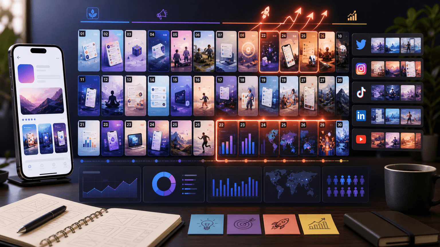
Showcase your app features in scroll-stopping carousels
AttentionClaw turns your app's features into polished Instagram carousels and TikTok slideshows. Define your brand style once, generate unlimited feature showcases.
Chapter 4
How to treat app screenshots so they sell instead of confuse
Raw screenshots are the biggest missed opportunity in app marketing carousels. A screenshot without context is just a picture of a phone screen — it communicates nothing to someone who has never used the app. Every screenshot in a feature carousel needs three things: a visual focus area, a benefit headline, and enough whitespace to breathe.
The visual focus area means cropping or highlighting the specific part of the screen that demonstrates the feature. If your feature is a smart search bar, do not show the entire app — zoom into the search interface with an annotation arrow. Guide the viewer's eye to the exact element that delivers the benefit.
Device mockups (phone frames around your screenshots) add polish and immediately signal that this is an app being demonstrated. But use them sparingly. Full device frames shrink the screenshot, making text harder to read. A borderless phone frame or a subtle shadow achieves the same effect without sacrificing readability.
Crop screenshots to focus on the feature being discussed — full-screen shots waste visual real estate
Add annotation overlays (arrows, circles, highlights) to guide the viewer's attention
Use your app's actual UI colors for carousel backgrounds to build subconscious brand consistency
Maintain a maximum of 30 words of overlay text per slide — the screenshot should do most of the talking
Test readability at actual Instagram viewing size (phone screen) before publishing
Chapter 5
Feature carousel frameworks by app category
The best carousel approach depends on your app's category because different categories have different buying objections and value frameworks.
- 1
Productivity apps: The time-saved framework
Lead every feature with the time it saves. 'Automatic invoice generation: 3 hours saved per week.' Productivity app users are buying back time, so quantify the return on every feature. Use before-and-after screenshots showing the manual process versus the app-powered process.
- 2
Finance apps: The money-impact framework
Frame features around financial outcomes. 'Smart budget alerts helped users save an average of $340/month.' Finance app users are risk-averse and respond to concrete numbers. Show dashboard screenshots with real-looking (not real) data that demonstrates the insight.
- 3
Health and fitness apps: The transformation framework
Show the journey from start to result. A meal-tracking feature becomes 'From guessing calories to knowing exactly what you ate in 10 seconds.' Health app users are motivated by progress, so screenshots should show progress dashboards, streak counters, or before-and-after data.
- 4
Social and communication apps: The connection framework
Frame features around relationships and community. 'Group video that actually works with 20+ people' matters because it enables something human. Show screenshots of real-looking conversations or group interactions that feel alive.
- 5
Creative tools: The output framework
Show what the user creates with the feature, not the feature itself. A filter tool carousel should show 8 beautiful images made with the tool, not 8 screenshots of filter settings. Creative app users care about output quality above all else.
Chapter 6
12 hook formulas for feature showcase carousels
The hook determines whether your feature showcase reaches 500 people or 50,000. These formulas are specifically tuned for app feature content and can be adapted to any app category.
'The feature that made me delete [3 other apps]' — frames your feature as a replacement, not an addition
'I did not believe this was possible on a phone until I tried [app]' — creates curiosity through disbelief
'The hidden feature in [app] that nobody talks about' — leverages the discovery impulse
'You are doing [task] the hard way. Here is the 30-second version.' — directly addresses inefficiency
'[App] just added [feature] and it changes everything about [workflow]' — update framing creates urgency
'Why 50,000+ [audience] switched to [app] this month' — social proof as hook, features as proof points
Callout
Hook testing protocol
For your highest-priority feature carousel, write 5 hook variations. Post the carousel with your best guess. If it underperforms after 48 hours, delete and repost with a different hook. The same content with a stronger hook can perform dramatically better. Never give up on strong content because of a weak first slide.
Chapter 7
Building a feature carousel design system that scales
If you are producing multiple feature carousels per week, you need a design system, not a collection of one-off designs. A system means every carousel shares the same typography, color palette, slide layouts, and screenshot treatment — but with enough variation that your feed does not look monotonous.
Define three to four slide templates: hook slide (bold text, gradient or solid background), feature slide (screenshot with benefit headline), proof slide (quote or stat with minimal design), and CTA slide (download instruction with app icon). Every feature carousel you produce uses some combination of these four templates.
AttentionClaw streamlines this by letting you define your brand style once — fonts, colors, visual aesthetic — and then generating carousels that stay within those parameters automatically. This means every feature showcase maintains brand consistency without manual design enforcement, even when you are producing 4-5 carousels per week.
Lock in fonts: one heading font, one body font, same across every carousel
Lock in colors: pull from your app's UI palette so social content and in-app experience feel connected
Lock in layouts: create 4 reusable slide templates that cover every content type
Lock in screenshot treatment: same device frame, same crop style, same annotation approach
Vary the accent: rotate a secondary color or background treatment between carousels to prevent visual fatigue
Chapter 8
How to sequence feature carousels across your content calendar
Posting five feature showcase carousels in a row turns your feed into a product catalog, which is the fastest way to lose followers. Feature carousels need to be interspersed with problem-awareness content, social proof, tutorials, and industry insights.
The ideal ratio for app marketing accounts is: 2 feature carousels per week, 1 social proof carousel, 1 educational or industry carousel, and 1 community or behind-the-scenes post. This gives you enough feature exposure to drive downloads while keeping your feed valuable enough to retain followers.
Within feature carousels, alternate between single-feature deep dives and multi-feature overviews. If Monday's carousel was a deep dive on your search feature, Thursday's should be a '5 reasons to download' overview. This variation keeps feature content fresh and reaches viewers with different content preferences.
Maximum 2 feature showcase carousels per week — more than that and your feed feels promotional
Alternate formats: deep dive one post, multi-feature overview the next
Never post feature carousels on consecutive days — space them with value-first content
Use feature deep dives when you ship updates — the timing gives the content a news hook
Use multi-feature overviews at the beginning and end of each month as periodic re-introductions
Chapter 9
Optimizing your feature carousels for actual downloads
A feature carousel that gets 1,000 likes and zero downloads is failing at its primary job. The optimization targets for app marketing carousels are profile visits and link-in-bio clicks, not vanity metrics.
Three changes consistently improve download conversion from feature carousels. First, add your app name and 'link in bio' on every slide from slide 5 onward, not just the last slide. Viewers drop off at different points, and each one should know where to go. Second, use your app icon as a visual element throughout the carousel so it becomes recognizable before the viewer reaches the App Store. Third, make your CTA slide impossible to misunderstand: 'Download [App Name] free. Link in bio. Tap now.' Three short sentences. No ambiguity.
Callout
The 48-hour optimization window
Instagram distributes carousels to non-followers primarily in the first 48 hours. If your carousel is getting good engagement but low profile visits during this window, edit the caption to add a stronger CTA and reply to every comment with a natural mention of the download link. These actions signal activity to the algorithm and extend the distribution window.
Next step
Turn this guide into a production-ready carousel.
AttentionClaw turns your app's features into polished Instagram carousels and TikTok slideshows. Define your brand style once, generate unlimited feature showcases.
Keep the workflow inside AttentionClaw.
Common Questions
FAQ
More Reading
Keep reading
8-chapter read
App Launch FAQ Carousel Template
An app launch FAQ carousel should answer the questions that block trial or download: who the app is for, what it does, what happens first, pricing or access, privacy or AI control, and where to try it. Use one question per slide and keep answers specific enough to reduce uncertainty.
8-chapter read
Carousel Slide Order That Converts: Hook, Proof, Offer, CTA
A converting carousel usually follows a clear order: hook, context, problem, solution or product, proof, objection handling, offer, and CTA. The exact slide count can change, but the reader should never wonder why the next slide exists.

App Onboarding Carousels: Turn New Users Into Power Users With Instagram Content
Most apps lose 75% of new users within the first week because users never discover the features that would make them stay. Onboarding carousels published on Instagram solve this by teaching new users how to get value from your app in a format they are already consuming daily.
The 30-Day App Launch Carousel Campaign: Day-by-Day Plan
Most app launches fail on social media because teams post randomly instead of following a structured campaign arc. This 30-day plan maps every carousel you need — from pre-launch hype through launch week to sustained post-launch growth.
Instagram Carousels for App Marketing: The Complete Playbook
Instagram carousels consistently outperform single-image posts for app marketing because they let you demonstrate value across multiple slides before asking for the download. This playbook covers the exact carousel types, structures, and publishing cadence that drive app installs at a lower cost than paid ads.

How to Build an App Download Funnel Using Only Social Media Content
You do not need landing pages, email sequences, or ad budgets to drive app downloads. A well-structured social media content funnel can take someone from first impression to install in under a week.
7-chapter read
How to Explain a Complex App Feature in Five Carousel Slides
To explain a complex app feature in five carousel slides, show the user's situation, the hidden friction, the simple mental model, the feature workflow, and the result. Do not start with the architecture or settings. Start with the decision the user needs to make and end with the next action.

App Marketing Hooks That Drive Downloads: 20+ Proven First-Slide Formulas
The first slide of your app marketing carousel decides whether someone downloads or scrolls past. These 20+ hook formulas are built specifically for app promotion — covering curiosity, pain points, social proof, and demo-driven openings.
8-chapter read
Social Content Templates for App Onboarding Education
App onboarding education content should teach one useful action at a time. Use social carousels and slideshows for setup, first win, feature discovery, objection answers, and advanced tips. The goal is not to replace in-app onboarding, but to reinforce it with contextual, saveable tutorials users can find before and after install.

SaaS Demo Carousels: Turn Product Workflows Into Social Content
A SaaS demo carousel should show one buyer problem, one workflow, one visible result, and one next action. It is not a feature tour. The best SaaS demo carousels translate product screens into a short buyer story: before state, decision point, guided workflow, proof of outcome, and CTA.
Written by
AttentionClaw
Editorial Team
Editorial context
Part of the Carousel Creation topic cluster. Last updated June 22, 2026.