Chapter 1
The short answer: market the outcome, not the build method
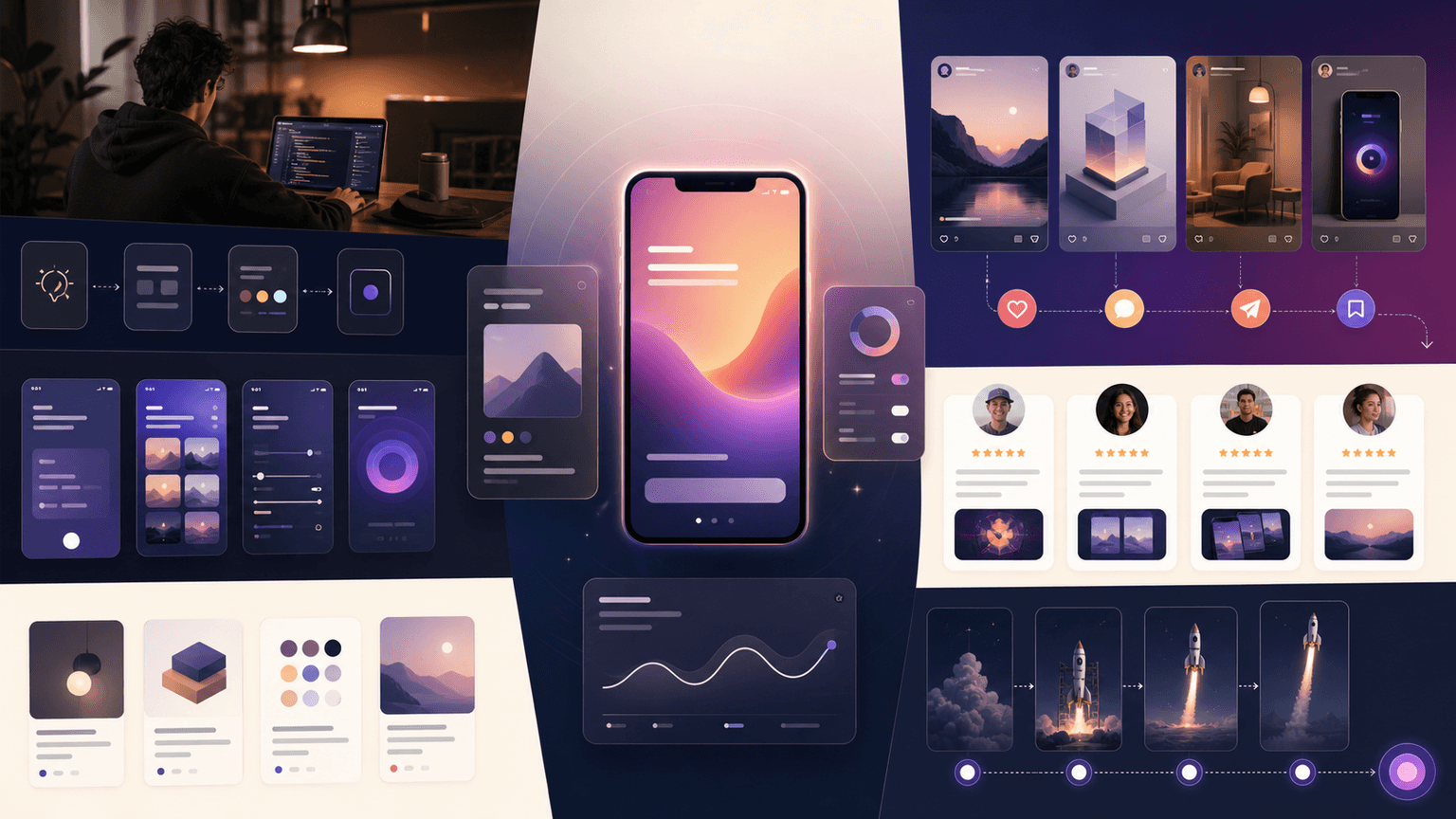
The strongest way to market a vibe-coded app is to package the product into repeatable social proof of usefulness: before-and-after posts, short workflow demos, onboarding carousels, feature comparison slides, launch countdowns, and user-result stories. The build method can add founder interest, but it should never replace the value proposition. People do not download because an app was built quickly. They download because it solves a problem they recognize.
A practical launch plan has three layers. First, make the promise concrete: who the app is for, what job it completes, and what the user can do after five minutes. Second, turn that promise into visual social formats that are easy to understand without sound. Third, connect every post to a measurable action such as waitlist signup, download, onboarding completion, template save, or profile visit.
This approach also protects the app from the most common vibe-coded launch failure: getting curiosity from builders but no retention from real users. Founder-content can attract early attention, but product-content teaches buyers, validates positioning, and gives app-store visitors a reason to trust the tool.
Callout
Useful framing
Use 'built fast' as context only after you have shown the user outcome. If the first slide says 'I vibe-coded an app,' the audience is mostly other builders. If it says 'Plan a week of meals in 3 minutes,' the audience is potential users.
Chapter 2
Choose one marketable use case before you make content
Most vibe-coded apps fail at social marketing because the founder tries to explain every feature at once. A small app needs a narrow first story. Pick one user, one pain point, one trigger moment, and one visual outcome. A budgeting app might start with 'freelancers who forget tax savings.' A habit app might start with 'people who restart routines every Monday.' An AI writing app might start with 'founders who need launch posts but hate blank documents.'
The use case becomes your content filter. Every post should either make the pain more visible, show the workflow, teach the outcome, reduce perceived risk, or prove that the app is active and improving. If a post does none of those jobs, it is probably founder entertainment rather than acquisition content.
Search and answer engines reward complete, helpful explanations. Google's people-first content guidance is a useful discipline here: the article, post, or carousel should leave the reader with a satisfying answer, not just a keyword-stuffed claim. Social content works the same way. A carousel that teaches the user how to solve a slice of the problem will outperform a vague product announcement.
- 1
Name the first user
Write the audience as a job and situation, not a demographic. 'Solo iOS developer launching a habit app' is more useful than 'founders.'
- 2
Name the trigger
Identify the moment when the user feels the pain: launch week, failed routine, messy client feedback, empty content calendar, or confusing onboarding.
- 3
Name the visible win
Turn the outcome into something a screenshot or slide can show: a completed plan, cleaner dashboard, faster setup, generated schedule, or clearer recommendation.
Chapter 3
Use five content pillars so the launch does not become repetitive
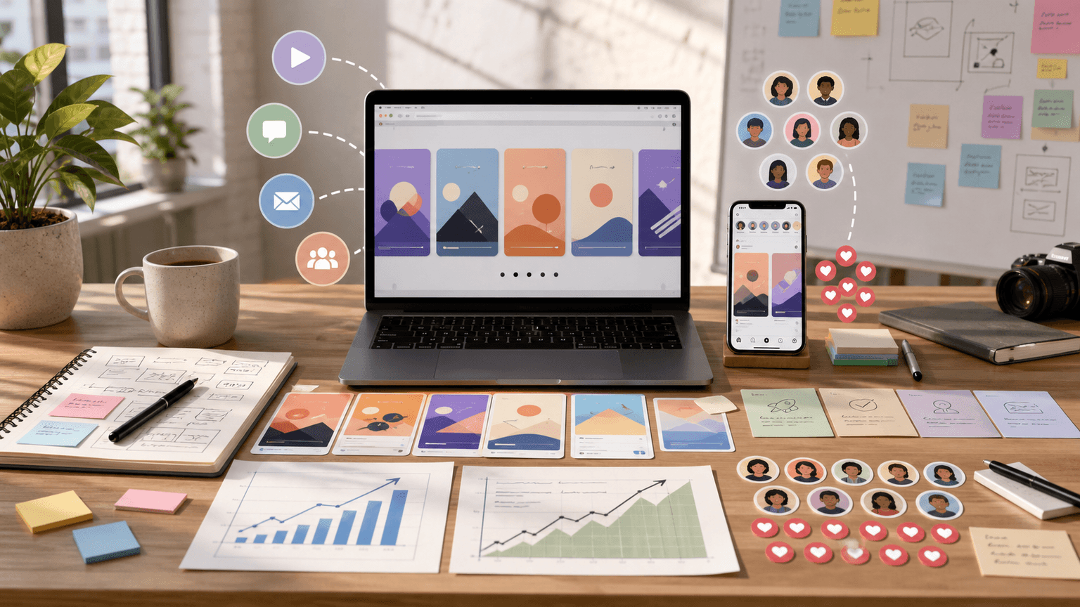
A vibe-coded app launch needs more than product demo clips. If every post shows the same screen with a different caption, the audience learns to ignore it. The content system should rotate through five pillars: problem education, workflow demo, onboarding help, credibility, and founder context. Each pillar answers a different search or social intent.
Problem education catches people who are not yet shopping. Workflow demos convert people who already feel the pain. Onboarding help keeps new users moving after install. Credibility content reduces the fear that the app is a fragile weekend project. Founder context gives the account a human voice without turning the product into a maker diary.
The ratio can be simple during the first month: 35 percent problem education, 25 percent workflow demo, 20 percent onboarding help, 10 percent credibility, and 10 percent founder context. The goal is not to hide the founder. The goal is to make sure the buyer sees enough product value to act.
Problem education: 'Why your launch posts are not converting' or 'The mistake most habit apps make on day one.'
Workflow demo: 'From blank idea to scheduled launch calendar in 6 slides.'
Onboarding help: 'Set this up before you invite your first teammate.'
Credibility: changelog, roadmap progress, support responses, benchmark screenshots, or user quotes.
Founder context: lessons from building, constraints, decisions, and mistakes that make the product story more trustworthy.
Build from this playbook
Turn your app launch into a month of social content
AttentionClaw helps app founders turn launch ideas, screenshots, and onboarding moments into consistent Instagram carousels and TikTok slideshows ready to schedule.
Chapter 4
A 30-day launch sequence for a vibe-coded app
The best launch content starts before launch day. A one-day announcement asks the market to care immediately. A 30-day sequence lets the audience learn the problem, see the product mature, and understand the first action they should take. It also gives the founder enough posting volume to discover which angles resonate before paid traffic or press outreach.
Start 21 days before launch with problem and waitlist content. Move into demo and objection-handling posts 14 days before launch. In the final week, show proof of readiness: onboarding screens, app-store assets, early-user feedback, and the clearest use-case walkthrough. After launch, shift from hype to activation: tutorials, first-week workflows, feature deep dives, and customer questions.
Product Hunt's own launch preparation guidance emphasizes planning content and community activity before launch day. That matters for social because launch posts should already be written, scheduled, and mapped to the exact moments of the day when users need reminders.
- 1
Days -21 to -15: problem discovery
Publish posts that make the pain concrete. Use checklists, mistake lists, and 'before' workflows. The CTA is waitlist or follow for the build.
- 2
Days -14 to -8: product clarity
Show the app solving one workflow at a time. Use carousels, TikTok slideshows, and short screen recordings. The CTA is 'join the launch list' or 'save this for launch day.'
- 3
Days -7 to 0: readiness and proof
Publish launch countdown slides, onboarding previews, app-store screenshots, early-user quotes, and founder notes about the problem. The CTA is download, try, or join the launch page.
- 4
Days +1 to +9: activation
Teach the first five minutes. Answer objections from launch-day comments. Turn support questions into tutorial carousels and use the best comments as future content prompts.
Chapter 5
The best social formats for AI app launch content
For a small app, the highest-leverage formats are visual, silent-friendly, and repeatable. Instagram carousels are strong for teaching the problem and showing step-by-step workflows. TikTok slideshows work well for hooks, transformations, and lightweight demos. LinkedIn document carousels can work for B2B apps when the buyer needs a framework before they trust the product.
TikTok's own business guidance notes that image-based placements can increase creative volume and variety, and that native image storytelling can fit the platform when it uses the language of TikTok rather than recycled ad assets. That is useful for app founders because it means one product story can become many lightweight visual posts without filming a new video every time.
The key is to avoid making every asset look like an app-store screenshot. Use screenshots when a UI detail matters, but combine them with plain-language slides, outcome panels, and before-and-after frames. The reader should understand the benefit before they inspect the interface.
TikTok slideshow: fast hook, pain point, 3-step workflow, result, and download CTA.
Instagram carousel: problem frame, why it matters, app workflow, example output, objection answer, CTA.
LinkedIn document: market insight, framework, implementation checklist, product-adjacent example.
Short video: founder screen narration for one workflow, not a full feature tour.
Story posts: launch-day reminders, polls, Q&A, and quick social proof.
Chapter 6
Connect social posts to the app-store page
Social content creates demand, but the app-store page captures it. The message should match. If a TikTok slideshow promises 'build a launch calendar in 10 minutes,' the first screenshots and description should reinforce that exact outcome. A mismatch between social promise and store listing creates doubt at the final step.
Apple's App Store guidance is clear that screenshots, app previews, subtitle, description, ratings, and product page tests all affect how users understand and evaluate an app. Apple also supports product page optimization and custom product pages, which means social campaigns can eventually point to different app-store narratives for different audiences.
For a vibe-coded app, the store listing should signal reliability. Use screenshots that show real workflows, avoid exaggerated claims, keep the first sentence of the description concrete, and make the support path easy to find. The audience may already assume an AI-built app is new or experimental. Your social-to-store bridge should reduce that concern.
- 1
Mirror the hook
Use the same primary outcome in the social post, landing page, and app-store screenshots.
- 2
Show the first workflow
Make the first three screenshots explain what a new user can do immediately after install.
- 3
Track the path
Use campaign-specific links where possible, then compare profile visits, store page views, downloads, and first-session activation.
Chapter 7
Quality control: avoid AI launch content that feels disposable
AI-assisted production can create more posts, but volume only helps when the posts carry real information. A founder can generate 100 generic launch graphics in an hour and still have no acquisition system. Search traffic and social traction both come from specificity: concrete examples, clear decision criteria, useful templates, visible proof, and honest trade-offs.
The quality bar should be simple. Every post needs one audience, one idea, one proof point or example, and one next action. If a carousel explains a feature, it should show the situation where that feature matters. If a TikTok slideshow gives a list of ideas, at least half should be specific enough to use today. If a founder post mentions AI, it should explain what the build speed made possible for users, not just for the maker.
Callout
Editorial test
Ask: would a user save this if they never downloaded the app? If the answer is no, the post is probably too promotional or too thin.
Chapter 8
How to produce the system without becoming a full-time content team
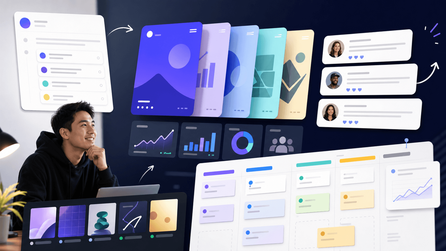
The workflow is to separate thinking from production. First, build a topic bank from support questions, onboarding friction, app-store objections, and competitor-free search queries. Second, write the core slide logic for each idea. Third, generate visual variants in a consistent style. Fourth, schedule posts by journey stage instead of posting whatever is finished first.
AttentionClaw is designed for that exact operating rhythm. A founder can define the product style once, turn one launch idea into Instagram carousel frames and TikTok slideshow frames, keep the app visuals consistent, and schedule a month of launch education without rebuilding every asset manually.
For vibe-coded apps, that consistency matters. The product may be young, but the content should feel deliberate. A steady visual system tells users the app is maintained, the founder understands the problem, and the launch is more than a one-day experiment.
Create one content brief per user problem.
Turn the brief into 3 formats: carousel, TikTok slideshow, and onboarding tutorial.
Reuse screenshots intentionally, but rewrite hooks for each platform.
Schedule by journey: problem, demo, proof, onboarding, reminder.
Review weekly metrics and make the next batch from the strongest saved or shared posts.
Next step
Turn this guide into a production-ready carousel.
AttentionClaw helps app founders turn launch ideas, screenshots, and onboarding moments into consistent Instagram carousels and TikTok slideshows ready to schedule.
Keep the workflow inside AttentionClaw.
Common Questions
FAQ
More Reading
Keep reading
8-chapter read
Vibe-Coded App Demo Carousel Template
A vibe-coded app demo carousel should show the user's problem, the app workflow, the output, the trust check, and the next action. Do not lead with the build method. Lead with what the app helps a real user do, then use the founder story as supporting context.
9-chapter read
Founder-Led AI App Marketing Without Becoming a Build Diary
Founder-led AI app marketing works when the founder uses their voice to clarify the user problem, show the product workflow, build trust, and teach first use. It fails when the account becomes only a build diary. Balance founder context with demos, proof, onboarding education, and user outcomes.
8-chapter read
App Referral Program Social Content: Posts That Explain Sharing
App referral program social content should explain why sharing helps both people, how the referral works, what the reward or benefit is, and what happens after the friend joins. Use screenshots, clear rules, trust language, and specific use cases instead of vague 'invite your friends' posts.
8-chapter read
Social Proof Posts for Apps With Few Reviews
Apps with few reviews can still create credible social proof by showing product proof, beta feedback, workflow evidence, founder responsiveness, changelog progress, and user questions answered. Do not fake testimonials or overstate traction. Make proof specific, modest, and connected to the user's decision.
App Marketing on $0: How to Grow Downloads With Just Instagram Carousels
Funded startups can outspend you on ads, but they cannot out-content you. Instagram carousels are the most effective free marketing channel for bootstrapped app developers who need downloads without a budget.
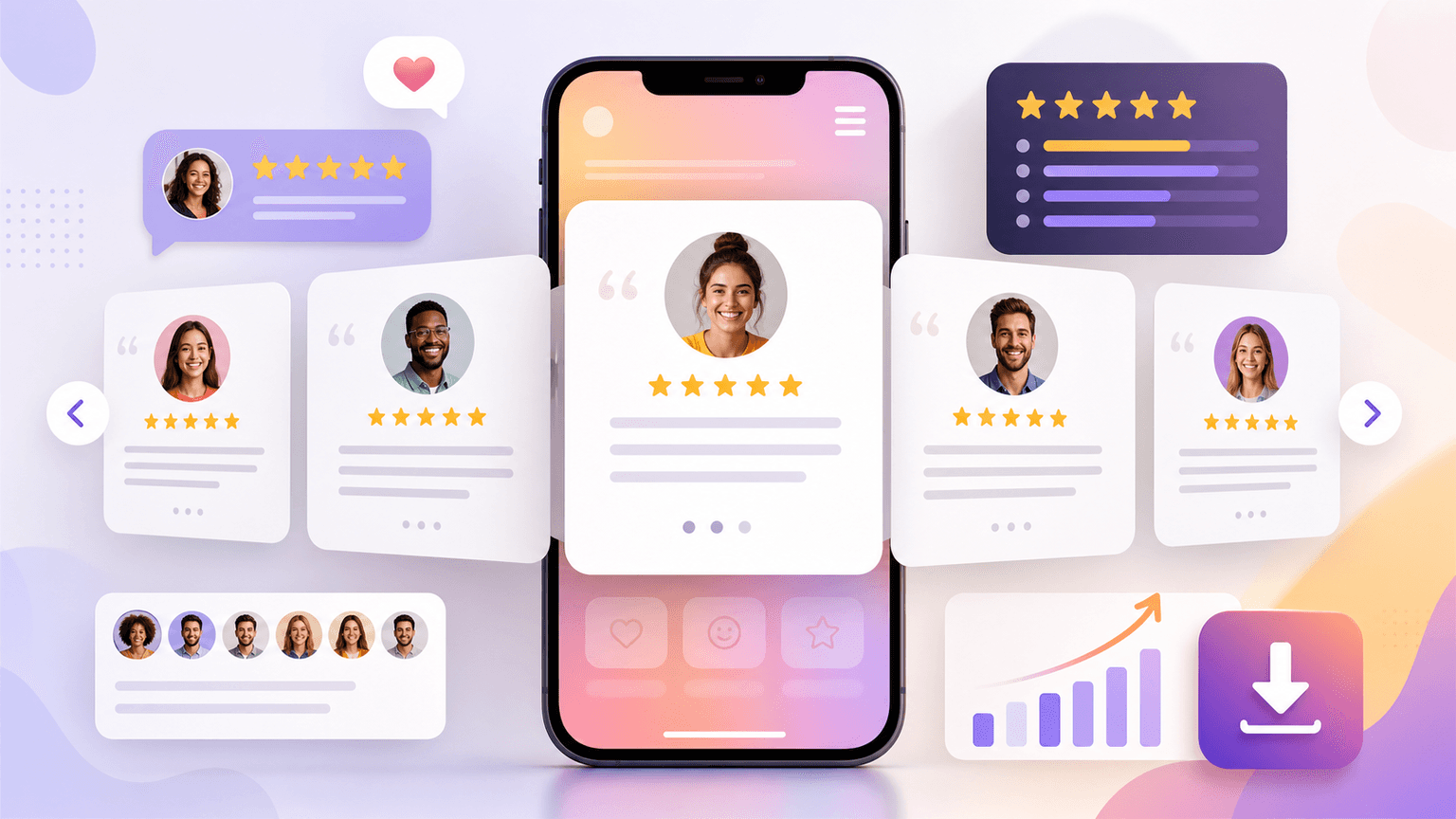
App Testimonial Carousels: Scripts and Frameworks That Convert Skeptics
App store reviews and user testimonials are your most underused marketing asset. This guide shows you how to transform raw user feedback into carousel scripts that overcome skepticism, build trust, and convert viewers into downloaders.
Startup Social Media Guide: How Early-Stage Companies Win With Carousels
Early-stage startups cannot afford paid acquisition at scale, but they can build organic reach through carousel content that compounds over time. This guide shows founders and small teams how to do it without a designer or a big content budget.

How the Instagram Algorithm Ranks Carousels (And How to Win)
Instagram gives carousels a second and third chance in the feed that single images never get. Understanding the specific ranking signals the algorithm uses for carousels lets you engineer posts that the system actively wants to distribute.
Sources
- Creating helpful, reliable, people-first content — Google Search Central
- Google Search's guidance about AI-generated content — Google Search Central Blog
- TikTok Image Ads: Visual Marketing Solutions to Engage Customers — TikTok For Business
- Creating Your Product Page — Apple Developer
- Prepare for your Product Hunt launch — Product Hunt
Written by
AttentionClaw
Editorial Team
Editorial context
Part of the Content Planning topic cluster. Last updated June 22, 2026.