Chapter 1
The onboarding gap: why in-app tutorials are not enough
The average mobile app loses 77% of its daily active users within the first three days after install. By day 30, that number climbs to 90%. The root cause is almost never a bad product — it is a failure to communicate value quickly enough. Users who do not reach their 'aha moment' within the first session rarely come back.
In-app onboarding only reaches users who open the app. That sounds obvious, but it is the critical blind spot. A user who downloaded your app yesterday and has not opened it since will never see your carefully designed tutorial flow. An Instagram carousel that shows up in their feed, however, reaches them exactly where they are spending their time.
Onboarding carousels serve a dual purpose. For new users, they are activation content that teaches a specific workflow and gives them a reason to open the app right now. For potential users who have not downloaded yet, they are conversion content that demonstrates how easy the app is to use. One carousel, two audiences, both moving toward the same outcome.
Chapter 2
Identify your app's 'aha moments' before you create a single slide
Not every feature deserves an onboarding carousel. Focus on the moments that make users stick.
Your app's 'aha moment' is the point where a user first experiences real value — not theoretical value, not promised value, but actual felt value. For a habit tracking app, it might be seeing a 7-day streak. For a budgeting app, it might be the first time the dashboard shows where all their money went. For a collaboration tool, it might be the first real-time edit with a teammate.
Identify 3-5 aha moments by analyzing your retention data. Which actions correlate most strongly with users coming back on day 7, day 14, day 30? Users who complete those actions within the first 48 hours retain at dramatically higher rates. Those actions are your onboarding carousel topics.
- 1
Pull your retention cohort data
Compare users who churned within 7 days against users who stayed for 30+ days. What actions did the retained users take that churned users did not? These are your activation milestones.
- 2
Rank milestones by impact and difficulty
Some aha moments are easy to reach (creating a profile) and some require effort (completing a first project). Prioritize carousels for high-impact milestones that users struggle to reach on their own.
- 3
Map each milestone to a carousel format
Simple milestones (setting up a profile, connecting an account) work as quick-tip carousels. Complex milestones (building a workflow, completing a project) work as step-by-step tutorial carousels.
Chapter 3
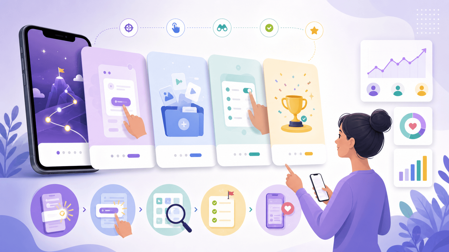
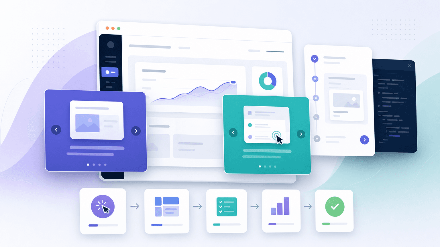
The step-by-step tutorial carousel: 10-slide framework
- 1
Slide 1: The outcome hook
Lead with what the user will achieve, not what they will learn. 'Set up automatic expense tracking in 60 seconds' beats 'How to use our expense tracking feature.' The outcome gives the reader a reason to swipe.
- 2
Slide 2: The 'what you will need' setup
Tell the user what to have ready before starting. 'Open [app name] and go to Settings > Integrations.' This reduces friction by eliminating the 'wait, where do I go?' moment mid-tutorial.
- 3
Slides 3-7: The numbered steps with screenshots
One action per slide. Each slide has a step number, a clear instruction ('Tap the blue + button'), and a screenshot with an annotation arrow pointing to the exact UI element. Maximum 15 words of instruction per slide.
- 4
Slide 8: The result screen
Show what the user's screen looks like when the workflow is complete. This is the payoff — the visual confirmation that they did it right. 'Your automatic tracking is now active. Here is what it looks like.'
- 5
Slides 9-10: Pro tip and CTA
Slide 9: one advanced tip that makes the feature even more useful ('Pro tip: set a weekly reminder to review your tracked expenses'). Slide 10: CTA for users who have not downloaded yet, plus a 'Save this for later' prompt for existing users.
Callout
The 60-second rule
If the workflow you are teaching takes more than 60 seconds to complete in the app, break it into multiple carousels. A 3-part series ('Part 1: Setup, Part 2: First Use, Part 3: Advanced Tips') performs better than one 15-slide carousel that tries to cover everything.
Build from this playbook
Create onboarding carousels that keep users coming back
AttentionClaw generates brand-consistent tutorial carousels from your app screenshots and brand style. Teach users how to get value from your app without designing a single slide.
Chapter 4
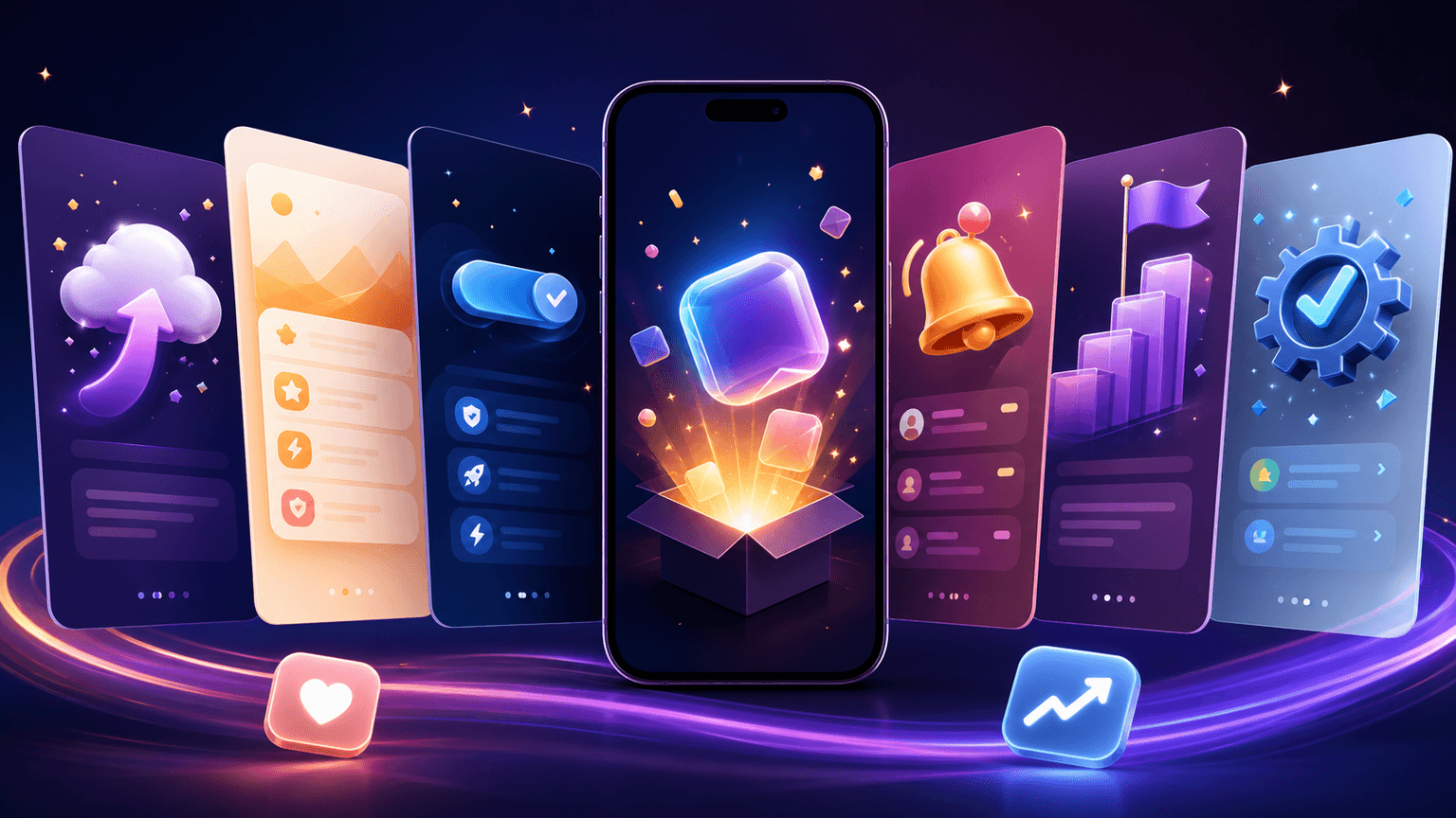
The quick-tip carousel: fast wins that build habits
Not every onboarding carousel needs to be a full tutorial. Quick-tip carousels cover small, standalone tricks that make the app more useful. These are the features users discover by accident after months — or never discover at all. Surfacing them in a 5-7 slide carousel creates 'I did not know it could do that!' moments that deepen engagement.
The format is simple: each slide is one tip with a screenshot and a one-line explanation. No narrative arc, no setup, just rapid-fire value. '7 things you probably did not know [app] can do' is a proven hook for this format.
Keyboard shortcuts or gesture shortcuts that speed up common actions
Hidden settings that unlock better default behavior
Integration tricks with other apps the audience already uses
Customization options that make the app feel personal
Export or sharing features that extend the app's value beyond the app itself
Notification settings that reduce noise without losing important alerts
Chapter 5
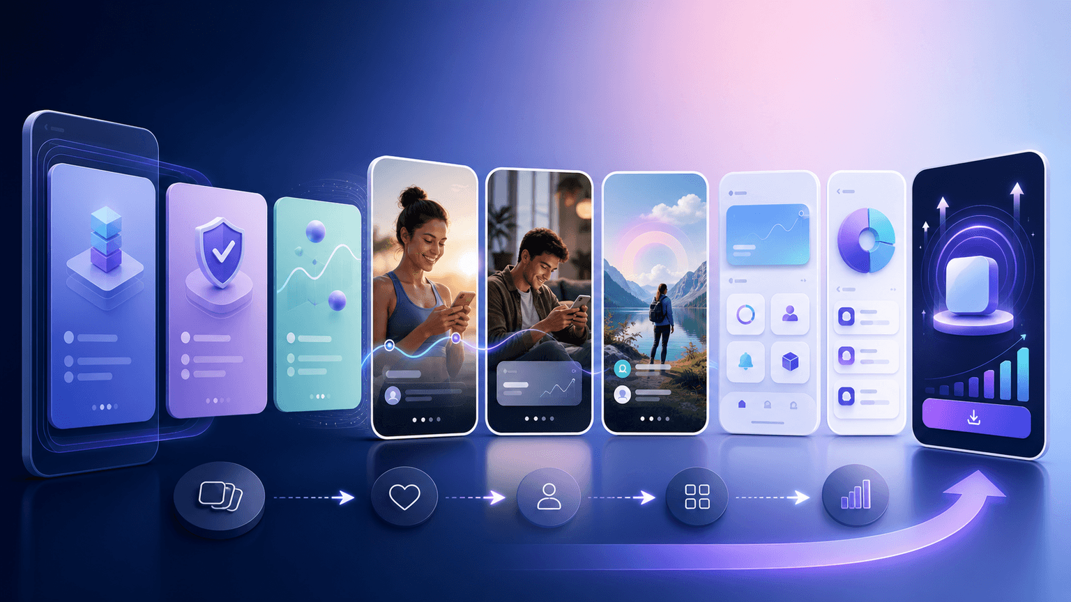
Use-case carousels: show the workflow, not the feature
The most effective onboarding carousels do not teach features — they teach workflows. A feature is 'calendar integration.' A workflow is 'How I plan my entire week in 10 minutes every Sunday morning using [app].' The workflow gives the feature context, purpose, and emotional resonance.
Build one use-case carousel for each of your primary audience segments. A project management app might create 'How freelancers use [app] to manage 5 clients at once,' 'How marketing teams use [app] to run campaigns,' and 'How students use [app] to organize every class.' Same app, same features, completely different framings.
Use-case carousels also work as top-of-funnel content for users who have not downloaded yet. When someone sees a carousel that mirrors their exact workflow and shows the app fitting into their specific day, the download feels inevitable rather than optional.
Callout
The specificity principle
Generic use cases convert poorly. 'How to use our app for productivity' is weak. 'How a freelance designer uses [app] to deliver 3 client projects per week without working weekends' is strong. The more specific the scenario, the more the right reader feels like the app was built for them.
Chapter 6
Building an onboarding carousel series that guides users through their first 7 days
A single tutorial carousel is a one-time interaction. A series builds a relationship that carries users through the critical first week.
Publish the series as numbered posts ('Part 1 of 4') and reference the previous installments in each caption. Users who joined mid-series can catch up by visiting your profile. Pin the Day 1 carousel to the top of your grid so new profile visitors always start at the beginning.
- 1
Day 1 carousel: First setup and quick win
Walk through the initial setup and help the user complete one meaningful action. The goal is to get them to their first aha moment before they close the app. Keep it to 7-8 slides and focus on speed.
- 2
Day 3 carousel: The power feature
Introduce the feature that differentiates your app from competitors. By day 3, users who have not churned are open to going deeper. This is where you show the capability that makes switching to an alternative feel like a downgrade.
- 3
Day 5 carousel: The integration or customization tutorial
Help users connect the app to their existing tools or customize it to their preferences. This increases switching costs naturally — once someone has invested time configuring an app, they are far less likely to abandon it.
- 4
Day 7 carousel: The community and 'what's next' guide
Introduce community features, share user success stories, and preview advanced capabilities they have not explored yet. This carousel transitions the user from 'trying the app' to 'being part of the ecosystem.'
Chapter 7
Design principles specific to tutorial carousels
Tutorial carousels have different design requirements than promotional carousels. The priority is clarity and instructional flow, not visual impact. Every design choice should reduce cognitive load and make the steps feel easy.
Use consistent numbering on every step slide — a large, bold number in the top-left corner so the viewer always knows where they are in the sequence. Use arrows and highlight circles on screenshots to direct attention to the specific button, menu, or field the user should interact with. Keep backgrounds neutral so screenshots pop as the focal element.
Use a maximum of 2 colors per slide: one for the background, one for annotations and highlights
Keep instruction text at the top of the slide, screenshot in the center — the eye reads top to bottom
Make annotation arrows thick enough to see at mobile resolution — thin lines disappear on small screens
Use the same screenshot cropping ratio across all tutorial slides for visual consistency
Add a subtle progress bar or step indicator that shows how far through the tutorial the viewer is
AttentionClaw's brand system ensures your tutorial carousels match your promotional carousels visually, so your feed looks cohesive even when mixing content types
Chapter 8
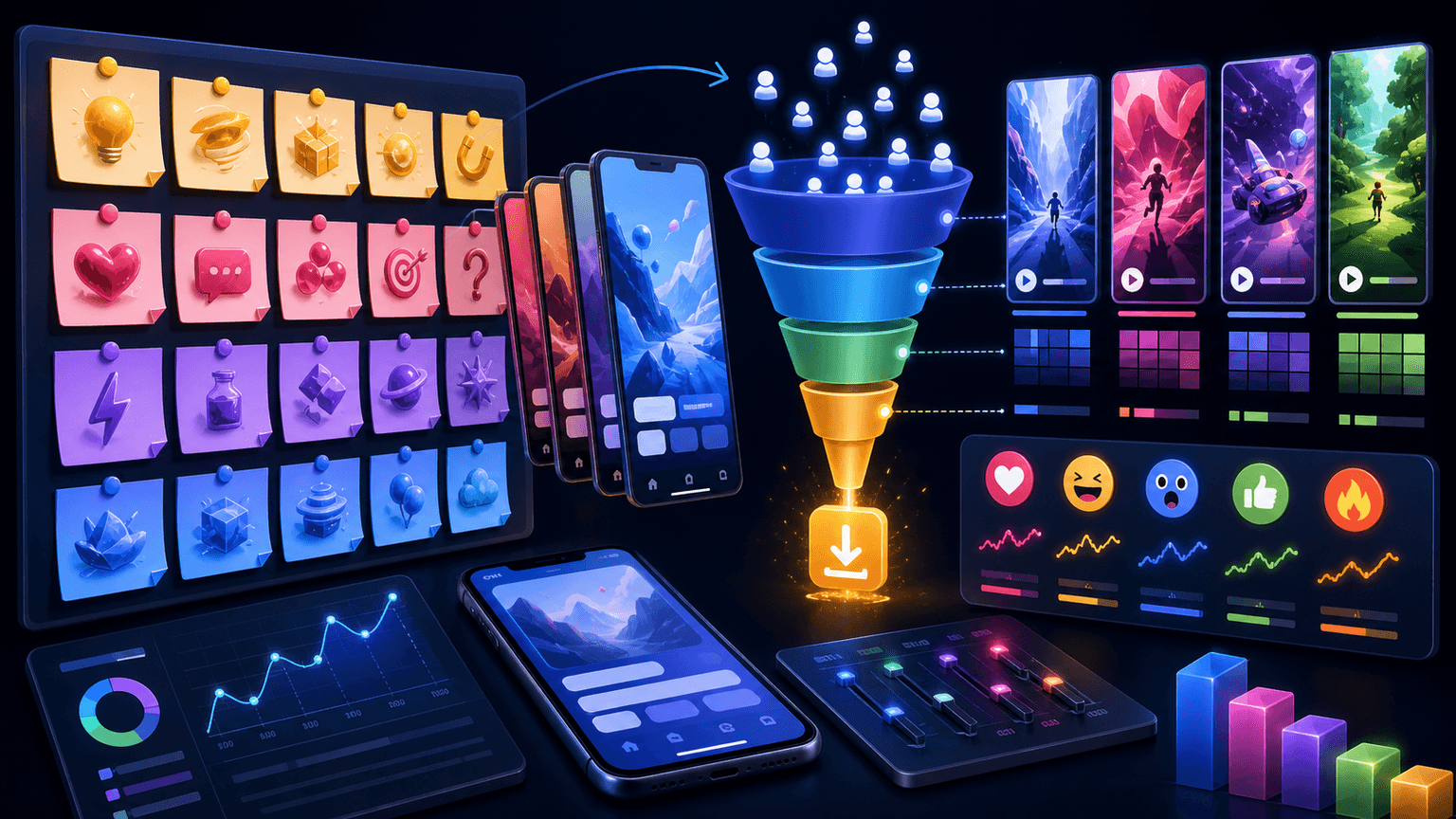
Measuring whether your onboarding carousels actually reduce churn
The ultimate metric for onboarding carousels is not engagement — it is whether users who see the carousel take the taught action inside the app. This requires connecting your Instagram analytics with your app analytics, which most teams skip because it is harder than checking likes.
The simplest tracking method: create a unique deep link for each tutorial carousel's CTA. When a user taps the link in bio and opens the app, your analytics tool records which carousel drove them. Compare the activation rate of users who arrived via tutorial carousels against your baseline activation rate. The difference is the carousel's impact.
If direct attribution is not feasible, track proxy metrics. Do your tutorial carousels have higher save rates than your other content? Saves indicate intent to use the content later — the viewer is bookmarking instructions they plan to follow. A tutorial carousel with a 5%+ save rate is likely driving real in-app behavior.
Primary metric: in-app activation rate among users who arrived via tutorial carousel deep links
Secondary metric: save rate — indicates the content is useful enough to reference later
Tertiary metric: DMs and comments asking follow-up questions — indicates genuine engagement with the material
Compare day-7 retention for tutorial-exposed users vs. non-exposed users when possible
Track which specific tutorials correlate with the strongest retention improvements and produce more content in that format
Chapter 9
6 mistakes that make onboarding carousels useless
- 1
Teaching features instead of workflows
A carousel about 'how the calendar feature works' teaches mechanics. A carousel about 'how to plan your entire week in 10 minutes' teaches a workflow. Users do not care about features. They care about outcomes.
- 2
Using outdated screenshots
If your app updated its UI last month and your tutorial still shows the old interface, users will get confused at the first step that does not match. Update tutorial carousels within 48 hours of any UI change.
- 3
Cramming too many steps into one carousel
If the tutorial has more than 5-7 action steps, break it into a series. Each carousel should teach one complete, self-contained workflow that the user can finish in under 2 minutes.
- 4
Skipping the outcome preview
Always show the end result on an early slide (slide 2 or 3) before diving into steps. Users need to see where they are headed to stay motivated through the process.
- 5
Forgetting the non-user audience
Your tutorial carousels reach people who have not downloaded the app yet. Every tutorial should work as both an instructional guide and a product demo. Include a download CTA for viewers who are not yet users.
- 6
Publishing tutorials once and never updating
Pin your best tutorial to your grid, republish updated versions quarterly, and create new tutorials whenever you ship features that affect the onboarding workflow. A stale tutorial library signals an abandoned app.
Next step
Turn this guide into a production-ready carousel.
AttentionClaw generates brand-consistent tutorial carousels from your app screenshots and brand style. Teach users how to get value from your app without designing a single slide.
Keep the workflow inside AttentionClaw.
Common Questions
FAQ
More Reading
Keep reading
8-chapter read
Vibe-Coded App Demo Carousel Template
A vibe-coded app demo carousel should show the user's problem, the app workflow, the output, the trust check, and the next action. Do not lead with the build method. Lead with what the app helps a real user do, then use the founder story as supporting context.
8-chapter read
App Store Review Request Social Content
App-store review request social content should ask at the right moment, explain why honest reviews help, and avoid pressure. Use social posts to educate users about when to leave feedback, what kind of review is useful, and how the team uses reviews to improve the app.
9-chapter read
Turn SaaS Onboarding Emails Into Carousel Content
SaaS onboarding emails can become strong carousel content when each email is translated into one public lesson: first setup, first win, feature discovery, mistake correction, or advanced tip. Do not paste email copy into slides. Rewrite it as a visual workflow with one action per frame.
8-chapter read
Carousel Slide Order That Converts: Hook, Proof, Offer, CTA
A converting carousel usually follows a clear order: hook, context, problem, solution or product, proof, objection handling, offer, and CTA. The exact slide count can change, but the reader should never wonder why the next slide exists.
How to Announce App Updates With Carousels That Get Users Excited, Not Bored
Most app update announcements read like technical changelogs that only developers care about. Carousel storytelling transforms the same updates into exciting content that re-engages lapsed users, activates new features for existing users, and gives potential downloaders a reason to finally act.
How to Showcase App Features in Instagram Carousels That Drive Downloads
Listing features does not sell apps. Showing how each feature changes the user's day does. These carousel frameworks turn abstract feature descriptions into visual, benefit-driven content that makes viewers reach for the download button.
7-chapter read
How to Explain a Complex App Feature in Five Carousel Slides
To explain a complex app feature in five carousel slides, show the user's situation, the hidden friction, the simple mental model, the feature workflow, and the result. Do not start with the architecture or settings. Start with the decision the user needs to make and end with the next action.
App Marketing Hooks That Drive Downloads: 20+ Proven First-Slide Formulas
The first slide of your app marketing carousel decides whether someone downloads or scrolls past. These 20+ hook formulas are built specifically for app promotion — covering curiosity, pain points, social proof, and demo-driven openings.
8-chapter read
Social Content Templates for App Onboarding Education
App onboarding education content should teach one useful action at a time. Use social carousels and slideshows for setup, first win, feature discovery, objection answers, and advanced tips. The goal is not to replace in-app onboarding, but to reinforce it with contextual, saveable tutorials users can find before and after install.
The Software Feature Carousel Framework: Show Don't Tell
Feature announcement carousels that just list bullet points fail because they tell instead of show. This framework turns product capabilities into visual stories that make prospects feel what the product does, not just understand it.
Written by
AttentionClaw
Editorial Team
Editorial context
Part of the Carousel Creation topic cluster. Last updated June 22, 2026.