Chapter 1
The short answer: source first, generate second, verify last
The safest generated infographic workflow is: define the reader question, collect credible sources, extract only supported claims, choose the visual explanation type, generate layout directions, add final text and numbers manually, check readability, cite sources, and adapt the asset into platform-specific formats. Do not ask AI to invent facts, statistics, diagrams, or labels.
Infographics feel authoritative because they compress information. That makes errors more damaging. A wrong number in a paragraph is bad; a wrong number in a chart looks like proof. AI-assisted social teams need a workflow that separates research, reasoning, design, and export.
Google's SEO and helpful-content documentation both point toward content that helps users understand and make decisions. For social infographics, that means the asset should clarify a real question, not turn weak claims into polished-looking graphics.
Start with the question the infographic answers.
Use sources before visual design.
Write claims in plain text before generating layouts.
Add final numbers, labels, and citations in controlled design steps.
Export different crops for Instagram, TikTok, LinkedIn, blog, and landing pages.
Chapter 2
Start with one reader question
A good infographic answers one question. It does not summarize everything the team knows. Examples: 'Which product variant is right for me?', 'How does this app workflow save time?', 'What changes between plan tiers?', 'What does a launch timeline look like?', or 'How do our ingredients work together?'
The question determines the visual format. A process needs a flow. A comparison needs a table. A timeline needs stages. A hierarchy needs a tree. A statistic needs context and denominator. Choosing the format before the question usually produces pretty but vague content.
For social posts, the question should be narrow enough to answer in a swipe sequence. If the full explanation requires 2,000 words, turn it into a carousel with one idea per slide and link to a blog or landing page for the complete answer.
- 1
Write the primary question
Use the exact language your buyer or reader would use, not internal campaign language.
- 2
Name the decision it supports
Decide whether the infographic helps someone choose, compare, understand, troubleshoot, trust, or act.
- 3
Set the depth limit
Decide whether the asset is a single image, 5-slide carousel, 10-slide carousel, TikTok slideshow, LinkedIn document, or blog support graphic.
Chapter 3
Build a source gate before visual generation
The source gate is the point where a claim earns the right to become visual. Use official platform documentation, product documentation, original data, reputable standards, or credible research. Avoid using unsourced AI output, competitor blogs, or vague social media anecdotes as proof.
Google's structured data guidance is a useful analogy: structured information helps systems understand content when the underlying content is accurate. In the same way, infographic structure only helps readers when the source claims are accurate.
For each claim, write the source, the exact supported statement, and the allowed wording. If the source says a format supports 2 to 10 cards, the infographic should not imply 'unlimited cards.' If the source gives a contrast threshold, do not round it into a vague 'good contrast' rule.
Official docs for platform specs and policies.
Product documentation for product capabilities.
Analytics exports for owned performance data.
Standards bodies for accessibility and technical claims.
Original customer research when permissions and methodology are clear.
Callout
Do not decorate weak evidence
If the source is weak, the infographic should not make the claim look stronger. Use the asset to explain what is known, what is estimated, and what the reader should verify.
Build from this playbook
Turn sourced explanations into reusable social assets
AttentionClaw helps teams transform verified ideas into carousels, slideshows, and visual systems without losing the workflow behind the claim.
Chapter 4
Create a claim sheet before the design brief
A claim sheet is a short document that separates facts from interpretation. It lists the approved claims, source URLs, notes, forbidden wording, and visual risk. This keeps the designer or AI prompt from accidentally turning a qualified statement into a hard promise.
For example, a claim sheet might say: 'TikTok carousel ads support multiple images in order; do not claim organic slideshows always outperform video.' Or: 'WCAG contrast guidance uses a 4.5:1 threshold for normal text; do not claim this guarantees readability in every social context.'
The claim sheet also helps with approvals. A reviewer can check the infographic against the sheet quickly instead of re-reading every source.
- 1
Approved claim
Write the precise statement the infographic is allowed to make.
- 2
Source and note
Attach the source URL and a short explanation of what it supports.
- 3
Forbidden wording
List stronger claims the asset must avoid, such as guaranteed results, causal performance claims, or unsupported comparisons.
- 4
Visual risk
Flag whether the claim could become misleading if represented as a chart, before-after image, ranking, or timeline.
Chapter 5
Choose the infographic type that matches the claim
The visual format should make the claim easier to understand. Use a flowchart for processes, comparison matrix for choices, timeline for sequences, annotated screenshot for product education, hierarchy diagram for systems, and checklist for review tasks.
Do not use a chart unless you have real quantitative data. A generated bar chart with invented proportions is worse than no chart. If you are explaining a qualitative workflow, use steps, cards, swimlanes, or labeled diagrams instead.
For social carousels, each slide should carry one visual job. Slide 1 frames the question. Slides 2 through 7 explain the system. The final slide gives the action and source context. This structure lets the infographic work as a swipeable story instead of a crowded poster.
Process: flowchart or step ladder.
Choice: comparison matrix or decision tree.
Timeline: launch calendar or stage map.
System: hierarchy, hub-and-spoke, or swimlane.
Evidence: chart only when real data exists.
Review: checklist with pass/fail criteria.
Chapter 6
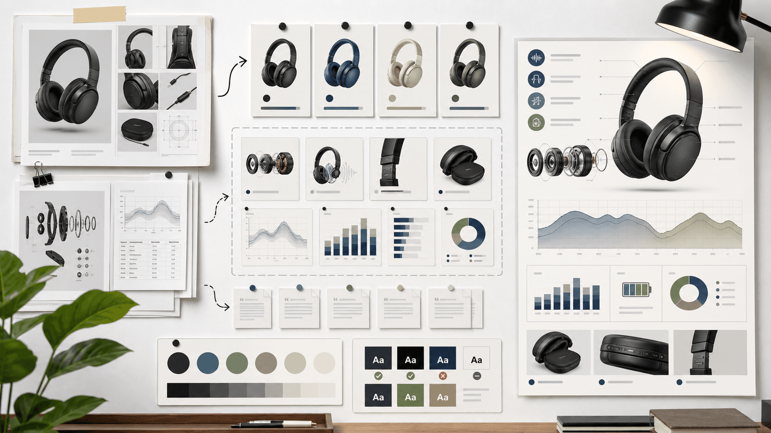
Use AI for layout exploration, not final factual text
AI image generation is useful for exploring composition, mood, icon style, illustration language, and slide rhythm. It is not reliable enough to set final factual labels, numbers, citations, or UI text without review. Treat generated output as a layout draft.
A practical workflow is to generate three layout directions from the same claim sheet, choose the clearest one, then rebuild final text, numbers, and labels in a design layer. This avoids the common problem where the visual looks finished but contains distorted text or unsupported microcopy.
For product or app infographics, use real screenshots and product references where accuracy matters. AI can create the surrounding visual system, but product truth should come from approved assets.
- 1
Generate layout directions
Prompt for composition, hierarchy, icon style, and visual rhythm, not final facts.
- 2
Select for clarity
Pick the layout that makes the reader question easiest to answer, not the most decorative option.
- 3
Rebuild factual text
Add final labels, numbers, captions, and citations manually or with a controlled design system.
- 4
Attach source notes
Keep source notes in the post, caption, blog section, or review record depending on the format.
Chapter 7
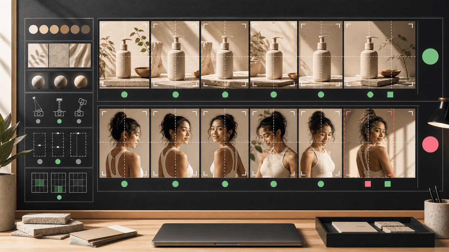
Check accessibility before export
Infographics often fail because they compress too much text into too little space. Social media makes this worse because the asset is viewed on small screens. Accessibility review should happen before export, not after the campaign is scheduled.
W3C's contrast guidance gives teams a concrete minimum for text contrast, and the broader principle is simple: if a user cannot read the slide quickly, the infographic does not communicate. Use fewer labels, larger text, stronger contrast, and simpler diagrams.
Accessibility also includes non-visual context. Captions, alt text, source notes, and blog expansions can explain what a dense visual cannot. A social infographic should not be the only place important information exists.
Use large text and short labels.
Meet strong foreground-background contrast.
Avoid relying on color alone to encode meaning.
Use clear reading order and enough spacing.
Provide caption, alt text, or linked explanation for complex diagrams.
Chapter 8
Turn one infographic into a content system
A strong infographic should become more than one post. The source sheet can become a blog section. The flowchart can become a carousel. The checklist can become a downloadable resource. The comparison matrix can become a landing-page block. The key is to preserve the claim sheet so every reuse stays accurate.
Platform formats determine how the asset should be adapted. TikTok carousel ads and Meta carousel ads rely on swipeable ordered cards. LinkedIn carousel formats support professional document-style storytelling. A blog support graphic can carry more citation context than a square Instagram slide.
Reuse should not mean reposting the same image everywhere. It means adapting one verified explanation into the right crop, density, and CTA for each channel.
- 1
Blog version
Use the full claim sheet, sources, and explanation. Add the infographic as a support visual.
- 2
Instagram carousel
Break the infographic into one idea per slide with high contrast and a final CTA.
- 3
TikTok slideshow
Use a vertical crop, stronger first frame, and faster text rhythm.
- 4
LinkedIn document
Use a more professional layout with clear headings, source notes, and decision-oriented framing.
- 5
Landing page block
Use the clearest visual summary to support conversion, not to overload the page.
Chapter 9
Final QA checklist for generated infographics
The final QA pass should compare the exported asset against the reader question, claim sheet, source URLs, accessibility rules, and destination page. This is where a social team catches the errors that visual polish can hide.
Ask five questions: Does the asset answer one question? Are all claims sourced? Are numbers and labels accurate? Can the slide be read on mobile? Does the CTA send people to the next logical step? If the answer to any question is no, the asset is not ready.
AttentionClaw fits this workflow by helping teams turn verified explanations into reusable carousel and slideshow systems, while keeping source-backed copy and review notes attached to the campaign.
One reader question is clear.
Every claim traces to a source or owned data.
Charts use real numbers only.
Generated text has been rebuilt or manually verified.
Contrast, type size, and reading order work on mobile.
Sources and CTA are included where the format allows.
Destination page matches the infographic promise.
Callout
Turn sourced explanations into reusable social assets
Use AttentionClaw to turn source-backed explanations into reusable carousels, TikTok slideshows, and campaign visuals without losing the claim sheet behind them.
Next step
Turn this guide into a production-ready carousel.
AttentionClaw helps teams transform verified ideas into carousels, slideshows, and visual systems without losing the workflow behind the claim.
Keep the workflow inside AttentionClaw.
Common Questions
FAQ
More Reading
Keep reading
8-chapter read
Carousel Slide Order That Converts: Hook, Proof, Offer, CTA
A converting carousel usually follows a clear order: hook, context, problem, solution or product, proof, objection handling, offer, and CTA. The exact slide count can change, but the reader should never wonder why the next slide exists.
AI-Generated Product Infographic Checklist
AI-generated product infographics should start with product truth and source-backed claims. Use a checklist for SKU accuracy, variant logic, evidence, chart integrity, readability, citations, and destination-page match before publishing.

How to Batch Instagram Carousels and Save 10+ Hours Every Week
Most creators spend 2-3 hours per carousel because they restart from scratch every time. A batch production system cuts that to 15 minutes per post.
9-chapter read
Source Citation Checklist for AI-Assisted Social Content
AI-assisted social content needs a source checklist whenever it makes factual, product, performance, legal, health, financial, environmental, platform, or customer-proof claims. The checklist should define claim risk, acceptable sources, citation notes, reviewer status, and rewrite rules before content is scheduled.
8-chapter read
AI Prompt Library Template for Social Media Teams
A useful AI prompt library is not a folder of clever prompts. It is a production system with repeatable prompt families, required inputs, source rules, brand constraints, output specs, approval status, and QA notes so social teams can create faster without losing accuracy or brand control.
8-chapter read
Brand Safety Checklist for AI-Generated Social Images
AI-generated social images should not go live because they look polished. They need a brand-safety review that checks product fidelity, claim accuracy, platform policy, accessibility, disclosure, and landing-page match before publication.
AI Image Consistency Checklist for Instagram Carousels
AI image consistency for Instagram carousels requires checks before, during, and after generation: identity lock, style lane, product accuracy, character continuity, camera rules, crop safety, text safety, disclosure, and final mobile review.

Carousel Design Principles: The Visual Rules That Get More Swipes
Great carousel design is not about being a graphic designer. It is about following a set of visual rules that make your content readable, recognizable, and swipeable. This guide breaks down each rule with concrete specifications you can apply immediately.
Sources
- Search Engine Optimization (SEO) Starter Guide — Google Search Central
- Intro to How Structured Data Markup Works — Google Search Central
- Understanding Success Criterion 1.4.3: Contrast (Minimum) — W3C Web Accessibility Initiative
- Carousel Ads Specifications — LinkedIn Help
Written by
AttentionClaw
Editorial Team
Editorial context
Part of the Content Planning topic cluster. Last updated June 22, 2026.