
Chapter 1
Why most app update announcements get ignored
The default app update post looks something like: 'Version 3.2 is here! New features: dark mode, improved search, bug fixes. Update now!' This post fails for three reasons. First, it speaks in product language, not user language. Nobody wakes up excited about 'version 3.2.' Second, it lists features without explaining why anyone should care. Third, it is a single image that communicates the same amount of information as a push notification — which the user already dismissed.
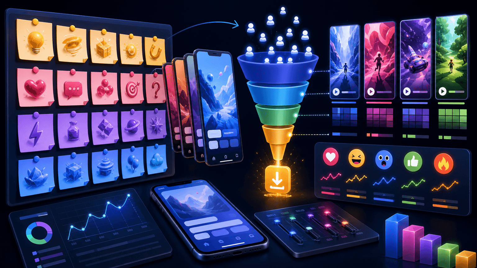
The carousel format fixes all three problems. You have 10 slides to translate each update into a user benefit, demonstrate it with screenshots, and build enough excitement that the viewer actually opens the App Store. The narrative arc of a carousel — hook, build, payoff — turns a flat announcement into a mini-story about how the user's experience is about to improve.
Update carousels also serve a retention function that single-image announcements cannot. A well-crafted update carousel re-engages lapsed users by showing them that the thing they complained about has been fixed. It activates underengaged users by surfacing features they missed. And it gives potential new users a signal that the app is actively maintained and improving.
Chapter 2
How to reframe technical changes as user benefits
Every line in your changelog has a human translation. Finding it is the core skill of update carousel creation.
Engineers write changelogs for engineers. Marketers need to translate those changelogs for humans who do not care about the mechanism — they care about the result. The translation formula is straightforward: take the technical change, ask 'What does the user experience differently?', and write that answer as the slide copy.
'Improved search algorithm with fuzzy matching' becomes 'Find anything in your library even when you cannot remember the exact name.' 'Reduced load time by 40%' becomes 'Your dashboard now loads before you finish blinking.' 'Added dark mode' becomes 'Finally: an interface that does not blind you at midnight.' Same update, but now the reader feels something.
- 1
List every change from the release notes
Pull the raw changelog from your engineering team. Include everything — features, improvements, and bug fixes. Even minor fixes can become compelling slides when translated into user language.
- 2
Score each change by user impact
Rate each change: High (changes a daily workflow), Medium (improves an occasional frustration), Low (fixes an edge case). Only High and Medium changes deserve carousel slides. Low changes go in a bullet list on one summary slide.
- 3
Write the 'so what?' sentence for each keeper
For every High and Medium change, write one sentence that completes: 'Now you can _____ .' This sentence becomes the headline on that change's carousel slide.
- 4
Rank the survivors by excitement potential
Put your most exciting change first (it becomes the hook) and your second most exciting change last (it drives the CTA momentum). Fill the middle with supporting changes in descending impact order.
Chapter 3
The update announcement carousel: story arc framework
- 1
Slide 1: The anticipation hook
'The #1 thing you asked for is finally here.' Do not reveal the update yet. Create a gap between what the reader knows (something changed) and what they want to know (what changed). This earns the swipe to slide 2.
- 2
Slide 2: The user frustration callback
Acknowledge the pain point that triggered this update. 'We heard you: searching for old files was painfully slow.' This shows you listen and validates the frustration your users felt.
- 3
Slides 3-4: The hero change with before-and-after
Show the biggest update. Slide 3 is the before state (old UI or old workflow). Slide 4 is the after state (new UI or new workflow). The visual contrast makes the improvement undeniable.
- 4
Slides 5-7: Supporting changes
One change per slide, each framed as a benefit. Keep these punchy — one headline, one screenshot, one sentence. These slides build the feeling that the update is substantial, not a single tweak.
- 5
Slides 8-9: What's coming next and CTA
Slide 8: tease the next major update. 'And we are already working on...' This keeps the user excited about the app's trajectory. Slide 9: 'Update now' for existing users, 'Download free' for new users. Two CTAs, one slide.
Build from this playbook
Turn every app update into a scroll-stopping carousel
AttentionClaw generates brand-consistent update announcement carousels from your screenshots and release notes. Ship the update, post the carousel, re-engage your users.
Chapter 4
Hook formulas that make update carousels irresistible
The hook on an update carousel has a unique challenge: it needs to create excitement about something the viewer does not yet know about. Generic hooks like 'Big update!' or 'New features alert!' have been done so many times that they trigger automatic scroll-past behavior. Your hook needs to break the pattern.
'The feature 10,000 of you requested is finally live' — social proof combined with anticipation
'We fixed the one thing everyone hated about [app]' — acknowledges criticism, promises resolution
'[App] just got 3x faster. Here is what that looks like.' — quantified improvement, curiosity about visuals
'Stop updating later. This one is worth opening the App Store right now.' — urgency through specificity
'Before vs. after: what [workflow] looks like with today's update' — visual comparison promise
'We deleted our most popular feature... and replaced it with something better' — pattern interrupt through contradiction
Callout
The reply hook technique
Screenshoot or reference actual user complaints and feature requests as your hook. 'Three months ago, @user said our export was broken. They were right. Here is the fix.' This technique humanizes the update and shows your team actively responds to feedback.
Chapter 5
Visual storytelling techniques for update carousels
Update carousels live or die on their visual proof. Telling someone search is faster means nothing. Showing a side-by-side comparison where the old search takes 4 seconds and the new one takes 0.5 seconds is undeniable. Every update claim needs a visual receipt.
The before-and-after split is the most powerful visual technique for updates. Put the old experience on the left or top half and the new experience on the right or bottom half of the same slide. Use a clear divider and label them. The viewer processes the improvement instantly without reading a single word.
For updates that are hard to visualize (performance improvements, backend changes), use metaphorical visuals or animated GIFs embedded in the carousel. A loading bar comparison, a speed counter, or a simplified workflow diagram can make invisible improvements visible.
Before-and-after splits: most effective for UI changes, layout improvements, and workflow simplifications
Side-by-side comparisons: ideal for showing speed improvements or reduced step counts
Annotated screenshots: highlight exactly what changed with circles, arrows, and 'NEW' badges
Progress timelines: show the evolution of a feature across multiple updates to demonstrate ongoing investment
User quote overlays: pair each update with a user request that inspired it
Chapter 6
Tailoring update carousels for three different audiences
Every update carousel reaches three distinct audiences with different needs. Active users want to know what changed and how to use it. Lapsed users want a reason to come back. Potential users want evidence the app is worth downloading. A single carousel can serve all three if you structure it intentionally.
- 1
Active users: Lead with the change, show the workflow
Active users already understand the app. They want specifics: what is new, where to find it, and how it improves their current workflow. Slides 3-7 should include enough screenshot detail that an active user can start using the new feature immediately.
- 2
Lapsed users: Lead with the pain point you fixed
Lapsed users left for a reason. If your update addresses a common complaint, make that complaint your hook. 'Remember when [frustration]? We fixed it.' Lapsed users who see their specific frustration acknowledged are significantly more likely to reopen the app.
- 3
Potential users: Lead with the cumulative value
Potential users do not care about what changed — they care about what the app does now. Include one slide that summarizes the app's current state: 'With today's update, [app] now [does X, Y, and Z].' This positions the update as a reason to download, not just to update.
Chapter 7
How often to post update carousels and how to avoid update fatigue
Posting an update carousel for every minor patch annoys your audience and devalues your major releases. Reserve the full story-arc update carousel for significant releases — roughly once per month or once per major feature ship. Minor updates can be covered in a quick-tip format or bundled into a monthly roundup.
The monthly roundup carousel is an underused format that works well for apps that ship frequently. '5 things we improved in [app] this month' covers multiple small updates in a single carousel without any one change needing to carry the entire post. This format also signals consistent improvement, which builds confidence in the app's long-term viability.
Major feature launches: full 9-10 slide story-arc carousel with before-and-after visuals
Meaningful improvements: 5-7 slide carousel focused on the benefit, not the technical change
Bug fixes and minor patches: batch into a monthly roundup carousel or skip the social post entirely
Avoid posting update carousels more than twice per month — space them with educational and social proof content
Use AttentionClaw to produce update carousels quickly when a release drops so you can announce while the update is fresh
Chapter 8
Caption strategies that amplify update carousel performance
The caption on an update carousel should add story context that the slides cannot convey. Why did you build this update? What user feedback drove it? How does it fit into the bigger product vision? These narrative elements turn a product announcement into a brand-building moment.
Structure the caption in three parts: the backstory (1-2 sentences about why this update exists), the highlight (the single most important benefit restated differently than the carousel), and the CTA (specific action for the viewer to take).
Open with backstory: 'We have been working on this for 4 months because...' — humanizes the update
Reference user feedback: 'This feature exists because @user and 200 others told us...' — builds community
Include the practical CTA: 'Update to the latest version to access [feature]' — direct instruction
Add a conversation prompt: 'What should we build next? Drop it below.' — generates comments that boost reach
Keep it under 200 words — update captions should be punchy, not essays
Chapter 9
Repurposing one update into multiple content pieces
A single significant app update can fuel an entire week of content across formats and platforms. The update carousel is the flagship piece, but it should not be the only one.
From one update, produce: the story-arc announcement carousel (flagship), a tutorial carousel teaching how to use the new feature, a quick-tip carousel surfacing 3 non-obvious things the update enables, a TikTok slideshow with the before-and-after comparison set to trending audio, and an Instagram Story poll asking users to vote on what they want improved next. Five content pieces from one product event, each reaching a different segment of your audience.
Day 1: Story-arc announcement carousel on Instagram — maximum reach and excitement
Day 2: TikTok slideshow repurposed from the carousel with vertical format and trending audio
Day 3: Tutorial carousel teaching the new feature step by step
Day 4: Instagram Stories poll — 'What should we build next?' — drives engagement and gathers feedback
Day 5: Quick-tip carousel covering hidden capabilities unlocked by the update
Callout
The content multiplier principle
Every update carousel you create with AttentionClaw can be instantly adapted into a TikTok slideshow from the same brand style and content. One production session, two platforms, double the audience. Define your style once and generate both formats from the same inputs.
Next step
Turn this guide into a production-ready carousel.
AttentionClaw generates brand-consistent update announcement carousels from your screenshots and release notes. Ship the update, post the carousel, re-engage your users.
Keep the workflow inside AttentionClaw.
Common Questions
FAQ
More Reading
Keep reading
9-chapter read
Mobile App Permission Onboarding Carousels: Explain Data Requests Before Users Bounce
Mobile app permission onboarding carousels should explain why the app asks for data or device access, what value the user gets, and where privacy details live before the prompt appears.

App Onboarding Carousels: Turn New Users Into Power Users With Instagram Content
Most apps lose 75% of new users within the first week because users never discover the features that would make them stay. Onboarding carousels published on Instagram solve this by teaching new users how to get value from your app in a format they are already consuming daily.

6 Instagram Carousel Hook Formulas That Actually Stop the Scroll
Your carousel is only as good as its first slide. These 6 hook families give you a rotation system that keeps your openings sharp without ever running out of ideas.
7-chapter read
How to Turn App Changelogs Into Social Posts Users Understand
A changelog becomes useful social content when it translates technical changes into user outcomes. Group updates by user problem, show the before and after workflow, explain who should care, and end with the next action. The best changelog posts teach value, not version history.

Storytelling Hooks for App Creators: Turn Your Build Story Into Downloads
People do not download apps — they buy into stories. This guide shows app creators how to turn their build journey, founder struggles, and behind-the-scenes moments into carousel hooks that build an audience and drive downloads simultaneously.
App Marketing Hooks That Drive Downloads: 20+ Proven First-Slide Formulas
The first slide of your app marketing carousel decides whether someone downloads or scrolls past. These 20+ hook formulas are built specifically for app promotion — covering curiosity, pain points, social proof, and demo-driven openings.

App Testimonial Carousels: Scripts and Frameworks That Convert Skeptics
App store reviews and user testimonials are your most underused marketing asset. This guide shows you how to transform raw user feedback into carousel scripts that overcome skepticism, build trust, and convert viewers into downloaders.

The Software Feature Carousel Framework: Show Don't Tell
Feature announcement carousels that just list bullet points fail because they tell instead of show. This framework turns product capabilities into visual stories that make prospects feel what the product does, not just understand it.

SaaS Social Proof Carousels: Turn Metrics and Testimonials Into Sign-Ups
Testimonials buried on your website convert nobody. The same testimonials reformatted as carousels and distributed on social media can become your highest-converting content type. This playbook shows you how.

Carousel Copywriting Masterclass: Write Slides That People Actually Read
The difference between a carousel people swipe through and one they screenshot is the writing. Not the design, not the topic — the copy on each slide. This masterclass covers the word-level techniques that separate forgettable slides from shareable ones.
Written by
AttentionClaw
Editorial Team
Editorial context
Part of the Hooks & Captions topic cluster. Last updated June 22, 2026.