Chapter 2
Step 1: Audit every reusable asset from your store listing
Before you touch any design tool, inventory everything you can pull from your App Store and Google Play listings.
- 1
Export all screenshots at original resolution
Download every screenshot from both App Store and Google Play. Google Play allows up to 8 screenshots per device type; Apple allows up to 10. Export them at full resolution — you will crop and reframe for Instagram's aspect ratios later.
- 2
Extract all text copy from your listing
Copy your app subtitle, promotional text, description, and every caption that appears on your screenshot overlays. Paste everything into a single document. This is your copy bank for carousel text overlays.
- 3
Identify your visual design elements
Note the background colors, gradient styles, device frame types, font families, and icon treatments used in your screenshots. These are your brand parameters for carousel production — matching them ensures visual consistency between store and social.
- 4
Catalog your feature-to-screenshot mapping
Create a list that pairs each feature with its corresponding screenshot. One screenshot might cover your dashboard, another your onboarding flow, another your analytics view. This mapping tells you which screenshots feed which carousel types.
Chapter 3
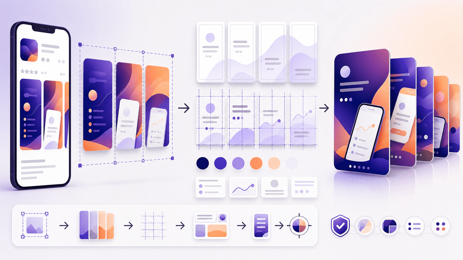
Step 2: Reframe screenshots for Instagram's format and context
App Store screenshots are designed for a vertical browsing context where the user is already considering a download. Instagram carousel slides exist in a completely different context: the user is scrolling for entertainment or information, not shopping for apps. This means you cannot simply dump screenshots into a carousel and expect results.
The reframing process adapts the same visual assets for a content-first context. Each screenshot needs a new text overlay that leads with a benefit or insight rather than a feature label. A store screenshot captioned 'Advanced Analytics Dashboard' becomes a carousel slide that reads 'See exactly where your money goes — in real time.' Same screen, different frame, dramatically different engagement.
Crop screenshots to 1080x1080 or 1080x1350 — App Store dimensions do not match Instagram natively
Replace feature-name overlays with benefit-driven statements that speak to the user's goal
Add a branded background frame that matches your store aesthetic but includes breathing room for text
Remove or minimize device frames if they make the screenshot too small to read on mobile
Add numbered indicators or visual flow cues so each slide feels connected to the next
Ensure text is legible at mobile viewing size — minimum 24pt for body, 32pt for headlines
Build from this playbook
Turn app screenshots into carousels in minutes
AttentionClaw takes your app assets and brand style and generates Instagram carousels and TikTok slideshows automatically. No design skills needed.
Chapter 4
5 carousel recipes you can build from existing screenshots
- 1
The Feature Tour (uses 5-7 screenshots)
One feature per slide. Take each of your best screenshots, add a benefit-driven headline overlay, and sequence them from most impressive to supporting. Open with a hook slide that says 'What [app name] actually looks like inside' — this satisfies curiosity without feeling promotional.
- 2
The Before-After Workflow (uses 2-3 screenshots)
Show the painful old way of doing something, then show your app's solution with real screens. You only need 2-3 screenshots but you pad the carousel with text slides explaining the context. Highly effective for productivity and utility apps.
- 3
The Problem-Solution Walkthrough (uses 3-4 screenshots)
Slides 1-3 describe a problem with text-only slides. Slides 4-7 show your app solving it with actual screenshots. Slide 8 is social proof. Slide 9 is the CTA. Works for any app category because the problem framing does the heavy lifting.
- 4
The User Journey (uses all screenshots in sequence)
Walk through the complete experience from download to daily use. Show the onboarding screen, the setup flow, the core action, and the result screen. This carousel format reduces download anxiety because the viewer already knows what to expect.
- 5
The Single-Feature Deep Dive (uses 1-2 screenshots)
Take one screenshot and zoom into different sections across multiple slides. Slide 2 shows the full screen. Slides 3-6 zoom into specific UI elements with annotation callouts. Great for complex features that need explanation.
Chapter 5
Translating App Store copy into carousel copy
App Store copy is written for a buyer mindset. The user is evaluating whether to download. Carousel copy is written for a browser mindset. The user is deciding whether to keep swiping. These are fundamentally different mental states and your copy needs to adapt accordingly.
The translation formula: take each feature statement from your store listing, strip the technical language, and rewrite it as a benefit the reader can feel. 'AI-powered expense categorization' becomes 'Stop sorting receipts — the app does it for you in seconds.' Same feature, but now it speaks to the reader's lived experience.
Pull your strongest App Store review quotes and use them as slide content too. A real user saying 'This app saved me 3 hours a week' is more persuasive on Instagram than any copy you could write. Review quotes work especially well on social proof slides and CTA slides.
Callout
Copy conversion cheat sheet
For every feature statement, ask: 'What does the user stop doing, start doing, or feel after using this?' That answer is your carousel copy. 'Smart notifications' becomes 'Never miss a deadline without the stress of checking constantly.' Lead with the human outcome.
Chapter 6
The weekly repurposing workflow: 45 minutes for 3-4 carousels
Once your asset audit is done, this repeatable workflow turns screenshot repurposing into a fast weekly habit.
- 1
Minutes 0-10: Pick this week's carousel angles
Choose 3-4 features or themes from your screenshot catalog. Vary the formats: one feature tour, one problem-solution, one social proof. Check that you are not repeating an angle you covered in the last two weeks.
- 2
Minutes 10-25: Write hooks and slide copy
Draft the first-slide hook and all text overlays for each carousel. Pull from your copy bank and translate into benefit-driven language. Write CTAs that tell the reader exactly where to download.
- 3
Minutes 25-40: Assemble the carousels
Drop screenshots into your carousel templates, apply text overlays, and adjust cropping. With a tool like AttentionClaw, you can feed in your screenshots and brand style to generate finished slides without manual layout work.
- 4
Minutes 40-45: Review and schedule
Swipe through each carousel on your phone to verify readability and flow. Schedule for the week. Write captions that complement rather than repeat the carousel content.
Chapter 7
Adapting for Google Play vs. App Store differences
If your app is cross-platform, you have two sets of screenshots with different aspect ratios, design treatments, and even feature emphasis. This is actually an advantage for carousel production because it gives you visual variety.
Google Play screenshots tend to be more feature-descriptive with text-heavy overlays, while App Store screenshots often lean toward cleaner, more lifestyle-oriented visuals. Use Google Play assets for tutorial and feature-walkthrough carousels where detail matters. Use App Store assets for aesthetic-focused carousels where the visual feel drives engagement.
For TikTok slideshows, the vertical format of phone screenshots is a natural fit. A screenshot that needs cropping for Instagram's square format might work perfectly as-is in a TikTok slideshow. Consider producing both formats from the same asset batch to expand your content output significantly without extra production effort.
Google Play allows feature graphics (1024x500) — these work as Instagram carousel cover slides or backgrounds
App Store preview videos can be broken into still frames for additional carousel content
Keep a master spreadsheet tracking which store asset maps to which carousel — avoids duplicate content
Update your carousel library every time you update store screenshots so social and store stay aligned
Chapter 8
When and how to refresh your screenshot-based carousels
Screenshot-based carousels have a shelf life. When you push an app update that changes the UI, every carousel showing the old interface becomes a liability. Users who download expecting what they saw in the carousel and find a different experience feel misled.
Set a recurring monthly review: compare your live app screenshots against your published carousels. Flag any carousel where the UI no longer matches. Either update the carousel with new screenshots or archive it. This 15-minute monthly check prevents a credibility gap between your social content and your actual product.
Major UI updates: refresh all carousels within 48 hours of the update going live
Minor feature additions: create new carousels showcasing the addition but leave existing ones intact
Seasonal or campaign refreshes: swap background colors and overlay copy while keeping the same screenshot base
Every 90 days, audit your top 10 performing carousels and confirm they still accurately represent the current app
Chapter 9
Scaling the pipeline: from one app to a portfolio
If you manage multiple apps or work at an agency, this repurposing system scales predictably. Each app's store listing generates a self-contained asset library. The carousel templates and production workflow stay the same — only the inputs change.
For agencies managing 5-10 app clients, the time savings compound dramatically. Instead of custom-designing carousels from scratch for every client, you pull from each client's existing store assets, apply the repurposing framework, and produce 3-4 carousels per client per week. AttentionClaw accelerates this further by letting you define each client's brand style separately and generate carousels that match their distinct visual identity.
The key to scaling is documentation. Create a one-page brief for each app that includes: store screenshot catalog, copy bank, brand parameters, and a running log of which carousels have been produced from which assets. This prevents duplication and ensures consistent quality across the portfolio.
Callout
Portfolio efficiency benchmark
A single content producer using this system can manage carousel production across multiple app clients simultaneously. The repurposing framework compresses design time significantly compared to building from scratch for each client.
Next step
Turn this guide into a production-ready carousel.
AttentionClaw takes your app assets and brand style and generates Instagram carousels and TikTok slideshows automatically. No design skills needed.
Keep the workflow inside AttentionClaw.
Common Questions
FAQ
More Reading
Keep reading
8-chapter read
App Store Review Request Social Content
App-store review request social content should ask at the right moment, explain why honest reviews help, and avoid pressure. Use social posts to educate users about when to leave feedback, what kind of review is useful, and how the team uses reviews to improve the app.
7-chapter read
How to Turn a Product Detail Page Into Social Content
A product detail page can become a full social campaign when you extract buyer questions, benefits, proof, variants, objections, reviews, and offers. The goal is not to copy the page into posts; it is to turn each product-page section into one useful social asset.

App Onboarding Carousels: Turn New Users Into Power Users With Instagram Content
Most apps lose 75% of new users within the first week because users never discover the features that would make them stay. Onboarding carousels published on Instagram solve this by teaching new users how to get value from your app in a format they are already consuming daily.

How to Showcase App Features in Instagram Carousels That Drive Downloads
Listing features does not sell apps. Showing how each feature changes the user's day does. These carousel frameworks turn abstract feature descriptions into visual, benefit-driven content that makes viewers reach for the download button.
The App Marketing Content Calendar: 30 Days of Carousel Ideas
Most app marketers stall because they run out of content ideas by week two. This 30-day calendar gives you a ready-made posting plan with specific carousel topics for every single day.
7-chapter read
How to Explain a Complex App Feature in Five Carousel Slides
To explain a complex app feature in five carousel slides, show the user's situation, the hidden friction, the simple mental model, the feature workflow, and the result. Do not start with the architecture or settings. Start with the decision the user needs to make and end with the next action.

Instagram Strategy for App Developers: From Zero to 10K Downloads
Most app developers treat Instagram as an afterthought, posting screenshots and hoping for the best. A structured carousel strategy turns Instagram into a predictable app download channel.
7-chapter read
App Store Custom Product Pages for Social Campaigns
Custom product pages and custom store listings let app teams continue a social campaign's message inside the app-store experience. Use them when TikTok, Instagram, or paid social promotes a specific feature, persona, season, or offer. The social post, screenshots, preview text, and first in-app destination should all answer the same intent.

SaaS Content Repurposing: Turn Docs, Blogs, and Changelogs Into Carousels
SaaS companies sit on mountains of existing content — docs, blogs, changelogs, support articles — that could become dozens of carousels. The problem is not a lack of ideas. It is the lack of a system to extract and reformat that content efficiently.

How to Turn YouTube Videos Into Instagram Carousels (Step-by-Step)
Every YouTube video you publish contains 3-5 Instagram carousels worth of content. The problem is not a lack of material — it is the lack of a system for extracting and reformatting that material for a completely different platform and consumption behavior.
Written by
AttentionClaw
Editorial Team
Editorial context
Part of the Repurposing topic cluster. Last updated June 22, 2026.