Chapter 1
Why leading with pain works better than leading with features
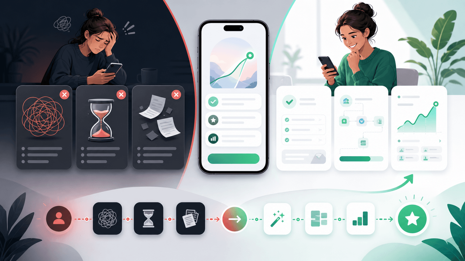
Human psychology is wired to avoid pain before seeking pleasure. This is not a marketing opinion — it is a well-documented cognitive bias called loss aversion. People tend to be significantly more motivated to avoid losing something than to gain something of equal value.
Applied to app marketing, this means a carousel that says 'you are wasting 5 hours a week on this manual task' will outperform one that says 'save 5 hours a week with our app.' Same value proposition. Different framing. Dramatically different results.
Leading with pain also filters your audience in the best possible way. When your hook describes a specific frustration, only people who actually experience that frustration stop scrolling. That means your entire swipe-through audience is pre-qualified — they already have the problem your app solves.
Loss aversion makes pain significantly more motivating than equivalent gain
Pain-first hooks pre-qualify your audience — only people with the problem will engage
Feature-first hooks attract curiosity seekers who may never convert
Pain-first framing makes the solution feel like a relief, not a purchase
Chapter 2
The PAS framework adapted for carousel content
Problem-Agitation-Solution is the oldest copywriting framework for a reason: it works. Here is how to adapt it for app marketing carousels.
The classic PAS framework has three stages. Problem: name the specific pain your audience experiences. Agitation: make the pain feel worse by exploring its consequences, frequency, or hidden costs. Solution: present your app as the fix.
In a carousel format, PAS maps perfectly to the slide structure. Slide 1 is the Problem hook — a bold statement or question that names the pain. Slides 2-4 are the Agitation — each slide digs deeper into why the problem is worse than the viewer thinks. Slides 5-8 are the Solution — showing how your app eliminates the pain point by point. The final slide is your CTA.
The magic is in the agitation phase. Most app marketers rush through it. They name the problem and immediately jump to the solution. But the agitation is what builds the emotional pressure that makes the viewer care about the solution. Spend at least 2-3 slides twisting the knife before you reveal the fix.
- 1
Slide 1: Name the problem with brutal specificity
Your hook should describe the problem so specifically that the viewer feels like you are reading their mind. Not 'social media is hard' but 'you just spent 3 hours making one carousel and it got 12 likes.'
- 2
Slides 2-4: Agitate by expanding the pain
Show the hidden costs, the time wasted, the frustration of current alternatives. Make the viewer feel the accumulated weight of living with this problem day after day. Each slide should make the problem feel bigger.
- 3
Slides 5-8: Introduce your app as the resolution
Walk through how your app solves each dimension of the problem you just agitated. Match each agitation point to a specific feature or capability. The viewer should feel relief with each slide.
- 4
Final slide: CTA that converts relief into action
The viewer is now in a state of 'I need to fix this.' Your CTA should be frictionless: 'Try it free — link in bio' or 'Download and solve this today.' Do not introduce new information. Just give them the path to relief.
Chapter 3
How to find pain points that actually resonate
The difference between a hook that gets 50 saves and one that gets 5,000 saves is the specificity of the pain point. Generic pain does not stop the scroll. Specific, visceral, deeply-felt pain does.
The best pain points come from your actual users, not from your imagination. Every support ticket, every user interview, every app store review contains language that your potential users are already using to describe their frustration. Your job is to collect that language and use it in your hooks.
Look for pain points that are frequent (happen daily or weekly, not annually), emotional (cause frustration or embarrassment, not just inconvenience), and currently unsolved (the viewer has tried to fix this and failed).
- 1
Mine your support tickets
Read the last 100 support tickets and highlight the language users use to describe their frustration with the old way of doing things. These exact phrases become your hook copy.
- 2
Read competitor reviews (2-3 stars)
Two and three star reviews of competitor apps are goldmines. These are people who are in your target market but are dissatisfied with current solutions. Their complaints are your hook material.
- 3
Interview your happiest users
Ask them: 'What were you doing before you found our app, and what was the most frustrating part?' Their answers give you before-and-after stories that power entire carousel series.
- 4
Scan Reddit and Twitter for complaints
Search for your product category plus words like 'frustrated,' 'hate,' 'annoying,' 'why is it so hard to,' and similar phrases. You will find raw, unfiltered pain language straight from your target audience.
Callout
Use their words, not yours
The most converting hooks use the exact language your target users use to describe their pain. Do not polish it. Do not make it sound professional. If they say 'I hate that I have to manually export every stupid spreadsheet,' that frustration — in those words — is more powerful than any marketing-approved version.
Build from this playbook
Create problem-solution carousels in minutes
AttentionClaw turns your pain-point messaging into professional Instagram carousels and TikTok slideshows. Define your brand style, describe the problem and solution, and get publish-ready slides.
Chapter 4
15 problem-solution hook formulas for app marketing
These hook formulas are specifically designed for the first slide of a problem-solution carousel. Each one names a specific pain and implies that a solution exists inside the carousel. Customize them with your app's specific problem domain.
'You are spending [X hours/week] on [task] and you do not have to'
'If [frustrating scenario] sounds familiar, you need to see this'
'The reason [task] takes you so long has a simple fix'
'Stop doing [painful manual process]. There is a better way.'
'You are paying $[X]/month for [tool] and getting [fraction] of what you need'
'[Task] is broken. Here is proof — and here is the fix.'
'Your [workflow/process] is costing you [specific loss] every month'
'I was stuck in the same [painful cycle] until I found this'
'Everyone hates [common task]. Nobody talks about why — or what to use instead.'
'The hidden cost of [current approach] that nobody calculates'
'Why [task] feels so hard (and the one change that fixes it)'
'Your current [tool/process] was not built for [what you actually need]'
'[X]% of [audience] waste [time/money] on [task] — here is the fix nobody talks about'
'This is what happens when you try to [task] without the right tool'
'If you have ever [relatable frustration], this carousel is for you'
Chapter 5
5 agitation techniques that make the pain unbearable
The agitation phase is where most app marketing carousels fail. They name the problem and immediately show the app. But without agitation, the viewer has no emotional urgency. They think 'yeah, that is annoying' and keep scrolling. With agitation, they think 'I need to fix this NOW.'
Good agitation does not invent problems. It reveals the full scope of a problem the viewer has been tolerating. Most people underestimate how much time, money, and energy their current approach costs them because they have normalized the pain. Your job is to de-normalize it.
- 1
The compound cost calculation
Show the viewer how a small daily annoyance compounds. '15 minutes per day = 5 hours per month = 60 hours per year = almost 8 full working days lost to [task].' Small numbers feel tolerable. Annual numbers feel unacceptable.
- 2
The what-else-could-you-be-doing reframe
Translate the wasted time or money into something the viewer values. 'Those 60 hours could be 60 hours building your business, being with your family, or working on the thing that actually moves the needle.'
- 3
The competitive disadvantage angle
Show the viewer that while they are stuck with the old approach, their competitors are moving faster. 'Your competitors are already automating this. Every day you do it manually, you fall further behind.'
- 4
The error rate exposure
If the manual process is error-prone, show the cost of mistakes. 'Manual [task] has a [X]% error rate. That means [specific consequence] happening [X] times per month without you even noticing.'
- 5
The emotional resonance moment
Describe the specific emotional experience of dealing with the problem. 'That sinking feeling when you realize you have to redo the entire [task] because of one small mistake. We have all been there.' Emotions drive action faster than logic.
Chapter 6
Revealing the solution without feeling like a sales pitch
After 3-4 slides of agitation, the viewer is emotionally ready for a solution. But the transition from problem to product is where many carousels lose trust. If the shift feels abrupt or salesy, the viewer disengages.
The smoothest transitions bridge from the pain to the principle before introducing the product. Instead of going from 'this problem is terrible' directly to 'download our app,' insert a slide that says 'the fix requires [principle]: a way to [abstract solution].' Then your app is presented as one implementation of that principle, not as a forced recommendation.
Another technique is the 'what if' bridge. After the final agitation slide, ask: 'What if [task] took 2 minutes instead of 2 hours?' This creates a vision of the better future before you reveal the tool that makes it possible. The viewer arrives at your product introduction already wanting the solution.
Bridge from pain to principle before bridging from principle to product
Use a 'what if' slide to let the viewer imagine the solution before you reveal it
Show the solution in action with screenshots or demos, not just claims
Present your app as a discovery ('I found a tool that does this') rather than an ad ('buy our product')
Let the before-and-after contrast speak for itself — the agitation makes the solution look impressive by comparison
Chapter 7
Problem-solution hooks by app category
Different app categories have different pain landscapes. A productivity app's pain points are not the same as a fitness app's or a finance app's. Here are problem-solution hooks tailored to the most common app marketing categories, showing how the same framework adapts to different audiences.
Productivity apps: 'You just spent 45 minutes on a task that should take 5. Here is why — and the tool that actually fixes it.'
Finance apps: 'You have no idea where $400 went last month. Neither did I, until I started using this.'
Fitness apps: 'Your workout plan changes every week because nothing sticks. The problem is not motivation — it is the plan itself.'
Social media tools: 'You are spending more time creating content than running your business. Something is wrong with that equation.'
Education apps: 'You have been studying the same material for weeks and can not remember half of it. The method is broken, not your brain.'
Health apps: 'You track 5 different health metrics in 5 different apps. The fact that none of them talk to each other is costing you insights.'
Creative tools: 'You have 12 tabs open trying to design one graphic. There is a reason this feels harder than it should.'
Chapter 8
Mistakes that kill problem-solution carousels
Problem-solution carousels are the most forgiving format in app marketing, but there are still mistakes that can tank their performance. Most of these mistakes happen in the transition between the problem and the solution.
The most common killer is rushing the agitation. If you spend one slide on the problem and seven slides on your features, you have created a feature showcase, not a problem-solution carousel. The emotional build-up is what makes the solution feel valuable.
The second most common mistake is choosing a pain point that is too broad or too niche. Too broad ('social media is hard') and nobody feels personally targeted. Too niche ('the Instagram API's rate limiting when posting from third-party schedulers in the European timezone') and your audience is three people.
Rushing through agitation — spend at least 30% of your slides on the problem and its consequences
Choosing pain points that are too generic — specificity is what stops the scroll
Making the solution slides feel like a feature list — show the experience, not the spec sheet
Forgetting the emotional bridge — do not jump from pain to product without a transition
Using jargon in the problem description — use the exact words your users use, not industry terms
Overpromising in the solution — realistic claims convert better than hyperbolic ones
Chapter 9
Building a problem-solution carousel production system
Once you understand the framework, the challenge shifts from 'how do I write this' to 'how do I produce these at scale.' A systematic approach lets you create problem-solution carousels consistently without starting from scratch each time.
The system starts with a pain point library — a running document of specific user frustrations, organized by category and severity. Every time you discover a new pain point (from support tickets, reviews, interviews, or social listening), add it to the library. This becomes your content calendar.
From there, use the PAS framework to structure each carousel, and a tool like AttentionClaw to produce the slides. The framework gives you the words. The tool gives you the visuals. Together, they let you publish problem-solution carousels at a pace that builds real momentum.
- 1
Build your pain point library
Create a spreadsheet with columns for the pain point, source (where you found it), severity (how much it bothers users), and frequency (how often it occurs). Add to it weekly from support tickets, reviews, and social listening.
- 2
Prioritize by severity and frequency
The strongest problem-solution carousels address pain points that are both severe (genuinely frustrating) and frequent (happen regularly). Start with these and work down the list.
- 3
Draft the PAS structure
For each pain point, write the hook (1 slide), agitation (2-3 slides), solution bridge (1 slide), and solution details (3-4 slides). Use the formulas from this guide as starting scaffolds.
- 4
Generate visuals with consistent branding
Use AttentionClaw to produce the carousel slides with your brand styling. The visual consistency across your problem-solution series builds recognition and trust over time.
Next step
Turn this guide into a production-ready carousel.
AttentionClaw turns your pain-point messaging into professional Instagram carousels and TikTok slideshows. Define your brand style, describe the problem and solution, and get publish-ready slides.
Keep the workflow inside AttentionClaw.
Common Questions
FAQ
More Reading
Keep reading
7-chapter read
Instagram Carousel Ad Hook Formulas That Qualify Buyers
The best Instagram carousel ad hooks qualify the audience, name the buying problem, and create a reason to swipe. A hook should attract the right buyer, not just the most curious viewer.
8-chapter read
Social Proof Posts for Apps With Few Reviews
Apps with few reviews can still create credible social proof by showing product proof, beta feedback, workflow evidence, founder responsiveness, changelog progress, and user questions answered. Do not fake testimonials or overstate traction. Make proof specific, modest, and connected to the user's decision.

6 Instagram Carousel Hook Formulas That Actually Stop the Scroll
Your carousel is only as good as its first slide. These 6 hook families give you a rotation system that keeps your openings sharp without ever running out of ideas.

App Marketing on $0: How to Grow Downloads With Just Instagram Carousels
Funded startups can outspend you on ads, but they cannot out-content you. Instagram carousels are the most effective free marketing channel for bootstrapped app developers who need downloads without a budget.
8-chapter read
A Hook Testing Framework for Paid Social Carousel and Slideshow Ads
Paid social hook testing works when each hook tests a clear buyer angle against the same proof, offer, audience, and destination. The goal is not to find the cleverest line. It is to learn which problem, outcome, proof, or objection earns qualified action.

Storytelling Hooks for App Creators: Turn Your Build Story Into Downloads
People do not download apps — they buy into stories. This guide shows app creators how to turn their build journey, founder struggles, and behind-the-scenes moments into carousel hooks that build an audience and drive downloads simultaneously.

Instagram Caption Formulas for App Promotion: Copy-Paste Templates
Your carousel does the convincing, but your caption closes the deal. These copy-paste caption templates are built specifically for app promotion — covering launches, feature updates, download CTAs, and ongoing engagement posts.
App Marketing Hooks That Drive Downloads: 20+ Proven First-Slide Formulas
The first slide of your app marketing carousel decides whether someone downloads or scrolls past. These 20+ hook formulas are built specifically for app promotion — covering curiosity, pain points, social proof, and demo-driven openings.
7 Viral Carousel Formulas for App Marketing (With Real Examples)
Some carousel structures are engineered for virality. They trigger saves, shares, and comments at rates that blow up algorithmic distribution. These 7 formulas are the ones that consistently go viral in the app and tech space — with slide-by-slide breakdowns so you can replicate them.

Carousel Copywriting Masterclass: Write Slides That People Actually Read
The difference between a carousel people swipe through and one they screenshot is the writing. Not the design, not the topic — the copy on each slide. This masterclass covers the word-level techniques that separate forgettable slides from shareable ones.
Written by
AttentionClaw
Editorial Team
Editorial context
Part of the Hooks & Captions topic cluster. Last updated June 22, 2026.